Ideas
- Wire-framing the sports app
- Creating promotional material
As I have little experience with wire-framing for an application, I decided that I would task myself with designing the structure of this app in its entirety so that I could make clear the full intentions of the service.
I imagined the app to function using specific sections that are tailored to the type of user. For example, the players, the coaches and the scouts would all have different intentions and therefore the app would need to function in different ways in order for it to appeal to different audiences. I started out by sketching and illustrating different icon ideas that could potentially be used to identify specific parts of the app. For the players section, the logos tend to show imagery based on football kits, actions in the game and equipment used during matches. The coach section was defined by visual representations of training equipment, match strategy and management of the players. The scouting section was defined through visuals of discovery, such as the magnifying glass.
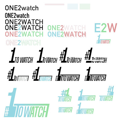
In relation to this, I felt it necessary to find a name that could be used to describe the function and intention of the app. After discussion with other peers and noting different potential names, I settled with 'One2Watch', as this reflects the scouts interest in players, the status of potential athletes and how the app would allow coaches and scouts to save information for later analysis.
The design of the app's title was made to look quick, condensed and simplified, as this reflects the motions of speed in the game and the compression of information within the apps features. The design itself took inspiration from the visual resemblance of a goal post and the desire of young athletes to become career professionals in the sport. This logotype is likely to feature in the opening page of the app, as an introduction feature.
No comments:
Post a Comment