Tuesday 30 April 2019

OUGD603 - Personal Branding - Visual research


Before the design stage for the personal branding could begin, it was important to first understand what inspirations could be taken and used for the style of the identity and the way in which to lay it out. During my time working with Uniform agency, I was given insight into the portfolios that agencies look for when applying at graduate level. I was shown examples of the graphic designers' websites and their own work, including the ways in which they layout their projects. I think this was a great way to tailor my own portfolio online and create it in a way that would appeal to studios of this type.

Another way that I was able to find inspiration was through Behance, as it provided several examples of existing online portfolios and personal branding projects. Studying the ways that designers layout the concept and explain it, made it easier for me to design a layout of my own that would eventually be useful for an online portfolio. Looking at how existing studios used certain typeface choices and colour schemes made me think about the sorts of fonts and colours found in my own work. As they would use them to reflect the type of business they are, in the same way I could include frequently used fonts and colours as a way to reflect my practice.

By also looking at the websites of the studios I am interested in, I can get a feel for how they prefer to present their own work. This might as a result, give me an advantage when it comes to applying for positions at these studios or similar places, as they will likely take interest in the projects similar to their own. One website I found particularly useful was Fifteen Studio in Liverpool, as this was one of researched agencies that I had considered applying for after graduation.


OUGD603 - Quickfire: Logo and Website Homepage - Evaluation

After finishing this brief, I felt that I had designed something that could potentially be used for inspiration of another project in the near future. As I enjoy designing commercially driven projects, with public audiences in mind, this project was ideal for my portfolio and my practice. Similarly to the signature brief found on BriefBox, this brief was limiting in its time frame and made the design process more demanding as a result. I think that the overall aim of this was to improve my ability to work quickly and under a time constraint, as I would be required to design quickly if I were working as a freelance designer or at a design agency.

One thing that I particularly found useful from this brief, was the visual research before the design process began. Seeing other interpretations of a challenge such as this gave me the chance to consider how other people might interpret a design. This then led me to consider the audience the project might be designing for, and how contemporary graphic design would play a part in communicating key ideas in an appropriate manner. As a result, I can now add another logo/website brief to my portfolio and refer back to the concept, as well as the process in the future.

OUGD603 - Quickfire: Logo and Website Homepage - Outcome


Here is the finalised logo for the concept, which was posted to BriefBox in an attempt to receive feedback from the author or other submitting users. This logotype concept helps to convey the idea of colour gradients and how they have been used on the design of the homepage for vegan frozen yoghurt.


The finalised homepage design combined ideas from the development stage and made amends to small details. This included the 'vegan frozen yoghurt' subheading beneath the logo being changed to the blue colour scheme, as this would help it to stand out on the pink background. In order for the homepage header text to become more visually legible, I changed it to a darker shade of blue with the body text beneath remaining navy grey.

Project Rationale
Created to reflect the flavours, sensations and stimulation of eating vegan frozen yoghurt, Froyogo gives audiences a visual representation of chilled, dairy free products. Using a simplistic homepage, Froyogo provides online users with a vegan approach to buying frozen yoghurt. Its contemporary approach to navigation makes shopping for products more enticing, while presenting impressive plant-based options as second to none on the market. Developed with the intention of improving environmental awareness, Froyogo gives customers a frozen yoghurt that not only tastes great but saves the planet while you enjoy.


OUGD603 - Quickfire: Logo and Website Homepage - Development


The concept was limited in its approach to colour, so that it could remain simple and contemporary visually. Therefore I chose these fonts, colours and icons to be the only designs used throughout the development. This would also allow the navigation of the homepage to remain easy to use and familiar to all audiences. 


The layout for the development changed slightly, so that the gradient was used at the homepage navigation bar. At the centre of the page, the audience is presented with the product. This image had been altered so that the dessert matched the pink colours of the gradient.

In the top right hand corner a search button and shopping cart button were added so the website could show visitors they're able to purchase products. To the left the navigation bar was also kept simple with four options to choose from.


Alternatively, the other option was to make the navigation bar white, centre layout gradient colours and the logotype matching. Positioning the dessert image to the bottom left gave the text options a more clear intention of matching in colour. The social media links were also positioned to the right, and utilised a dark grey colour application to contrast with the blue background layer.

In an attempt to compromise between the two ideas, the text to the right remained where it was but used the gradient. The dessert was moved back to the central position and the grey text was used beneath the header, in Helvetica light. 


OUGD603 - Quickfire: Logo and Website Homepage - Initial Ideas


I started off the initial stages by sketching different layouts and ideas for the brief. Some of the visual research that was first looked at provided inspiration for these sketches, as they analysed several approaches. This included the way the desserts in other submissions would show ingredients around the images.


One way to start off the initial stage, involved designing a set of layouts that could reflect a sense of refreshment or sweet flavour.


One idea involved dividing the layout in different flavours, similar to neapolitan ice cream.


When thinking about frozen yoghurt in visual form and how this could be portrayed in the design, I decided to try using various gradient based layouts. The idea here would be to show the sweet flavours of the product and how the flavours mix together. The chosen colour scheme for the layout therefore used this idea to show the pink as an indicator of sweetness, while the light blue refers to the chilled temperature of the dessert. Another thing I had considered after this was the way the body text could contrast from the background.

Creating a logo for the concept, took a similar approach with the use of gradients to convey flavours through colour. The name Froyogo came about when combining the words 'frozen yoghurt'. The ideas for this logo consisted of bespoke inspirations, as well as more playful handwritten styles. In a compromise between the two styles, I chose to use Helvetica Bold and tighten the kerning so that the gradient was made clearly visible in each letter. I also added a small degree symbol to the top right corner of the logotype to indicate temperate, which felt appropriate being placed on the side with colder colour visuals.


OUGD603 - Quickfire: Logo and Website Homepage - Visual Research

After reading through the brief, I was able to look at other submissions for inspiration. I knew that I wanted to make the homepage look contemporary, simple and elegant. Therefore the aim would be to find inspiration from submissions that focus on limited colour, clean visuals and simple information. I particularly liked how these submissions considered the way in which the navigation bar was placed in the frame. They also make use of photographs within the layout, making the colours of the desserts contrast with the outer layers. At this stage, it was unclear whether I would have time to animate the webpage within the time frame, as many of these had.

OUGD603 - Quickfire: Logo and Website Homepage - Brief

Quickfire: Logo and Website for a new vegan frozen yoghurt company

The brief found on BriefBox appealed to me as it was another task that required quick thinking and time management. The time restriction for this brief was between 2 and 4 hours, which was similar to the 5 hour time limit of the signature brief. This also meant that a time plan would once again be a necessary step to managing the project. Before beginning this task, I had several aims in mind in terms of what I hope to achieve by the end of the day. This included the opportunity to record how much work can be produce within the time frame, how well executed the finish process is and to learn more about web design. This could also mean looking at other interpretations of the same brief by other participants that have submitted their concepts.

Time Plan
  • 30 mins - visual research/inspirations
  • 15 mins - sourcing imagery
  • 30 mins - sketching ideas 
  • 1 hour - initial ideas 
  • 45 mins - development
  • 1 hour - finalising and analysing

Wednesday 24 April 2019

OUGD603 - Personal Typographic Signature ( 1 day brief ) Application and Evaluation


To understand how the signature might work in a professional setting, I applied it to a copy of my CV, which could then be seen by employers or potential clients. Adding this to the CV also improve the style and presentation of the document, which could as a result add creative professionalism for others to see. In conclusion to the design, I feel that this brief has allowed me to focus on a simple part of my personal branding but has also tested my ability to create the signature within a time limit. Sketching the ideas and then digitally enhancing them was one way to prove to professional contacts that the design an presentation of my work was creatively considered before hand. This brief also pushed me to organise a time limit on each task, including a time planner that helped to divide the project into manageable sections. Overall, I think that this brief could prove useful for other time constricting briefs and will add to my personal branding identity.

OUGD603 - Personal Typographic Signature ( 1 day brief ) Development

 Here are the selected designs from the initial stage of the project. These were chosen for their combination of style as well as the ways they connect first name and surname. I felt it was necessary to use my full name for the design, as it made it look more professional as opposed to shortened.


The final design that was chosen was digitally edited so that the lettering would include subtle shadowing. This way the hand-written effect could become more legible when read if attached to an email or online document. This also gave the signature a more sophisticated and thoroughly considered approach. As a result, online contact with industry professionals can include the signature design as a hint to my personal design style.

OUGD603 - Personal Typographic Signature ( 1 day brief ) initial ideas

After looking at different styles of signatures, I decided to begin sketching several ideas to use for my own signature. Eventually, I was able to find a style that worked best for me and could be written quickly. After sketching several different variations of the signature, I then scanned the ideas so that they could be studied and compared before deciding on a final design. 


OUGD603 - Personal Typographic Signature ( 1 day brief ) - research

Before beginning the research, I thought about how I would like the style of the signature to look and first listed the styles that inspire my work. From this I could then start to think about how these inspirations could have relevance to the design of a signature and whether they would reflect my style.

Style inspirations
  • street art
  • album cover art
  • 80s synth/wave aethetic
  • 90s rap
  • minimalism
  • stylish/high fashion
  • punk style
  • house/90s rave music
  • vintage style (50s/60s America)
  • wildlife/nature
Inspiring brands
  • Maniere De Voir
  • Nike
  • Maharishi
  • Dsquared2
  • Moretin, Aftermath, Futurism, Subsoul, Bicep - youtube channels
Inspirations
I knew that the style for the signature aimed to look somewhat stylish and sophisticated, but also informal and slightly playful. Therefore, I looked at these examples of signatures that were inspired by street art styles and others that were more elegant. By combining elements of the two, the sketches for the signature could communicate a creative persona with hints of presentability.

OUGD603 - Personal Typographic Signature ( 1 day brief )

Briefbox.com posted an online typographic brief, which involves creating your own signature within a 5 hour time limit. I chose to undertake this brief as I do not currently have a stylised signature and I think that creating one would allow professional emails and documents to look more design focused if they included my own personal mark.

Therefore, today I plan to use the time constraint as a challenge for my design abilities, to see how I manage time during the task. As a result, this may help me to work faster during the design process and subsequently improve my skill set. This will also prove useful for other projects that the signature may be used in, including my personal branding or when networking with professionals.

Time plan
  • 30 - 45 mins research and typography inspiration research
  • 1 - 2 hours sketching ideas
  • 1 - 1.5 hours digitising the signature
  • 30 - 45 mins applying to mock ups
*BriefBox description*
(Today we’re going to look at creating a quick email signature to add a little professionalism to your emails. As a designer, you should use every opportunity to show off your skills. Emails and letters that you send out should reflect your skills as a designer and show that you mean business!
Today we want you to create a stylised, typographic signature of your name. It can be just your first name, your initials or a combination of both… your choice. The finished product doesn’t necessarily have to look like a signature per say, it can be more advanced than that, this is a great opportunity to show off your lettering skills.
Start, as always, by searching for some great typographic inspiration (Check out the useful links sections below to get you started). Think about the style you want to achieve, do you want your signature to be rough and ready, in a script style, or in more refined serif or sans serif letter forms? Your decision. Once you have an idea start sketching out some concepts. These can be quick, rough ideas at first, we can refine them later on.
What I do at this stage is pick one or two of my preferred sketches, scan them into the computer and then print them off at a larger scale. From here I trace the original sketch using thin layout paper, making slight improvements to the letter forms as I go. You can repeat this process again and again until you’re happy with it. Don’t rush straight on to the computer, it will take more time in the long run.
Once I’m happy with the refined lettering, I will once again scan this into the computer and then begin digitalising it using the pen tool. Try and use only horizontal and vertical bezier curves to keep the angles consistent. The awesome guys over at the AGSC created a great tutorial for this technique. 
Once you have you digitalised letter forms you can play around with colour and texture until you have your final piece. This is a great little asset to add to letters, emails, bios, portfolios and resumes. Don’t forget to upload your submissions for feedback from myself and the rest of the community!)

OUGD602 - Studios and Agencies

After completing a week's experience at Uniform studio in Liverpool, I thought about other agencies that could be contacted about job vacancies or internships.

Studios

  • Smiling Wolf studio - www.smilingwolf.co.uk
  • Unit3 Design Studio - www.unit3-designstudio.com
  • Thoughtfully Studio - everythingthoughtfully.co
  • Uniform Agency - uniform.net
  • Black & Ginger - www.blackandginger.com

Thursday 18 April 2019

OUGD603 - Sport Scouting - Evaluation and reflection

I think that by narrowing down these options for a scout would make the app more desirable to those who do not wish to travel long distance across the UK, without first seeing potential players. This app idea also makes scouting a less pressuring process, as some players tend to perform differently on the field when they know a scout is watching their game. Instead, the app allows the players to showcase the best of their talent and connect with potential contacts who may be interested in bringing them to trials. As a result, the app makes sporting careers more easily manageably for players, coaches and scouts alike, without the stressful pressures often found in youth academies.

In the digital age, making a switch to a digital format when planning matches can be good for a team, as it makes coach decisions quicker and more thorough when explaining.  The information can then be shared on the app with players while outside of the game, meaning there can be more time planning prior to a match and an advantage over competitors. Using the app to view other teams gives players a chance to understand their opponent, understanding their weaknesses as well as their talents before meeting face to face. As a result, the app becomes more desirable in a market that lacks digital scouting options in the UK and provides users with ways to improve their skills on the field as well as their future careers as footballers.

Having little to no prior knowledge of wire-framing an application, it was clear to me early in the process that a project such as this would mean thorough investigation of the topic and what features would need to be added in order for it to provide a unique service that no other app can give. By applying a simple layout and colour scheme, the app gave users a simple break down of the options and how best to use them to their own advantage. However, I would have liked to have further explored the functionality of the app and looked into ways to bring it to life using UX and UI design. As I am not equipped with the knowledge of how to do this yet, I plan to use my experience with wire-framing in this project for future reference if I take on something of a similar nature.

Overall, I think that wire-framing was an enjoyable experience that taught me the many different and sophisticated ways to apply design for a format that is currently in high demand. After working with industry professionals, I was able to apply the research findings during my time there to this project. As a result, the project confronted the issue of youth academies and the pressures young players are under when training to become as big as their football idols. The app gave these players a sense of belonging but also highlights the competitiveness of the sport and encourages them to build a profile which showcases their talent, in the hopes that a scout can find their profile and offer them a trial.

OUGD603 - Sports Scouting - Development (Scout Section)

The final section, Scout, gives the user the option to actively seek out players and teams from around the UK. The screens used in this section however, are quite different to the others as they encourage the user to first identify themselves as officials and enable their location. The analytics of the app would then bring up a search option for the scout to choose either to search for certain types of players, events and trials or upcoming matches in their area. 

Using icons as a strong primary drive in the design, I felt that identifying individual player positions would make the page easier to navigate and condense the option of the search. However, if the scout wishes to search more thoroughly there are search bars located above each feature. This way they can search based on city, team, profile views, trophies and achievements, age, adaptability, years active or player record, to suggest a few.


Each part of the different player types contain a list of the top players in their category, but also top stats based on the play styles. For example, the goal keeper category shows players with the most saves of the season, the defenders section shows the highest number of defensive ranked players, midfielders show the highest assists and the strikers as identified by most goals of the season. This helps to narrow down each section according to play style and gives scouts a recommended list of players of interest in the nearby area. Allowing the user to add players to their 'watchlist' below each section makes it easier for them to refer back to when conducting a search for new players. These individual player options can also take the user to the player's profile to get a more in depth look at their style and talent.


Wednesday 17 April 2019

OUGD603 - Sports Scouting - Development (Coach Section)

Following on from the player section's layout, the Coach section of the app takes a similar approach to the introduction pages. Starting off with first screen, the app prompts the user to enter their name and connect with their team. These pages allow the coach to search for their team and connect based on their unique sign in codes. The profile is very similar in style to the player's and features 'follow' and 'message' buttons, as well as a share option for others to recommend the profile.

The first tab allows personal details and a short description to be added by the user, while the second tab allows coaches to manage their players and track progress. This second tab placed high rated users at the top, in the interest of coaches and shows results of recent games below. Both of these options can be further navigated and expanded to reveal the full team line up below, featuring player numbers and positions of play. The last tab, 'Strategy' gives coaches the option to 'add a game plan' view 'previous game' plans and save strategic movements for future reference. 


Adding a game plan opens a new screen with a view of the field and prompts the user to add additional sketches, markings and position players on the map. The page could also be expanded and minimised using a full screen button to the left of the field, accompanied by a description below allowing coaches to add notes. The 'previous games' tab shows individual matches and the tactical approach used prior to the game, allowing the user to refer back to a preferred style of play. This too could be expanded and defined by different approaches, with the app suggesting tactical, attack or defensive options for the user to choose from.

Tuesday 16 April 2019

OUGD603 - Sports Scouting - Development (Players Section)

Once the name for the app had been created, I then applied the logotype to the first screen of the app. This means it would be positioned centre on the loading screen when tapping on the app icon. The following page shows the three different options for users to choose based on their intention with the app. From these links, the app is then divided into Player, Coach and Scout navigation. To keep the layout simple and the information clear, I decided it would be necessary to identify each of the sections using soft blue, green and red shades. The graphite coloured outer layer would allow these primary colours to contrast and mix with the white backdrop.


After initially deciding on a layout that could be consistent throughout the app's identity, I finalised the structure for the 'Player' section of the app. In the top right hand corner of the wire-framing is the icons used throughout this section, while the lines in between each screen represent the functionality of the icons and the pages that users are taken to when tapping on certain areas.


Monday 15 April 2019

OUGD603 - Sports Scouting - App Structure

Developing on from the initial icons of the first stage, I began by mapping out a set of pages that could be used for the different sections of the app. Wireframing each page in this way allowed me to see how each sections functionality might work and what features could be repeated, as well as what features would be individual to a certain section.

On example of this would be the player section of the app, which features a personal profile of the user, their sporting record and the abilities they possess. As this feature would not be needed for coaches or scouts, it  adds personal value to the player in building their professional profile and representing who they are as an athlete.

The first three screens would prompt the user to enter their name, player number, profile information and the option to connect with their current team. Including features such as the 'follow' and 'message' tabs would allow players, coaches and scouts to track progress and contact one another, concerning professional agreements. The profile is then presented on the 4th screen and the user is given 3 options to choose from. The first option allows the user to enter personal details, but the statistics would be based on coach and fellow player feedback to avoid false information. The second option involves the record of the user, where others can see the trophies and achievements in the player's career. This too would be influenced by the input of the user's coach and team. Using analytics, the section would update whenever a team wins a trophy and the user is a verified member of the team. The last section of the profile would be a video library for users to add personal clips and videos of their progress and highlights.

In expansion to the record section of the profile screen, I added two sections that navigate the viewer to the 'Trophies' cabinet of the user, including team achievements as well as their own. The other page would contain 'Coach Report', allowing viewers to read the feedback about their abilities and interactivity in the sport. This section would be separated using individual games in the past months, giving viewers the full report of each match including the team comments and who they played on certain dates.


OUGD603 - Sports Scouting - Initial Ideas

After looking at several sporting infographics, websites and applications it became evident that the common feature in all of these was the use of iconography. Because these platforms and visuals were sports based, information needed to look quick and energetic. This made the symbols and pictograms more appropriate to their purpose, as vast information was then made easily interpretable. In the same way, I planned to use iconography as a way to condense vast amounts of data that would be found within a sports app.

Ideas

  • Wire-framing the sports app
  • Creating promotional material 
As I have little experience with wire-framing for an application, I decided that I would task myself with designing the structure of this app in its entirety so that I could make clear the full intentions of the service. 
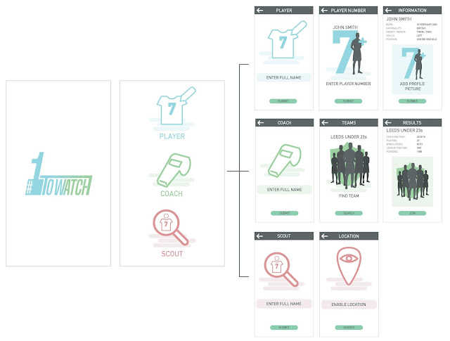
I imagined the app to function using specific sections that are tailored to the type of user. For example, the players, the coaches and the scouts would all have different intentions and therefore the app would need to function in different ways in order for it to appeal to different audiences.

I started out by sketching and illustrating different icon ideas that could potentially be used to identify specific parts of the app. For the players section, the logos tend to show imagery based on football kits, actions in the game and equipment used during matches. The coach section was defined by visual representations of training equipment, match strategy and management of the players. The scouting section was defined through visuals of discovery, such as the magnifying glass.

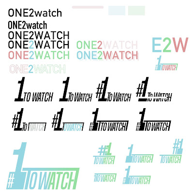
In relation to this, I felt it necessary to find a name that could be used to describe the function and intention of the app. After discussion with other peers and noting different potential names, I settled with 'One2Watch', as this reflects the scouts interest in players, the status of potential athletes and how the app would allow coaches and scouts to save information for later analysis.

The design of the app's title was made to look quick, condensed and simplified, as this reflects the motions of speed in the game and the compression of information within the apps features. The design itself took inspiration from the visual resemblance of a goal post and the desire of young athletes to become career professionals in the sport. This logotype is likely to feature in the opening page of the app, as an introduction feature.


Sunday 14 April 2019

OUGD603 - Sports Scouting - Research

During my time at the Uniform Studio in Bold Street, Liverpool I worked for several days on a project that involved researching and collecting source material for a brief. As the studio had classified this brief from the public, I was not able to see the full extent of the work. However, instead they tasked me with collecting images and information about sports data and analytics for a discussion they would be having mid way through my time there.

When gathering the source material, this gave me the idea to start another brief of my own based on the findings so that they could be put to some use.

 The research for Uniform began with layouts used for sports websites that gather information and analytics. Much of what I found involved the different uses of sports data and how this influenced the financial business of different sports. For example, I found that the analytics gathered by these websites were all using live feeds to collect information in real time around the world. The data from these websites can help sports teams to understand their upcoming opponents abilities, track progress of athletes, influence gambling sites and inform the public on future events.

This made me think about how teams in sports could use information to their benefit and what platforms were likely to be used to track player progress.
 As the Uniform Studio brief involved content for an advertising campaign, I looked at different sports infographics and how abilities of players could be broken down into different statistical visuals. I thought about where these infographics might exist in the world of sport and which platforms people would most likely find them. This led me to research into the different websites of sports teams, more specifically, football teams in Europe.

Taking notes on different inspirational layouts and structures in these websites revealed some of the best and most stand out designs within the format. Most notable of these websites included Borussia Dortmund, Paris Saint Germain and Lille OSC for their contemporary approach to web design.


The Idea
The proposed idea that came to mind from this gathered information was to find a way for young footballers in youth academies to get scouted more easily. The first thing that came to mind from this was to first look for existing apps that run on a similar principle to this. That is when I came across an article about a young footballer from Germany who was scouted when he attended a trial that had been advertised on an app called Tonsser. The app seemed to be in it's beta stage for UK users, but had found wide success in other parts of Europe when connecting footballers with coaches, scouts and trial events. Therefore, I decided that the idea would involve design for an app that allows players, coaches and scouts to connect more easily. This idea could potentially be a beneficial solution to clubs who spend money on sending scouts around the country in search of new players. It could also narrow down the options of players and coaches when finding a local team, signing up to events and managing progress, all from a handheld device. Having found several different visual approaches to sports data, this could prove useful in the design process of this brief over the next few days.


Saturday 13 April 2019

OUGD602 - Uniform studio summary

After spending the week with Neil Sheakey at Uniform studios in Bold Street, Liverpool, I was able to meet plenty of professional designers, advertising specialists and marketing team members. The aim of the visit was to understand the structure of a graphic design agency, how teams work together and the projects that they work on. As I enjoy branding identity, campaign design and other commercial forms of communication, I felt that my time at Uniform was well spent. Here I met firstly with Neil, who got to know me by interviewing me on my arrival. We spoke about my own practice, what sort of work I would be looking for in the future and how the studio could work to my benefit.

Throughout the week, I was then introduced to other members of the design team, including John Barton and Pete Blake. They provided me with work similar to the projects I had recently been working on, as this was the best way for them to see what style my work was. Towards the end of the week, I spoke with Pete about my own independent clothing brand and how I was considering changes to the identity. He then gave me advice on his own experience with freelancing and put me in contact with another designer who had been selling branded clothing of his own.

Overall, I feel that Uniform studio was my favourite work experience to date, as it was a thriving design space that felt more involving and busy for all people. This is exactly what I had been looking for, and as a result I feel confident in searching for a career within design agencies. Working together on a project was what attracted me most to this studio, but working independently with other designers around you also felt welcoming. I think that having experienced the work at Uniform and the people involved in the design structure, I am also confident that independent studios such as this are more attractive in terms of my career prospects. This is because there are many studios like this in the north-west that could potentially be of interest to me in the near future.

Friday 12 April 2019

OUGD602 - Uniform Internship - Day 5

Today I began developing some of the research ideas I had found yesterday and presented them to other members of Neil's team. They then gave feedback to me on the things they were working on and how my work could be tied into their project. I felt this was good for understanding how each team communicated with one another on different tasks within a project.

I was also able to meet another member of staff who explained to me how he had ended up working for Uniform and the small independent businesses he knew from his time as a free lance graphic designer. He put me in touch with another colleague of his, who owned a part-time clothing label similar to my own. Unfortunately, I wasn't able to meet his contact but he did send me his details, which I plan to use soon when asking for advice about going freelance. I could also ask him what he would recommend for someone in my position and whether going freelance would be a good idea early in my career.

Overall, I had thoroughly enjoyed my time working for Uniform agency as I was able to meet plenty of friendly designers and creatives from different specialties. One thing that I planned to get out of the experience was to find out what life is really like at a design studio for someone who has recently graduated. Although there weren't many recently graduated members of staff, I did get advice from the people I had worked with on ways to break into the industry. It was also a bonus opportunity meeting someone with insight on freelance business and side projects, who was able to put me in contact with other creatives.

Work
The client they were designing for were looking to improve areas of their business through employee awareness, environmental impact and international communication.
Therefore the work that was required included sketching ideas for iconography, ideas about training employees and how well the business communicates between different sectors. They wanted me to illustrate these ideas in different ways, so that a A0 poster could be printed displaying all the information.


Thursday 11 April 2019

OUGD602 - Uniform Internship - Day 4

Following on from yesterday's task, I continued to gather source material for the visual approach to a client's business. As the promotional poster would involve a central component it was important to first try to visualise different sectors of the business and then compile different elements of each to summarise the look of the business in the middle. As the focus of the business was around environmental sustainability among other things, I began by visualising this in relation to the centre image.

Feedback from a Uniform member of staff gave me further ideas on ways to improve this visual and we then re-evaluated the brief so that I could better understand what it was that the client wanted. This also gave me the chance to look at the client's website again, so that I could gather research about their core ideas and aims. This also made the visual approach different as the website showed the business as a specialist in bespoke design, making the colour palette more elegant as a result.

Wednesday 10 April 2019

OUGD603 - Personal Branding Brief

In order to extend my portfolio and online presence, I plan to work on a visual branding project that can sell my specialties as a designer to potential clients or employers. This will mean creating content that can be applied to online portfolios either on my own website or to professional portfolio sites, such as Behance.com. The aim will be to design a series of visual outcomes, that will present my personality and aesthetic as a designer. This may include printed content, such as business cards, invoice documents, project proposal statements and introduction documents. These will then be used as presentation of my practice and presence both physically and online.

Considering particular colours and typefaces that I frequently use may be one way to create an identity that best reflects my interests within the graphic design industry. Using visual research from websites, designers or existing online portfolios will provide inspiration for the design of the content, layouts and appropriate methods of production. Overall, I hope to create an online identity that can show my enthusiasm for commercially driven projects, collaborations and branding identity.


OUGD602 - Uniform Internship - Day 3

Morning
Following on from yesterday, I began sourcing more ideas for my own brief and beginning several initial preparations for my personal project. As the research began to look at the opportunities in sports for young aspiring athletes, I decided that the project would focus on ways to promote young footballers to clubs. The idea also involved giving coaches and scouts the option to manage and actively seek out new players, based on the personal profiles and reputation of the players.

As the research for Uniform focused on the uses of sports data and analytics, I started to incorporate this into the project I was making for myself. This allowed me to work on projects while further tasked were being gathered for me by the studio.

Afternoon
The task set for me in the afternoon involved interpreting a brief someone had been working on. I was then tasked with sourcing ideas and coming up with visual input for the project and ways that this could be displayed on an A0 sized promotional board. This meant I would be looking into the history of the client, the jobs involved in the business and then visualising how they deal with sustainability, manage employees, communicate and work with the community. As a result I spent the afternoon visualising the different sectors of the business using infographics, pictograms and sketches.

Tuesday 9 April 2019

OUGD602 - Uniform Internship - Day 2

After the first day of collecting visual research and sports data analysis, the findings were discussed with a group and how they might be used to inspire the project at hand. As the aim was to mix multimedia formats, we discussed how these actions could be implicated and what styles would need to be looked at further.

One way that I found the work to work to my own benefit was to use the research as a starting point of my next personal brief, while following on from ideas of my last brief. This way, I can manage my time here at Uniform more effectively in the run up to my university deadline. This may also give me the chance later in the week to receive feedback from industry professionals and understand what direction they would recommend I take. So far the project has involved using the sports research and visuals to explore football based app design. The majority of the day was spent making initial icons and designs that may work in a wire framing for a sports based app.

Monday 8 April 2019

OUGD602 - Uniform Internship - Day 1

Starting off the week internship at Uniform agency in Bold Street, Liverpool I was first given the task of collecting research for a brief they had been working on. As the brief required confidentiality, I was only given certain tasks to avoid any leaks of information.

My task included collecting visual research and making notes on the uses of sports data and analytics. Therefore, I started by collecting images from sports data websites and studying the layouts/visual elements of them.

The task itself was quite beneficial to the rest of my studies as it gave my the opportunity to add research to another brief of a similar kind. Working closely with Neil Sheakey, I was able to explain some of my current projects and interests, which allowed him to set a task that would help my ongoing work.
The most recent project that I completed was a football based rebranding brief, which made the task at hand easier to manage and more enjoyable as a result.