Tuesday 24 April 2018

OUGD501 - Study Task 7 - Project Statement

Project Statement

After receiving feedback from the first draft of the COP2 essay, it was obvious that in order to make the practical work more valid, there would need to be an improvement in the argument and resources to back it up. To do this, the essay was re-written using other contextual references to reading material. This included looking first at The Evolution of Human Artistic Creativity by Gillian M Morriss-Kay, as it would prove that throughout human history there is evidence to suggest that creativity is what helped humanity to evolve and advance.

As the essay was written to prove that technological advancements would change the way in which graphic design is practiced, I began looking at other sources that would prove the technological advancements were positive. Mark Graham and William h. Dutton’s book, Society and the Internet, proved that the introduction of this tool has not only changed the platforms of the design world but has also shaped society and made problem solving efficient and more precise.

Evidence to support this claim was found in another book by Alan Pipes, titled Production for Graphic Designers. In this, he explain how the internet had become so important to society in the modern world that he re-wrote his book because the first edition was written before the world wide use of the internet. He also explained how the tasks of the graphic design world were made easier by the internet, and how his first edition of the book focused primarily on the practices of the past, making it less relevant to the modern world.

In support of the essay’s themes, the practical investigation went on to look at the businesses that were thriving in today’s design industry, due to the advancements in technology. From this, the idea to create a website offering advanced technological services was imagined. Further more, it explored the ways in which these businesses would present themselves to their audience, as a way to inspire the website that would be designed specifically for an audience of the future.


Overall, the link between the theoretical investigation and the practical investigation became more plausible as a result, and allowed for the opportunity to explore ways that graphic design may change as a result of the advancements made in technology.

OUGD501 - Module Evaluation

As a result of the theoretical and practical investigation into technology, it was possible to find out what makes graphic design an important tool in the shaping of modern society. It proved how changing theories and formats will infect benefit the design industry in years to come. Through experimentation of the type of medium available in future, the practical investigation provided insight into the way that businesses with the design industry may benefit from these changes.

As the essay first began with limited sources to back up the evidence of the claims, the first draft was misinterpreted in its approach and relevance to graphic design. Therefore, the first initial idea stage also lacked context and relevance to the essay. However, once the ideas were discussed with peers and further feedback was provided on ways to improve the investigation, it was clear that the essay would need to be re-written so that it would add more contextually valid arguments and would look at different points of view on the issue.

As a result the practical investigation would then better link to the themes and claims of the essay, providing an example of a business that may exist in the near future, due to the changes in technological advancements. Providing evidence of the themes in this way, helped to better embed the argument within a contextual environment and allowed for an investigation into designs role in the process. Having explored the subject and tested it practically, it has then been possible to inform the ideas of COP3 practice in Level 6.

Overall, the investigation into theoretical and practical methods has proved that through research and experimentation, the module can further provide knowledge of ways to approach a design task such as this. With what has been learnt throughout the duration of COP2, the practices and approach to a subject can inform future practice of the same type. The feedback given in the studio also proved useful as it would collect opinions of others and understand someone else perception of a project.

Sunday 22 April 2018

OUGD505 - Module Evaluation

Throughout studio brief 1 and studio brief 2, there were many different options to choose when using graphic design as a way to express certain ideas to a specific audience. Through the research, discussions with peers and experimentation of process, it was possible to explore new ways of creating meaningful design through a range of different methods and platforms. This skills that have been learnt during this module will be transferable to future projects that may require similar approaches and methods of production.

For studio brief 1, exploring micro genres and ways that audiences interpret different styles of music, would ultimately help to communicate the ideas of a particular genre based on its qualities and uniqueness. As the project evolved around UK Drill and its popularity among underground music scenes, this meant exploring the themes relating to the genre, in an attempt to replicate them as an object. The research involved in this project brought about different opinions on UK Drill, as it is seen by some as a violent and nihilistic genre that is negatively influencing the youth. It was however, also seen as an expressive reality of life among young people living in South London and the gritty themes and lyrical content were seen as a way to explicitly depict the reality of the artists.

Looking at the different view points of UK Drill brought about ideas on ways to communicate it in a celebratory nature. Feedback from videographer and director of 'LDN', Nathan Miller, also gave a more clear understanding of what the artists in UK Drill were experiencing. As a result, the project began looking into ways that the music videos would play a big part in the distribution of the music and how popular figures of the genre began to rise to fame as a result. Through applying the ideas of the genre into design solutions, it was then possible to gain feedback from peers on ways to promote the genre and its aesthetic to a public audience.

The result of the project was a balaclava that used inspiration from high end music videos and London slang to express the themes of UK Drill. Admittedly, there were other options that could have been used to better communicate the outcome in a more appropriate way.

For studio brief 2, exploring the debate on cannabis legalisation allowed for the opportunity to understand the debate from either side. Research began by looking at how legal businesses operated and the ways in which they communicate to their customers. From this it was then easier to understand how states in the US were successfully providing customers with products that included the use of cannabis.

Time management during the project proved to be the key issue, as several opportunities for further experimentation into alternative possibilities were missed. However, the research and experimentation that was completed as a result of the project, proved that the intended audience could be targeted in a similar manner to the competitors. Having experimented with logo designing, web page design and printing the physical examples made the campaign more official in its approach.

Overall, the module has allowed for further investigations to be made into design strategies, time management, peer communication and means of production. This will all prove useful when it is later applied to further projects of a similar nature. The strengths of the module include, research and understanding of different approaches, idea generation and appropriation of design choices. The weaknesses of the module include, development strategies, appropriation of processes and limitation of alternative exploration. As a result, these will need to be addressed during future projects that may require a plan of action before hand, so that the time can be appropriately managed with the deadline in mind.

Friday 20 April 2018

OUGD505 - SB2 - Evaluation

When beginning the project, there were different options to pursue in terms of social debates that are currently being discussed. This social debate that was chosen was the debate over cannabis' legality and whether the stigma attached to medical and recreation use of the drug could be shifted. The aim of the project was to use design in a way that would target a specific audience that were against the legalisation, in an attempt to change opinions about the issue. The plan to do this involved looking at what the specific audience would typically shop for and what their interests were. From this it would then be possible to establish a place in the market among the competitors that target the same audience.

The plan of action involved creating a cosmetic brand campaign that would target people aged 65 and over, as this was found to be the age demographic that were most against the legalisation. The idea of a cosmetic brand came about through research of what this age demographic consumed most through online shopping. From this, the brand could be explored through inspiration of other cosmetic brands, the origins of cannabis and the ways that it is perceived by others.

As a result, the project explored a range of research sources that would verify the claim for the use of cannabis legally. It would also allow the campaign to explore the traditional uses of the drug as inspiration, as a way to avoid the stereotypical connotations attached to the drug. This meant looking at the spiritual interpretation of cannabis in Indian culture, particularly in Hinduism. Exploring a range of patterns and colours involved in the cultural practice, allowed the campaign to create an aesthetic that would not only show the brand to be ethical in its approach but also competitive within the high end market that it would be placed.

Once the aesthetic of the brand had been established, the campaign began looking at methods of communication to the specific audience. This included the designs created for certain packaging, as well as the web page and business cards that would make the brand look official. Throughout the process of the brand campaign, there were times when consulting with peers would prove useful in gathering new ways to explore the debate and different alternative approaches that could have been taken.

Had these alternative options been explored further, there may have been different directions in which  to take the project. One suggestion that was not fully explored was the medical approach to cannabis, including its communicative approach and the packaging involved in medical cannabis. If this had been the option that was pursued, then there may have been a different audience in mind with different approaches to the design aspect of the project.

Overall, studio brief 2 has provided the opportunity to explore ways to approach real life social issues and through the use of design, provide audience with an understanding of these issues. Having created a campaign that took a certain stance on an issue, it was possible to use design as a way to engage the opposition of the debate with a different point of view.

OUGD505 - SB1 Evaluation

As a result of the micro genre investigation, there were opportunities to explore new ways to create communicative work that would celebrate aspects of music through design. The chosen topic of investigation would be UK Drill, as there had recently been debate as to whether the genre is to blame for the rise in youth crime around London. Through investigating the genre through its lyrical content and origin, it would be possible to understand what makes it unique from other forms of UK rap.

It was found that the genre had originated in Chicago, USA under the sub genre 'Drill'. As UK Drill involved similar lyrical content and themes, it too had been demonised by the media and police as violent, nihilistic and problematic. Although the genre is seen as 'underground' by its fans, there were clear signs that it was becoming more mainstream, as its fan base had grown across the UK and other parts of the world.

During the initial ideas stage of the project, the genre was explored based on its lyrics, references to gang life and themes. This was then projected into several minimal designs that expressed the images, objects and locations often found in the music videos. From this, feedback was given on ways that the project could progress further, including the exploration of colour and typography.

Looking into the formats that UK Drill used to reach its fan base, also provided insight into the high production music videos for popular Drill artists and the typography used in the videos. Often, these videos were found on YouTube channels that had previously been known for distributing RnB, hiphop and Grime music. Channels such as Pressplay Media and GRM daily were found to be the most popular distributers of UK Drill, with millions of views on their videos.

After noticing the recurring aesthetic in the high production music videos, the content was assessed and used as inspiration for the final outcome. As the videos often included neon lighting, it was found that red and blue were the most used colours throughout these videos. This was then interpreted along side the previous practical investigation, with the colours being used as a way to celebrate the genre.

As some of the ideas of the prior investigation were dismissed during critiques, they were then explored further as an extra feature of the outcome. As it was found that Drill artists often referred to themselves and their gangs as soldiers, a set of dog tags were engraved with the examples of two Drill artist on them. This would inform the audience of the relation between the artists and their comparison with soldiers. It would also help add to the gritty aesthetic of the final piece and express this as a physical object to the public audience.

OUGD501 - COP3 Proposal (Study Task 6.5)


1. Research question
 - Can design play an important role in the promotion of a movie?

2. Rationale (why do you want to research this topic? what impact will this have on your practice?)
- I want to research this topic because I am passionate about cinema and I want to find out what makes a movie 'good' and what makes a movie 'bad'. By researching the topic, it will be possible to explore how design might play a role in the way movies are perceived by their audience.

3. Contexts (what are the immediate contexts in which your theoretical and practical research will be situated? Political? Social? Technological? Aesthetic? Cultural)
- For the topic, there will be research into the social considerations of film, the role that aesthetic plays in the promotion of a film and the cultural following of modern cinema. By looking at these the theoretical research will be able to inform a practical investigation and ways to use design so that it can make a movie appealing.

4. Theoretical Practice (Identify no more than two theories that will help structure your research - must be appropriate to the theme or question)

Theory 1 - Modern cinema plays an important role in the entertainment business and without it society would be different.

Theory 2 - Design is important in the promotion of anything, as it gives the audience a setting to imagine. With movies, design helps to set a tone, theme or genre to the audience.

5. Methods (Secondary: theorisation, semiotic analysis, textual analysis, content analysis, discourse analysis / Primary: surveys, interviews, focus groups, observations)
- Through the study of modern and old cinema, theories and analysis can be made in the differences in approach and how they are perceived by audiences. By looking into how people perceive good or bad, it may give some explanation as to how design can influence a movie. Using surveys of audience, it will be possible to receive feedback and input. Observing certain films and comparing them will prove what gives cinema quality and how does it entertain people.


6. Practical Outcome (what do you plan to produce/develop?)
- The outcome of the investigation, may be to apply the ideas to design in a way that targets the same audience. E.g. a movie poster, promotional advertisement or DVD cover. This will then provide evidence of how others might perceive the approach.

7. Resources (what resources will you need to access?) 
- Much of the research is likely to be digital based observation, but the practical may involve the use of type and printing methods to produce the outcome. 

8. Summer Reading List (find 5 books that you will endeavour to read in preparation for CoP3 - related to either 3 or 4 above)
The Story of Film: A concise history of film and an odyssey of international cinema - Mark Cousins
- Notes on the Cinematographer - Robert Bresson and Jonathan Griffin
Designs on Film: A Century of Hollywood Art Direction - Cathy Whitlock 
- Art of the Modern Movie Poster: International Postwar Style and Design - Judith Salavetz, Sam Sarowitz, and Spencer Drate
- 100 Movie Posters - Tony Nourmand

9. Time Management (Plan of actions from now until 14th Dec 2018)
- Research different sources over summer, including design solutions and appropriation of type.
- Theoretical documenting of evidence, between July and October
- Practical Investigation between September and December.


Thursday 19 April 2018

OUGD505 - SB1 - Outcome

After exploring the typography involved in UK Drill, it was decided that the best option to use for the outcome would be to show hand painted text. As the idea would be to physically replicate the development ideas, it would mean painting on fabric. The plan for the outcome will be to display references to the genre on a balaclava, using the colours that were found to be frequently used in the music videos.

As the previous ideas found, the best way to display the colours would be by having a white base layer. This way when painting onto a fabric surface, the colours will become the centre of attention to the audience. After discussing the ways in which to apply colour to fabric, it was suggested that a lycra or cotton balaclava would be used. This could then be painted using craft paint, ink or acrylic paint. As acrylic paint was the option available during the final stages, this would be chosen for the outcome.


As shown in the development stage of the project, the colour application would show a range of different shades. The plan was to start with green/blue at the top of the mask, changing into blue and purple in the middle and then ending with red at the bottom.

In terms of the layout for the text, the plan was to apply it in different sizes and weights, depending on the area of the mask and how it would curve around the face of the mask. This was also relatively unplanned, as it would create a rough effect and make the text seem more thrown together.

In terms of the application of colour, it was proved to be a more length process than anticipated, with some areas often needing to be adjusted due to the texture of the paint on lycra surface.

If more time had been carefully planned and allocated to the outcome, there may have been things that would be done differently and more precisely. This includes, research into the ways in which to apply colour to certain materials and experiments with alternative medium, like ink or printing.

In conclusion to the outcome, it is clear that it successfully communicates to the audience the type of music to expect. However, had alternative methods been pursued at an earlier stage then the outcome may have utilised the strategy in a more detailed and polished way. It may have also provided the opportunity to explore more ways to create design for a physical surface such as this.


Extra Feature
During an earlier stage in the project, one of the peer review sessions dismissed the idea of relating the project to soldiers. This was because gangs would often refer to themselves as 'soldiers', 'generals' or 'commanders' etc. As the idea that had originally come to mind wasn't pursued, it seemed necessary to explore it anyway. Therefore, as an extra feature to the balaclava a set of army dog tags were created as a way to present the audience with a comparison between drill artists and their lyrical content. The dog tags feature the details of two drill artists, Dimzy from the rap group 67 and MizorMac from Harlem Spartans. The engraving on the tags details their age, gang and area as a way to show audiences the reality of youth culture within UK Drill.


Wednesday 18 April 2018

OUGD505 - SB2 - Business Cards

To further extend the practical investigation into the brand campaign, the design would be tested in physical form. The idea would be to print the design onto hemp paper, so that it would relate to the ethical practice of the brand. It would also allow for the opportunity to see how it might look once printed into business cards to promote the brand.

Keeping to the idea of ethical practice meant also reducing the amount of digital production for the process. This meant hand cutting the cards once they were printed, reducing the amount of pollution for the process. As hemp paper is taken from the same plant as cannabis, it would be a fitting material to use in the production of the business cards.

Using illustrator, the business cards were aligned onto a single sheet of hemp paper and then printed to be hand cut from the page.

The hemp paper proved to be thicker than expected, meaning the process of hand cutting each individual card was a lengthy procedure. Another option that may have worked better, would have been to use a laser cutter to precisely trim each card.

In terms of the print quality, the cards were considered successful as they were printed at 3.5" by 2".


Overall, the process for creating the business cards proved that hemp paper worked well as a material to use for the campaign. However, the process of hand cutting proved to be inefficient and a different method should have been used for a better quality outcome. To add to this, the hemp paper could have also been tested on other packaging for the brand, including the idea for soap packaging and stickers.


Tuesday 17 April 2018

OUGD501 - Practical Outcome

Removing the grid shows that the logotype becomes more focused within the first page.It also makes the features of the menu bar more eye catching.
 However, the images may not look as engaging to the audience when they are placed without a grid. This is especially noticeable around the images that would expand within the grid shape.


The text does however, look better without the use of a grid, as it is more legible in the body text and easier on the eye when reading lines.

One option that could have replaced the expanding images, would be to have them all fully expanded next to one another and making the expansion move to the right of the neighbouring image.


The contact details used at the bottom of the page, work well without the grid because they initially were overlapping lines of the same colour, making some areas hard to read.
As a whole, the webpage looks as though it would work well in communicating a technologically advanced business that specialises in different services.

One thing that may have helped improve the website, would be to have added detailed pages of each navigation and to separate the sections with further options to other features. For example, the social media could have been showcased as an image on its own, separating the details of photography and apps.

Creating further options within each service may have provided the audience with a better idea of how the service works and how they can contact specific departments.

Overall, the website works well in the format that it has taken, but further development may have helped it to look more high tech. For example, the grid could have been kept in places as it worked well in positioning the images on the pages, while giving a structured technological look to the website.

Sunday 15 April 2018

OUGD501 - Further Development

The grid that was applied to the layout, would allow for each section of the website to use 5 rows and 8 columns. This would make the designs easier to apply in a structured manner and would make placement of the images more precise and considered.

For each of the 5 x 8 rows and columns, this would be imagined as a full screen page. Therefore, each 5 rows is considered to take the viewer down to the following page.

To begin the design, the logotype was placed at the centre of the first page, making it the focus point of the viewers attention. Scrolling beyond this, would show the menu bar that would feature different options to choose from.

Clicking on one of these options would scroll down the page to that particular section, making navigation quicker for the viewer.
Section 1 would promote the use of virtual reality marketing for the client, with text shown to the left and imagery placed to the right. This would help the viewer to read the information and follow across to the image.

Section 2 would give a brief look at the services provided by VRV. As imagined in the initial stages, the images would enlarge upon waving the curser over them. Here, the viewer could click to find out further details of these services.

Section 3 would show the app marketing service provided by VRV and below it, section 4 and 5 which would show details of photography and 360 video format.

At the bottom of the page, is the contact details for the business. This includes a phone number, email and social media contacts for viewers to follow.

As the web page now stands, it looks as though the grid used for structuring the layout could in fact prove to be a staple part of the design, as it adds to the futuristic style. The next step from here, would be to remove the grid and assess how the pages look without it and how they will look when placed in one continuous page.


Friday 13 April 2018

OUGD505 - SB2 - Website Proposal

To test the logo and aesthetic of the brand, the designs will be applied to different mock ups and displayed within a website layout. This way it will be possible to see how the designs will look when put into context. It would also validate the choice of colour and font of the campaign when analysed by peers in the final feedback session.

As previously considered, this stage in the project would allow the use of font that wasn't chosen for the logo. By applying Garamond Pro to the descriptive elements of the labels, it would further portray the brand as high end.

The use of white for the label has also worked successfully with the gold as it communicates an image of cleanliness.


The mock ups also allowed the opportunity to use the cannabis leaf within the design, making it clear to the audience of the ingredients. With this design, the leaf would be situated on the side of the soap packaging, making the Lifted Spirit logo the focus of the layout.

The same use of white was also applied as it was the best way for the gold to stand out.


To see how the branding might look on different materials the designs were then applied to different mock ups of paper bags. By trying the logo on different colours, it was easier to assess which colour options would best contrast the materials.

For the first design, the mock up provided a white material paper. This meant that the logo colour did not need to be changed as it had already worked on other mock ups. The other coloured bags were better when paired with the logo in black as the gold was not as stand out when paired with blue, yellow and brown.

Out of all the designs, the one that was best received was the yellow paper bag with a black logo. This was because it was the most legible and it also reflected the bright colourful aesthetic of the brand through the material.


For the website, the gold used for the logo was applied to the top of the page with the text situated in white. This was done because it was evident at this point that the two colours worked well at contrasting one another. Showing the photographs of the products in the centre of the page also gives the audience a clear view of the brand.

Below this, the option to shop the products is provided, along with the logo in a lower opacity and a chance to sign up to the newsletters that the campaign offers.


To improve the look of the website layout, the home page title and options were positioned differently. By adding the name of the brand central to the top of the page, it was more clear to the audience. Several options were then added below the name to navigate to different pages within the site, including the different product ranges that the brand offers.

Taken inspiration from other cosmetic brands, the website also features a search bar, account information and a check out basket for items to be purchased.

The idea of the home page would be to show the product photographs in slides, so that while the audience navigate the page it will show different products for them to click on.

Below this was a promotional offer to the customers giving them 20% off their first order when using a code provided.

As the brand would be focused on gaining popularity through its link to cannabis, it was important that customers would be informed of the ethical practice, the ingredients used in the products and the origins and uses of the plant. This way the brand can establish itself among competitors that believe in ethical practice. For example, Lush are known for their hand made products that refuse to test on animals. In the same way, Lifted Spirit would be able to show customers that the stigma attached to the use of cannabis can be misinterpreted.


OUGD501 - Development


To begin the development stage, the name Virtual Reality Visuals was used as the name for the imagined design business.

Similar to how the technology based design websites used bold sans serif font to express futuristic design, this idea would then be applied to the proposed business.

Starting with Helvetica Bold, the research went on to look at fonts that would make the letters less rounded and more geometric, as this would look more digitised and futuristic. From this, the font Archivo was discovered and used as the basis for the website text.


Through using Archivo, a logotype could be devised that would combine the letters to make the business look similar in nature to futuristic websites.

The idea to start of the logo, was to have each starting letter of 'Virtual Reality Visuals' connected together. It would show the colour scheme to be overlapping and advancing from left to right. The result of this was a logotype that started dark on the left and changed to bright yellow on the right, mimicking the advancement of technology. The words of the business were then also placed under each letter and used a separate, darker shade of orange. This gave the logotype a modern feel that could be used on different backgrounds. 

As the website would feature different sections for the audience to choose from, several texts were made as a way to entice the audience to look at the different formats that can be used to promote their businesses. For example, the texts would detail the service provided for people looking for particular photography or videography for their business promotion.


Identifying the colour scheme would also allow for the style of the website to be established. This way the logotype could be applied to the colours of the background without attention being drawn away from the darker areas of the design.


Thursday 12 April 2018

OUGD505 - SB2 - Development

To continue developing the project, a series of different ideas were used for the starting point of the brand campaign. This meant looking at Indian symbolism, religious beliefs and tradition. This would then inspire the designs to reflect a traditional Indian aesthetic. One thing to keep in mind while working on this, would be to consider how it can be placed within the same market as other attractive skin care brands and how it will appeal to the intended audience.

As the target audience is 65 and over, it was found that skin care products were likely to attract many people in this category, especially if the products were stylish or high end. Therefore, by looking at high end skin products, there would be more inspiration on ways to make the brand appealing.


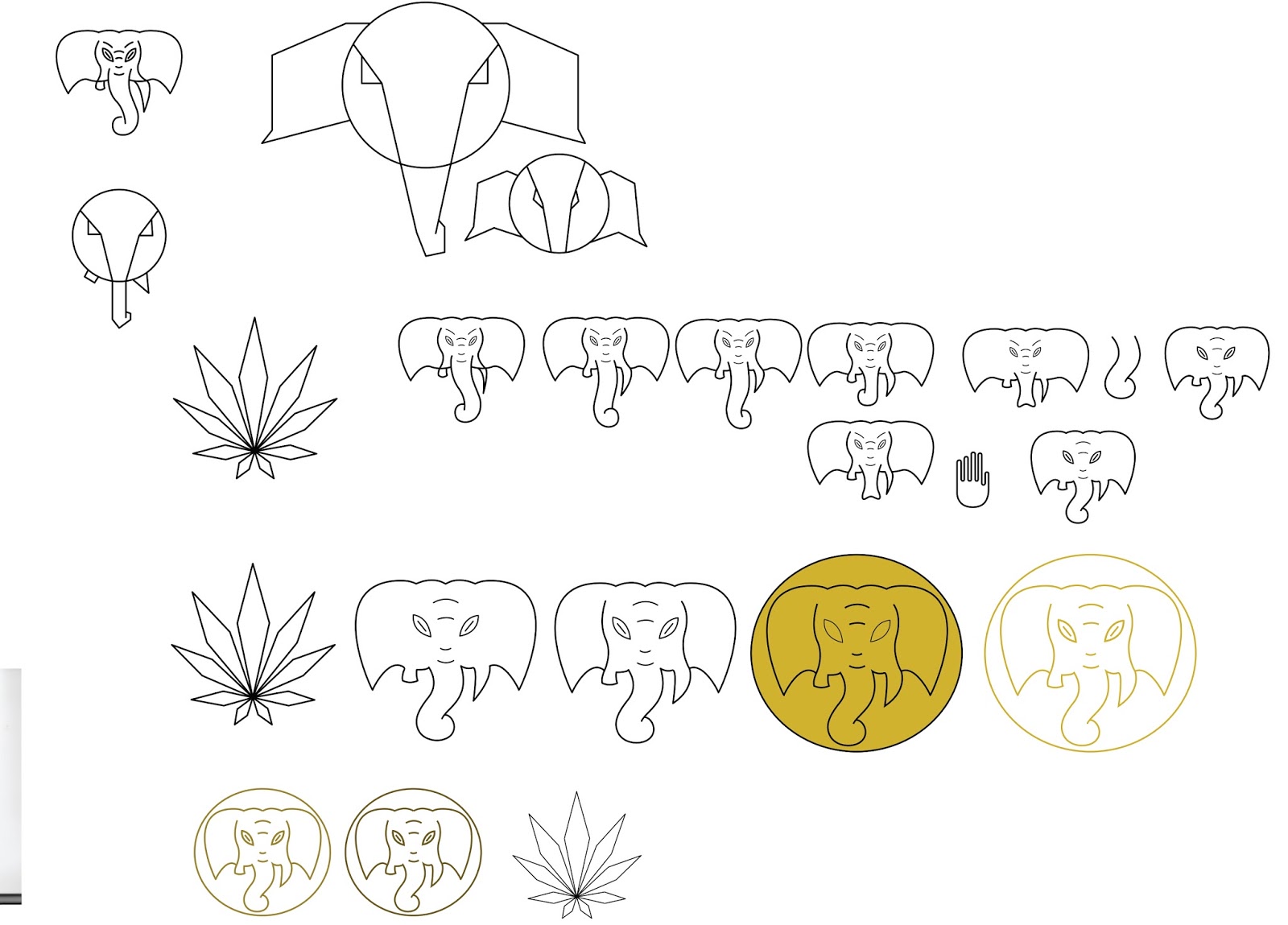
Looking at traditional face paint used in Indian tradition was one way to gather ideas for a logo design. From this, it was possible to find where the face painting culture originates. In Hinduism, face painting can be found on depictions of different gods, including Krishna and Ganesh.

Several initial sketches were made of the Hindu gods, as they were recognisable symbols of the faith and could interpreted by the audience as having a link to Indian culture.


Drawing the face of an elephant would be inspired by the Hindu god, Ganesh. It was decided at this point that it would be the most recognisable option to choose. The minimal approach to the design was inspired by the minimal patterns used in Indian face painting. At a later stage more detail could be added.


Developing these sketches would bring about a logo design to associate the brand with. The cannabis leaf was also designed with the packaging in mind. As the brand would need to be explanatory of its relation to the drug, showing the leaf would make it more clear to the audience.


In the same way that the Ganesh design was developed, the cannabis leaf was used as a way to look at pattern design. Here the leaf had been placed within a circle and copied over and over, using different sizes.

To make sure that the audience was aware of the Hindu god, a pair of hands were added to the design, showing that the god has human features and well as animal features. These hand designs were also inspired by many styles found within Indian culture.

Choosing a colour scheme meant thinking of how the patterns would look when applied to the packaging, as well as how they would relate to the context. In this case, cannabis is mostly associated with the colour green. Therefore different shades were tested on the logo.

Many Hindus also celebrate in Diwali, which centres around the idea of 'light over darkness'. Therefore, bright colours are associated with the festival, including gold in most cases.

When applying the gold to the logo, it seemed to be the best option as the packaging was likely to be white, making it a stand out colour that would also allow the brand to look authentic.

The logo had also began to finalise at this stage, with zigzag patterns being applied around the border and in small spaces within. The final step from here would be to find appropriate typeface to match.


When deciding on a typeface to use, several different variations were first collected and analysed for their features. Having looked at high end brands such as L'Occitane, it was clear that in order to make the brand suitable for the high end market, a serif font such as Garamond Pro or Minion Pro would be the best option.

Other fonts that were looked at include Samarkan, ArivNdr POMt, Sefer AH and Alcazar Regular. These were all found to be fonts that would communicate the culture more blatantly, through recognisable Indian styles and Hindu interpretation of the brand name, Lifted Spirit.

Applying these fonts to the logo in different ways would allow for further feedback at the final stages of the project. Personally, the designs that were considered best would be the ones either using the Samarkan font or the Alcazar font.

While Alcazar was more legible as it possessed more weight in the letters, the Samarkan font made the logo more suited to the recognisable Indian aesthetic. This is probably because the style of Samarkan can be recognised by almost all audiences, as a popular style among Indian design.

Some of the fonts that were not used at this stage may be considered for later stages, such as website proposals.

When consulting peers about which logo to use, the most popular was the Samarkan font logo. This was because it best represented the Indian traditional style. It was also suggested that the text remain below the logo, as it was easier to read when both words were side by side.


When analysing the finalised logo, it has been proven that the Samarkan font worked best under the logo. The use of gold has also allowed the design to place itself within a high end market, appealing the the same audiences as competitors. The next step in the project would be to apply the design to context, including mock up and proposals. This way further exploration can be made as to how design can be used to communicate to the intended audience.