- Halftone the background images on social media
- Could there be moving imagery, gifs or animated type featured on the social media?
- The traditional approach works best for the concept. Digital design in physical form is less unique.
- The traditional printing methods are also more likely to attract the attention of the speakers, as well as students.
- Could also experiment with a variation of printing methods in one. (typesetting, letterpress with screen printing)
- Create a plan for developing further than the proposed concepts.
Thursday 31 January 2019
OUGD603 - Creative Convos feedback
Group Critique feedback: 31/01/2019
Wednesday 30 January 2019
OUGD603 - Creative Convos Social Media
After finishing the concepts for the printed posters, we screen printed an example to be shown in the presentation. As for the other ideas that were not used for the physical process, we used them in the social media concepts in digital form. This would include images of the creative speakers, so that viewers could visualise the how the workshops would be and who the creatives are.
 Using the Instagram dimensions (1080 x 1080), an initial post was set up to work from. During the initial stages of the project, we considered the use of imagery but instead opted for a more minimal approach using halftone. This was because we wanted to promote the traditional methods found in graphic design and how they are primarily used at some stage in a designers career. Therefore, we decided that the digital approaches could be left for social media.
 Similar to the past year's social media, I created a post for each of the 5 days of the week. These would promote each individual speaker and links to their Instagram pages. Choosing Instagram as our main focus, the posts would first promote the event and then later document the workshop after each day.
 With inspiration from our screen printed poster, we re-used the font and layout so that the posts would remain consistent with the identity. They would also remain primarily as 2 colours, with white as a background. This would allow the posts to focus on the colour assigned to each speaker and the black text below it documenting the event.

 The logotype placed in the centre of each post was initially made with the intention of covering the halftone pattern, but we found that it could potentially be animated at a later stage. The idea we have in mind is to show the logo entering from the corner of the post to the centre, during the promotional stages of the event. After the event the posts could then show the logo retreating to the corner to show the passing of the week.
After creating each concept for the speakers of each day, I received some initial feedback before the presentation. Here it was suggested that further development could include halftoning the images in social media and considering other social media platforms.


The promotional post for the event would describe who would be visiting on which day and a link to their Instagram page. This way the students can easily access the speakers work and get a feel for what to expect from the workshop. In addition to this, the workshop could then be documented by a follow-up image from the workshop and links to the speakers after the students have worked with them.

 Similar to the past year's social media, I created a post for each of the 5 days of the week. These would promote each individual speaker and links to their Instagram pages. Choosing Instagram as our main focus, the posts would first promote the event and then later document the workshop after each day.
 With inspiration from our screen printed poster, we re-used the font and layout so that the posts would remain consistent with the identity. They would also remain primarily as 2 colours, with white as a background. This would allow the posts to focus on the colour assigned to each speaker and the black text below it documenting the event.
 The logotype placed in the centre of each post was initially made with the intention of covering the halftone pattern, but we found that it could potentially be animated at a later stage. The idea we have in mind is to show the logo entering from the corner of the post to the centre, during the promotional stages of the event. After the event the posts could then show the logo retreating to the corner to show the passing of the week.
After creating each concept for the speakers of each day, I received some initial feedback before the presentation. Here it was suggested that further development could include halftoning the images in social media and considering other social media platforms.


The promotional post for the event would describe who would be visiting on which day and a link to their Instagram page. This way the students can easily access the speakers work and get a feel for what to expect from the workshop. In addition to this, the workshop could then be documented by a follow-up image from the workshop and links to the speakers after the students have worked with them.
Friday 25 January 2019
OUGD603 - Creative Convos Poster

Using the Poppins Black font we added the names of each speaker to the bottom half of the posters, along with the date of the workshop.
Keeping the poster minimal in its approach to colour will make the printing process easier and more efficient. We also decided that the colours would remain in CMYK for the traditional printing process. Therefore the colours that we had initially considered could be used in the social media posts in a digital form.
OUGD603 - RSA Alone Together brief drop
After further consideration of this current brief, I have decided to drop the process as I think there are better briefs that could instead be focused on that are better suited to my practice. This could result in a more substantial brief that reflects my passion for design and the themes I enjoy working on. Although the brief has now been dropped, I had learnt some valuable insights during the research stage. In particular the research into the target audience (young people), showed how the amount of people struggling with mental health was significantly higher that that of the past generations. It also revealed how there was limited support for people in this situation and ways to engage with them.
As a result of the brief, I have been able to gather sources that could prove useful for other briefs that focus on youth audiences or mental health.
As a result of the brief, I have been able to gather sources that could prove useful for other briefs that focus on youth audiences or mental health.
Thursday 24 January 2019
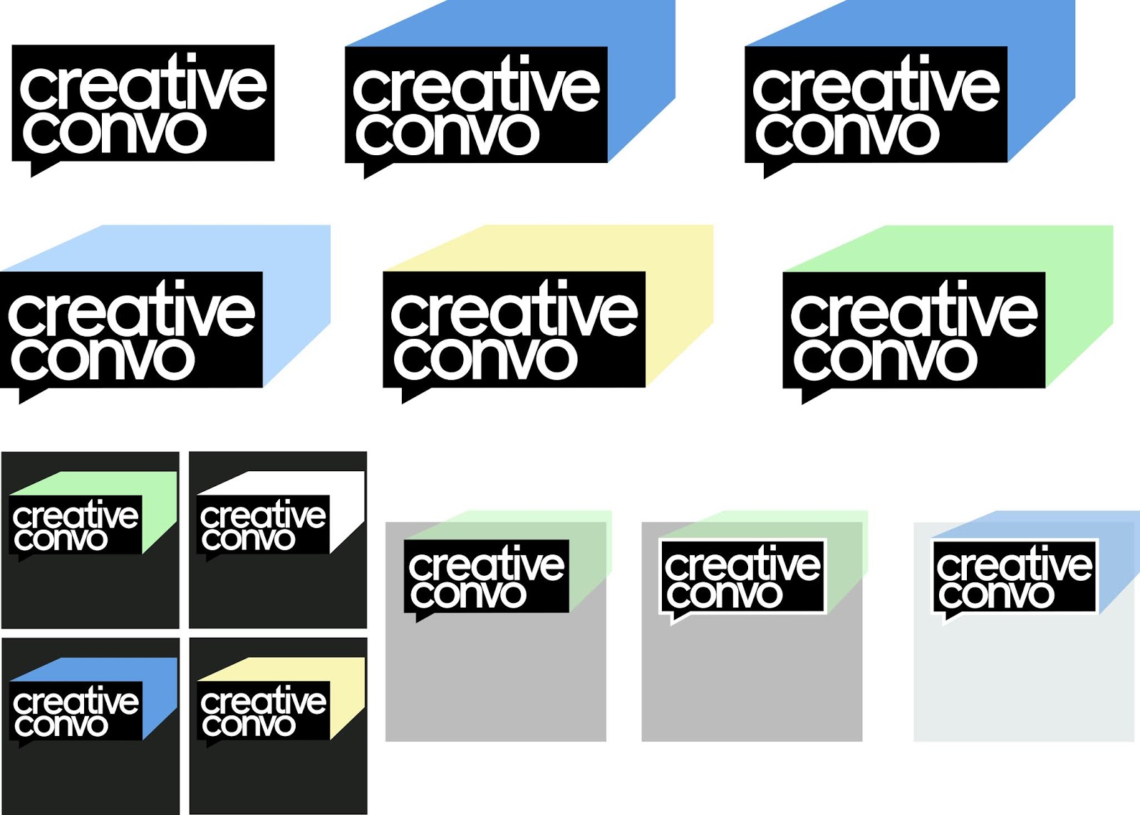
OUGD603 - Creative Convos logotype
For the logotype, we want to make sure that creativity and colour will be a main focus. This is because the workshops will involve creative processes and varied ways of working. Therefore if the logo can be applied to different contexts, it will be able to communicate a range of different styles.


Using the Fugue - regular font, the logotype for creative convos would remain in lowercase because the text looked more circular visually. The circular motion of the text would contrast a boxed outer layer, with straight lines.
The logo was based on a speech bubble to replicate the conversations between professionals and the students at the event. Experimenting with different colours for the logo revealed that it could potentially be applied to a number of different variations.


The idea that we had in mind for the logo, was to make the colour a focus point of the design. This way it could present the event as fun and engaging. Therefore, when we tried the logotype as one colour it looked more commercial and less suited to the event.
With the process and material in mind, the logo had been applied to different backgrounds to see how it could be designed within the space. One thing we had considered was to show the logo approaching the centre of the posters, so that it would visually look as though it was being presented to the viewer. In the same way, the logo could be shown retreating to the corner of the posters shown after the event. Posting this on social media would show a review of the event after it has happened.


Using the Fugue - regular font, the logotype for creative convos would remain in lowercase because the text looked more circular visually. The circular motion of the text would contrast a boxed outer layer, with straight lines.

The idea that we had in mind for the logo, was to make the colour a focus point of the design. This way it could present the event as fun and engaging. Therefore, when we tried the logotype as one colour it looked more commercial and less suited to the event.
With the process and material in mind, the logo had been applied to different backgrounds to see how it could be designed within the space. One thing we had considered was to show the logo approaching the centre of the posters, so that it would visually look as though it was being presented to the viewer. In the same way, the logo could be shown retreating to the corner of the posters shown after the event. Posting this on social media would show a review of the event after it has happened.
Wednesday 23 January 2019
OUGD603 - Creative Convos Research
After further considerations about the concept of the project, it was decided that the idea we would go with was traditional printing. This would mean that the concept would revolve around the use of traditional printing methods, such as screen printing, as a way to establish a more hands on experience of the workshops. Screen printing is also likely to be found in much of the guests' practices, as it is a reliable technique that has proved valuable and efficient in the industry.
To get an idea of what we wanted for the concept, we searched Pinterest for images relating to screen printing and commercial design. We also looked at other forms of traditional graphic design methods that involve manual practicality, as opposed to digitally focused design.

Firstly we looked at examples of stencilling and screen printing, to see whether they could potentially be used to promote the traditional forms of graphic design. Screen printing in particular was something we had considered for the poster, as it is likely to be a quicker and easier process to use without losing quality.
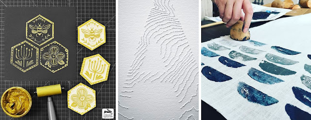
To get an idea of what we wanted for the concept, we searched Pinterest for images relating to screen printing and commercial design. We also looked at other forms of traditional graphic design methods that involve manual practicality, as opposed to digitally focused design.


Other techniques that were considered included ink rolling, pin prick embossing/de-bossing and potato printing.
OUGD603 - Statement of Intent (updated 23/01/19)
During the course of OUGD603, my aim will be to look into the ways
in which design is used commercially, competitively and professionally. Some of
the subjects that are likely to be explored in the projects will include
packing design, commercial use of design, advertising campaigning, printing
methods, marketing of work and selling work.
Some of the contexts that I plan
to explore further include societal values, technology and mental health as I
have previously looked into these subjects during past briefs. In terms of my
research led brief, I will be focusing my investigation on youth culture and the
changes that are becoming more noticeable over time. The research that is
likely to take place will explore human interaction and how we form groups
based on interests in certain activities, hobbies and music taste. More
specifically, the brief will explore the nihilistic culture of modern day youth
and why some believe they are an ‘identityless’ generation.
For some of the other briefs in the module, I will be using
personal interests as a starting point for the investigations. For example, I'm
interested in politics and persuading others to be more politically involved.
Therefore, one of my briefs will aim to propose a solution to the ways we
involve ourselves in politics and encourage younger generations to become more
actively involved in political debate, beyond the confines of social media. I
will also be creating personal work that will benefit my website, clothing
brand and eventually my portfolio by the end of the year.
In terms of how this will
benefit my practice in the end, I plan to be able to learn new skills and build
on the ones I already have. This will include a better understanding of
professional approaches to packaging and the necessary design choices required,
as well as ways to work both independently and in collaboration with others of
different skill sets.
Tuesday 22 January 2019
OUGD603 - RSA: Alone Together brainstorm
Exploring the applications available for mental health struggles revealed a more personal way to connect with people who may need help. Through a range of personalised features in the apps, users would feel that the creators were genuinely offering advice and guidance on ways to deal with their problems. Having these tools available from a user's device made the issue easier to tackle, as it offered support for those that may avoid face-to-face contact when sharing their thoughts. On the subject of loneliness, this approach could prove beneficial for those that may live alone or feel they have no one else to contact. An app such as the ones that were researched, would give users the opportunity to receive the same guidance as every other user, without the stigma or judgement from a personal encounter. Another feature that stood out in these apps was the inclusion of regular notifications, which would appear in the user's device daily so that they can feel reassured and reminded that the app is there at any point to help them.
My first idea would be to explore the designing of a mobile app through wire framing. Planning out a series of links within a multi-choice application would give more options to other audiences besides people struggling with loneliness. In the same way that loneliness can be considered less of an issue to some, it would also be wise to include help for other struggles besides the identified mental health issues. This may include the option to seek help for addiction of some form and the steps to overcome it.
Brainstorm
- could it be promoted using animation?
- cartoon/playful approach
- interactive situations/locations
- scenarios/places that might be familiar to the audience.
- illustrative approach
OUGD603 - Creative Convos event branding
For the event branding of the Creative Convos week, it was decided that in collaboration with another designer the concept would be researched and designed. Before deciding on the concept it was first necessary to look at the posters and promotional material used for the previous year's branding. This way we could get an idea of how the event is celebrated and what to include in the designs.
 As seen in the previous year's posters and social media posts, the concept of Creative Convos followed a simple blend of photography and text. While this does show the creative visitors and the workshop they were presenting, there isn't much in the way of noticeable concept behind the idea.
To this end, we propose that the new idea would follow a certain concept, which could then be applied to the posters and social media as a result.
 Another thing to consider was the design of a new logotype, which could be used in all aspects of the branding. From past examples, we can see that there is similarities in the logotype of the event and the text used elsewhere. Our plan is to make the logo more memorable and reflective of the event, in a way that could add colour or creativity to the event.

One thing to consider when designing the campaign will be its consistency across different platforms/medium. Once the project is put together, it will have more potential to display a recurring theme throughout.
Ideas/Concept themes
contemporary/commercial design
practical elements of design
traditional graphic design process
traditional printing
Aim
Our aim is to make something that will stand out from typical industry approaches. Instead we want to choose a concept that can both represent the graphic design processes and the industry professionals. This way the campaign will focus on the core elements of graphics and the approaches found in today's industry.

To this end, we propose that the new idea would follow a certain concept, which could then be applied to the posters and social media as a result.


One thing to consider when designing the campaign will be its consistency across different platforms/medium. Once the project is put together, it will have more potential to display a recurring theme throughout.
Ideas/Concept themes
contemporary/commercial design
practical elements of design
traditional graphic design process
traditional printing
Aim
Our aim is to make something that will stand out from typical industry approaches. Instead we want to choose a concept that can both represent the graphic design processes and the industry professionals. This way the campaign will focus on the core elements of graphics and the approaches found in today's industry.
Monday 21 January 2019
OUGD603 - RSA: Alone Together Inspiration
After looking at some of the factors behind mental health and loneliness in young people, it would be beneficial to then look at the solutions to these problems and how there may be existing ways to deal with it. This could include looking at the activities designed for people who may be struggling, the community centres available in the UK or interactive platforms that encourage a more positive change for people's lives. From this, I will be able to gather several ideas on how to target the younger audiences, as well as the appropriate methods of communication for the specific group. As a result, I aim to create something that proposes a solution to mental health issues, or more specifically loneliness. Furthermore, this solution could in fact work for more than just the target audience and may appeal to all ages that deal with these problems.
At this point, I have already looked at the design layout and approach to these problems through the use of websites and organisations online. Looking at the interactivity of mobile apps seems to give users more of a feeling of connectivity. By looking at several examples of apps that deal with mental health problems there may be a way to understand how to connect with the intended audience.
Mobile Apps
- Headspace - App that contains several podcasts that allow users to unwind and calm their mind. The simple illustrative nature of the app gives it a more universal approach and therefore open to all audiences. The use of colour in this app also highlights several different types of podcast to listen to, which makes the navigation of the app easier for the viewer. In terms of the layout of Headspace, there is a basic set of choices located at the bottom of the screen, which made the home page and profile both available to switch between easily. This was beneficial for the app, as it made it seem more personal to the user and therefore more connecting. The podcasts themselves were also animated in time with what was being played in the audio. For example, the breathing exercises would be displayed in real time with the interface and would move in and out according to the inhaling and exhaling.

- What's Up? - This app was a more personal approach to mental health support in comparison to other platforms available in the app store. As soon as the app is opened, users are introduced personally by the creator and the reasons behind the creation of the app. Adding these pages in at the start gave the user a more direct reassurance of the apps intention to help them and remember that it is not just them who may be dealing with personal issues. Upon entering the home page, there are several option which allowed the user to choose a topic they wish to explore further. These sections were divided into: help right now, coping strategies, information and personal. The help right now option brought users to a series of other options that would immediately calm the person or recommend call lines for emergencies. The coping strategies were a series of brain distractors, which would help to settle a user's mind and think about more positive thoughts. The information panel would guide users to more in depth knowledge about different conditions and how they can deal with these issues. The final option, personal, would give users a place to record personal achievements and progress. It also offered ways to record personal habits and steps to overcome them in time.


- TalkLife - This app was similar to What's Up?, in that it would provide suggestions and information when loading the app up. Being direct with the audience in this way seems to be a desirable approach for many of the mental health apps, as it gives users a more personal connection to the intention and the purpose of the app. As a result, they may feel safer knowing that there are others who reach out to them using this digital platform and sharing advice on how to cope with issues. The home page layout was similar in nature to Tumblr, in that it displays different chat bubbles from other users and the thoughts they would be sharing about their health, positive ways to cope and advice for others. This allowed for people to connect with others who may be experiencing similar problems and comment on each others posts.


- TalkLife also divided the introduction into several focus points: welcoming the users, sharing content, safety of the user and support. Each of these would be identified by colour and accompanied by photographic background, which made the app look as though they were other users around the world. This was good to reassuring the user that they are not alone.
Monday 14 January 2019
OUGD603 - Youth Culture: Research ideas
As part of my research led investigation I will be looking into youth culture of the 21st century, the values we hold in society and what this will mean for future generations. The first thing that came to mind when deciding on this topic was the way in which culture of today is heavily influenced by the internet, the media and political agendas etc. Unlike past generations, the internet has allowed society and particularly young people to express their identity and values in ways that inherently appear to have been influenced by familiar trends. Today the internet is seen as a vital part of our culture, with vast amounts of information being shared all across the globe on a daily basis. Bombarded with this endless cycle of new trends, musical influences and celebrity culture has shaped how we as a society interpret life and the way we choose to live it.
While discussing different ideas for the research led investigation, one subject stood out to me the most as it could suggest the current state of youth culture and where it is headed. This subject was Nihilism, a term often used to describe those who reject religious and moral values in favour of the belief that life is meaningless. In western culture, it is clear that religion is not as widespread as it once was. Because of this, society has adapted in a way that gives people more freedom to do what they want with their lives, even if that means a more destructive life.
Online research - Nihilism
Philosophers to further research
While discussing different ideas for the research led investigation, one subject stood out to me the most as it could suggest the current state of youth culture and where it is headed. This subject was Nihilism, a term often used to describe those who reject religious and moral values in favour of the belief that life is meaningless. In western culture, it is clear that religion is not as widespread as it once was. Because of this, society has adapted in a way that gives people more freedom to do what they want with their lives, even if that means a more destructive life.
Online research - Nihilism
- Nothing really matters and life should be enjoyed for the time we have.
- Self absorbed/destructive impulse.
- Norm of today.
- Existentialism was the core idea that nihilism extends from.
- Changes in the post-modernism era were a response to modernism.
- Morality/Spiritual/Intellectual nihilism.
THE STRANGEST YOUTH CULTURE IN HISTORY - A Documentary (2018) by Dayz of Noah
- "A post-modern, neo-liberal culture which promotes wreckless capitalism and obsession with cash and personal wealth, yet feeds off a socialist government programme system and sets unrealistic standards for millions of fans and eager followers, via social media."
- Normative Nihilism (softcore) - depression, anxiety, hyper consumerism, promiscuity, material worldview.
- Deep Nihilism (Hardcore response to Normative) - suicidal ideation, self harm, obsessive tattooing, murder/brutal violence, prostitution.
- drug use goes hand in hand with media influence and normalisation.
- Nihilist aestheticism.
- Generation to generation has shown that being different/weird is what makes people stand out from the crowd, yet today everyone is different and the same all together.
- Tumblr and WorldstarHipHop are examples of platforms that promote nihilism.
- Tumblr - mental illness romanticised, suicidal themes normalised through popular culture (music/memes/social media posts), drug use normalised, exploitative and incestuous sexualisation ('daddy themes'), 'sad boys and sad girls'.
- Worldstar - fight videos (primal instinct of violence), materialistic music videos, obsessive wealth themes.
After seeing this analogy video on YouTube about nihilism, I decided to revisit Tumblr and WorldstarHipHop to see what has changed since viewing them years ago in their prime. From what I can personally remember, Tumblr would often be seen as a platform that was heavily pornographic and was popular with bloggers for its anonymity. Worldstar was also a site that was known for its fight videos which were more often found on other platforms such as YouTube and Twitter.
Tumblr

Here is an example of the types of posts found on Tumblr, which would be recognisable to most of the early users of the platform, as it often would aestheticise sexual themes, dark imagery and mental health problems. Although the examples shown are representative of Tumblr's known aesthetic they were very few images like these remaining on the site. This is likely due to new regulations and restrictions imposed in recent years, as the site tries to expand its audience to younger people.

However, deeper exploration of the platform revealed that some forums, blogs relating to violence, mental health practices and other negative posts still remain unchecked. Though they were hard to find and few in numbers, the posts were sometimes graphic depictions of mental health struggles or comments by users. To any younger audience, these posts may have harmful effects if they were to find forums which promote these unhealthy practices. The posts themselves could be found through hashtags and search suggestions such as #ana, #depression, #thinspo and #anxiety.

One thing that seems to have been implemented in recent updates is the introduction of helplines to certain suggestions. When searching for certain words Tumblr will display a helpline page based on that search. For example, when searching the word depression, the helpline that was provided was based on self-harm and crisis situations. When searching for eating disorders and self-harm forums, the results were also displaying different organisations which would deal specifically with those issues. For the most part it seems that Tumblr has considered its audience more thoroughly and implemented changes that can help people struggling with their lives, rather than allow them to post negative outlets on their blogs which could romanticise or encourage others to do the same. In this way, the website has began to change their identity and make users experiences more positive and enjoyable.
 Worldstarhiphop on the other hand remained the same as it has always been, posting fight compilation videos, viral videos and the latest hip hop music videos. In this sense, the website remains a nihilistic platform that promotes violence and wealth.
Tumblr

Here is an example of the types of posts found on Tumblr, which would be recognisable to most of the early users of the platform, as it often would aestheticise sexual themes, dark imagery and mental health problems. Although the examples shown are representative of Tumblr's known aesthetic they were very few images like these remaining on the site. This is likely due to new regulations and restrictions imposed in recent years, as the site tries to expand its audience to younger people.

However, deeper exploration of the platform revealed that some forums, blogs relating to violence, mental health practices and other negative posts still remain unchecked. Though they were hard to find and few in numbers, the posts were sometimes graphic depictions of mental health struggles or comments by users. To any younger audience, these posts may have harmful effects if they were to find forums which promote these unhealthy practices. The posts themselves could be found through hashtags and search suggestions such as #ana, #depression, #thinspo and #anxiety.

One thing that seems to have been implemented in recent updates is the introduction of helplines to certain suggestions. When searching for certain words Tumblr will display a helpline page based on that search. For example, when searching the word depression, the helpline that was provided was based on self-harm and crisis situations. When searching for eating disorders and self-harm forums, the results were also displaying different organisations which would deal specifically with those issues. For the most part it seems that Tumblr has considered its audience more thoroughly and implemented changes that can help people struggling with their lives, rather than allow them to post negative outlets on their blogs which could romanticise or encourage others to do the same. In this way, the website has began to change their identity and make users experiences more positive and enjoyable.

Philosophers to further research
- Schopenhauer
- Hegel
- Kant
- Roussou
- Voltaire
- Niccolò Machiavelli
Thursday 10 January 2019
OUGD603 - 60 Second Documentary Development/Outcome
Text
 Using Pulp Fiction's intro credits for inspiration, the video would use 3 different fonts. Busorama for the first two text frames, Aachen Bold for the title and Benguiat Bold for the sub text.
This would mimic the same style found in Tarantino's movies. Paired with the same music found in the intro, the different text frames will move quickly and in sync.


Finally, the title to the video was added to the beginning and the timing was synchronised. During the last few seconds of the video, the music had been set to fade out as it came to a close. As a result of the finished video, it became clear that the use of video editing was something I had enjoyed and learned from in the process. This gave me the confidence to use this format again for any future projects that may require it, or for projects that I feel could benefit from its use.
finished video - Quentin Tarantino: Cinematic Trademark

This would mimic the same style found in Tarantino's movies. Paired with the same music found in the intro, the different text frames will move quickly and in sync.

Using Adobe Premiere Pro CS6, I began compiling the videos together and narrowing scenes to the iconic shots used in Tarantino's signature style. The first would be a series of clips showing the point of view(POV) trunk shots, the second would be black and white shots, the third would be extreme close ups and the last would be crash zooms. The video was first put together using this format, to which the titles could then be applied to and synchronised with the timing of the music.

Using Illustrator, the titles of each section could be finalised and then imported as separate files to use in the video. These titles would use the Benguiat Bold font in the same way that could be found in the Pulp Fiction intro credits.

Finally, the title to the video was added to the beginning and the timing was synchronised. During the last few seconds of the video, the music had been set to fade out as it came to a close. As a result of the finished video, it became clear that the use of video editing was something I had enjoyed and learned from in the process. This gave me the confidence to use this format again for any future projects that may require it, or for projects that I feel could benefit from its use.
finished video - Quentin Tarantino: Cinematic Trademark
OUGD603 - 60 Second Documentary initial ideas
Colour palette
 By first looking at the colour palettes found in Quentin Tarantino movies I would be able to better understand how the director uses colour in his films and what significance they have on the themes or scenes.
The opening credits found in Pulp Fiction are an iconic example of how Tarantino sets the stage for the thrilling black comedy. Paired with Dick Dale's Misirlou, this title sequence has proved itself to be a memorable classic in cinema history.
The dominant colours found throughout the film are a mix of blues, contrasting reds and yellows.

Similar to Pulp Fiction, Kill Bill Vol 1 and 2 have showcased Tarantino's attention to detail in terms of colour coordination. Some of the films iconic scenes such as the Crazy 88 battle scene show a mix of contrasting yellow and red among a background of brown shades.
Other more stylised scenes focused on utilising a single colour, as well as the absence of colour in several scenes featuring just black and white.
 Inglorious Basterds provided more emphasis on the use of green hues and shades of red, which complement one another when contrasting throughout the film. This provided more audience attention to details of the characters uniforms, props and filming locations.
 Much like the colour palette found in Pulp fiction, The Hateful Eight (2015) focuses the use of colour within the character outfits and how it may be contrasting to colours of the environment.

I started by creating a frame by frame plan of how the documentary might look when put together and what research might be included. The intro credits shown at the start of Pulp Fiction are what inspired the video to take this format. By making the documentary seem as though it is a short movie in itself, viewers could imagine it in the same way Tarantino may present his own works of film. In the same way that the title sequence would roll into frame and subtext would be separated by black frames, the video would also use a similar introduction. The remainder of the video would then quickly analyse several shots from Tarantino movies that showcase his signature style.

The opening credits found in Pulp Fiction are an iconic example of how Tarantino sets the stage for the thrilling black comedy. Paired with Dick Dale's Misirlou, this title sequence has proved itself to be a memorable classic in cinema history.
The dominant colours found throughout the film are a mix of blues, contrasting reds and yellows.

Similar to Pulp Fiction, Kill Bill Vol 1 and 2 have showcased Tarantino's attention to detail in terms of colour coordination. Some of the films iconic scenes such as the Crazy 88 battle scene show a mix of contrasting yellow and red among a background of brown shades.
Other more stylised scenes focused on utilising a single colour, as well as the absence of colour in several scenes featuring just black and white.


I started by creating a frame by frame plan of how the documentary might look when put together and what research might be included. The intro credits shown at the start of Pulp Fiction are what inspired the video to take this format. By making the documentary seem as though it is a short movie in itself, viewers could imagine it in the same way Tarantino may present his own works of film. In the same way that the title sequence would roll into frame and subtext would be separated by black frames, the video would also use a similar introduction. The remainder of the video would then quickly analyse several shots from Tarantino movies that showcase his signature style.
Wednesday 9 January 2019
OUGD603 - 60 second documentary research
The first idea that came to mind was to show different frames of the video as illustrations or animations. This could be frames based on the films of Quentin Tarantino or it could be shown as a montage of clips. Depending on the research that will take place, the initial stage will consider how the trademark skills of the director can be documented in a 60 second video.
Quentin Tarantino
Quentin Tarantino
- Born in Knoxville, Tennessee in 1963
- After the release of Reservoir Dogs in 1992, Tarantino rose to fame as one of the most unique film directors of the 1990s.
- The release of Pulp Fiction in 1994 cemented the director as one of the most influential people in Hollywood. The film won the 1994 Palme d'Or as well as Golden Globes and Academy awards for best original screenplay 1995.
- His unique style of film making pays homage to the 'blaxploitation' and the exploitation movies of the 70s.
- His films often blend black comedy with extended dialogues and stylised scenes of violence. This is also accompanied by soundtracks taken from the 60s, 70s and 80s.
- Films such as Kill Bill took inspiration from Japanese culture, while other films such as The Hateful Eight and Django Unchained took inspiration from Tarantino's love of Spaghetti Westerns of the 50s and 60s.
Cinematography
- Crash Zooms - A camera zoom style used by Quentin in several of his films to emphasise the character in the scene. This also pays homage to the Kung Fu movies of the 1970s, which adds to Tarantino's love for exploitation cinema.
- Extreme Close-ups - A concentrated close-up of a character, prop they are using or interacting with. This choice of cinematography was used by the director because it is forcing the viewer to pay attention to the details of the scene and how this may have impact on the context.
- POV Trunk shots - First found in Reservoir dogs, the trunk shot has become synonymous with Tarantino-esque films. It gives the viewer the point of view of the victim in the case of Reservoir Dogs but also it has been said to be used as it is the only option available.
- Black and White - Tarantino often uses black and white at certain points in his films to engage flashbacks of a characters past (Kill Bill), or it can be used as a way to pass censors (Kill Bill Vol 1).
- Exploitation - Paying homage to the exploitation era of film, many of Tarantino's film projects often hint at this. Collaborating with fellow director Robert Rodriguez, the two had worked together on two feature films, Deathproof and Planet Terror. Both films were heavily influenced by low budget B-movies and include missing film reals, jump cuts and damaged film stock. This gives the films a more authentic representation of Grindhouse cinema and 70s exploitation theatre experiences.
- Cameo/recurring Appearances - Tarantino himself has appeared in the majority of his own films, either as a small character part or as a subtle extra. Tarantino is also known for employing the same actors to appear in his features as different characters, all of which have their own signature characteristics and likability.
- Easter eggs - There are several props that can be found or mentioned throughout Tarantino's film universe, including Red Apple cigarettes and the Hawaiian Big Kahuna Burger.
- Consideration of film - Using 70mm film to capture The Hateful Eight, Tarantino hints at some of the classic films of the 50s and 60s which used wide-lense aspect ratio to capture films in a less convenient but more engaging manner. Being the 11th film in history to use Ultra Panavision 70, The Hateful Eight would use the same techniques as films such as Ben-Hur (1959) and Lawrence of Arabia (1962)
Tuesday 8 January 2019
OUGD603 - 60 second documentary ideas
Establishing an idea for the 60 second short documentary would mean thinking about what is personally important to me. This could be discussions or social issues that I find appealing or it could be based on my hobbies or interests.
ideas
ideas
- video on Palestine and Israel conflict
- youth culture
- football
- interest in film and cinematography
- Documenting a film star/director I like (e.g. Martin Scorsese, Denzel Washington, Quentin Tarantino)
Quentin Tarantino career documentary
- could be shown as a series of illustrations of each film
- Tarantino style video or camera approach
- could imitate an opening title sequence from Tarantino film
- highlight certain attributes or achievements that have impacted cinema
- compile a set of cinematography skills found in Tarantino movies
Quentin Tarantino cinematography trademark
- POV car trunk shot
- Use of black and white
- Narration
- Dance scenes
- Spaghetti western influence and kung fu inspiration
- Title sequences taken from originals (sense of nostalgia)
- Crash zooms, extreme close-ups and wide angle shots. (inspired by the likes of The Good, The Bad and The Ugly)
- Choice of music from 50s/60s/70s
Thursday 3 January 2019

Subscribe to:
Posts (Atom)