Wednesday 25 January 2017

Design Process - Design Development

from the initial ideas stage of the project, peer critique sessions allowed for refinements to be made in terms of approach to the object. As the chosen idea was to create a booklet based on the style of graphic novels such as Sin City, it meant annalysing A Clockwork Orange and deciding how the film adaptation could be altered to look like this.

Therefore, I started by looking at the style and layout that is used by Frank Miller in his work to find inspiration for the project. Analysing the imagery used in his work shows that much of the content is heavily based around black and white illustrations, which correspond with the background colours. In this way the imagery is simple, but unique as it does not involve using more than a handfull of flat colours.

In the same way, the aim of the outcome for the project was to create images from A Clockwork Orange that minimalised the use of many colours and instead highlighted certain aspects of the scenes. For example, where there was a scene involving a woman in a red outfit, it seemed necessary to experiment with this technique by creating the surrounding environment in shades of black and white, while the red outfit would stay the same. In this way it gave each of the images a way of focusing the attention of the audience to a certain aspect of the scene.
As the colour was mainly used to highlight the main subjects of each scene, it began to work well in a sequence. 

In terms of the layout for the designs, it was necessary to use the same reocurring boxes for each scene as it created a flowing pattern that can be found in a similar way in comic books. To add to this, the text boxes of each scene also reflected on the dialogue from the film and they too would follow the same layout with shadowed outlines, making the boxes three dimentional. 

For the fonts used throughout the booklet, it was necessary to look first at the typography used throughout the film. After looking for several font that were used throughout the film, I found there were two stand out fonts that would be recognisable and relatable with the themes of the film. These fonts were Synthemesc, which was used in the Korova Milkbar scenes and the Timepiece font, which was used for the title of the film. For the dialogue text, I looked for a comic book style font as many of Frank Miller’s graphic novels tend to feature these throughout. 


After looking through many different comic book fonts, Cotidiana seemed like the most appropriate for the booklet, as it was a satirical, sans serif typeface. This was chosen because the themes of the booklet were dark, yet satirical in nature and therefore went well with this typeface. 


Tuesday 24 January 2017

Design Process - Object Initial Design Idea

For the initial ideas phase of the project, 3 different approaches were taken towards the object. These ideas were to explore the use of typography in A Clockwork Orange, to create a series of museum advertisement banners, flyers and posters that would promote an exhibition on A Clockwork Orange, or to create a graphic novel. 

The purpose behind the first idea was to look further into the use of typography featured in a scene involving a casette tape. This included the musical notes to a song that the casette plays during the scene and the typography that can be seen on the casette itself. One way that this approach could have been developed would be through the use of Synesthesia experimenting. This involved mark making on different surfaces while listening to music, and relating the sounds to the colours that you imagine. In the same way, listening to the songs from A Clockwork Orange could be interpreted as words, as much of the music in the film is classical music, meaning their are no lyrics and therefore they are open to interpretation. 

Although this idea did not become the developed one, I still experimented with the technique of synesthesia earlier in the project when listening to the songs on the casette tape that was used for the photographs. From this, it was easier to get an understanding of how the technique works and what colours can be interpreted with different music notes.

The second initial idea was to create a series of posters and flyers that would focus on promotion for an exhibition at the Tate Modern museum. The plan was to focus the advertising on certain elements of A Clockwork Orange, including the iconic outfits worn in the film, the soundtrack used in it and the book of the same name. This would have meant an exploration into the layout and styles used by Tate Modern in order to find inspiration in the designs. However, due to peer critique this idea also did not receive much recognition, as the background information and possibilities seemed to short to extend as a project. 


The final initial idea, was to create a series of pages for a graphic novel style booklet. This included looking into the style of graphic novels and how A Clockwork Orange could be interpreted as a story in this style. Using digital editting, the plan was to take screen captures of scenes from the film and alter them so that they looked more like the style used by comic book artists, such as Frank Miller. In terms of depth in this idea, their were many possibilities to explore, including the layout of a graphic novel and what sort of fonts are used. The question being asked would be how this film adaptation could be applied to the comic book style and what typeface would be appropriate along with it. This idea also recieved the most positive feedback out of all three as it had more depth and approaches that could be explored.


Design Process - Object Research

‘In a way, ‘Sin City’s designed to be paced somewhere between an American comic book and Japanese manga. Working in black and white, I realized that the eye is less patient, and you have to make your point, and sometimes repeat it. Slowing things down is harder in black and white, because there isn’t as much for the eye to enjoy.’ - Frank Miller

Before finding a context in which to initiate the object project, several experiments helped to gain an understanding of the object itself and what it can be applied to in design. This included exploring the casette tape in its physical form as well as typographically. One way that this was done was through creating several different interpretations of what the object means and what properties it represents. 

Research into the history of the casette tape showed that the object was most popular in use during the 70s, 80s and 90s after it became a popular alternative to the 12-inch vinyl that was currently in use at the time of its release.

The next experimentation involved capturing photographs of the object from different angles and under different lighting. After this the images of the casette tape where then editted using Microsoft Word, in order to create images made out of text. This way it would give a new perspective on how the object may be perceived typographically.

As a result of this, I began experimenting with ways that typography could be accociated with the object. This included looking at hand written text that was used for labelling personal casette tapes and how this might be adapted to use as a typeface of its own.

As the object that was being explored had a broad potential to have many different approaches, it meant looking at different areas of culture that ivolved the object. For example, finding the inspiration meant looking at areas that featured casette tapes. One source in particular, showed how casette tapes were featured throughout popular culture. From this, reasearch began by looking at popular movie scenes that involve a casette tape.

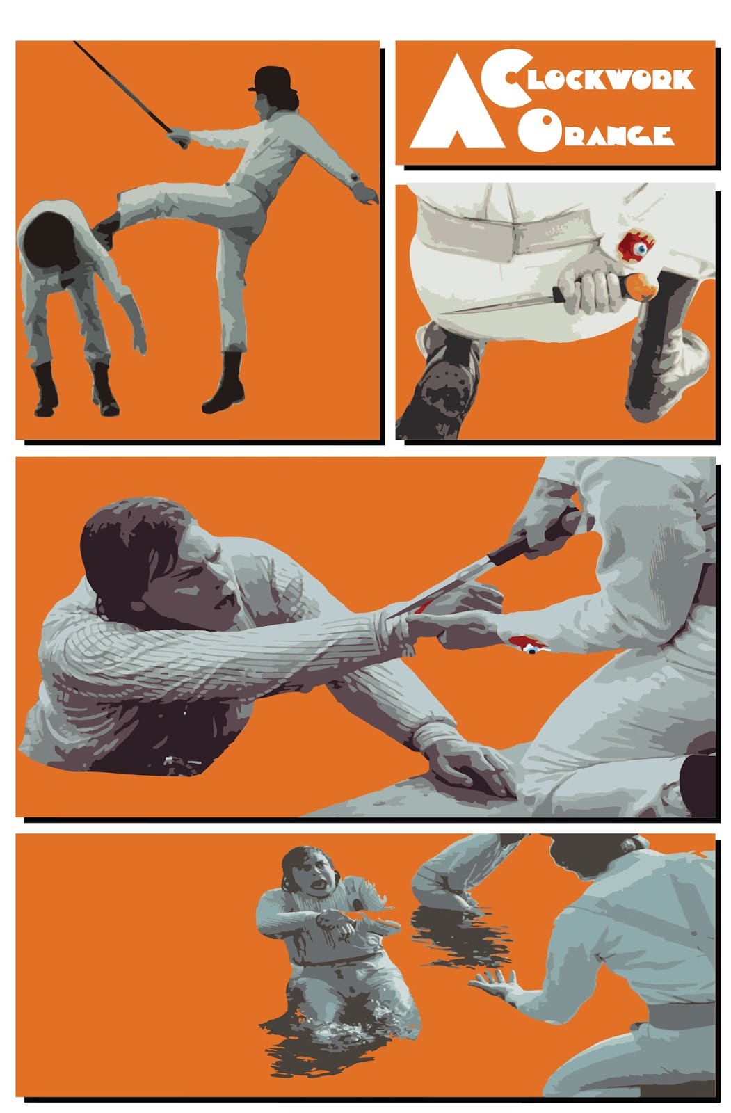
One scene that interested me in particular was a scene from Stanley Kubrick’s A Clockwork Orange. This was because the scene evolved around the classical music that was featured from the casette tape. After wtching the scene, I began researching the music that was used throughout the film. The majority of the songs used were similar to that of the casette scene and generally, were used during scenes of chaos and violence as a way of creating a satirical but disturbing atmosphere.

This is what sparked the idea to create designs based on the scenes that featured classical music and acts of violence. What needed to be considered was how the designs would be applied to a context. Therefore, I started to look at different design areas that would be appropriate for this, including museum posters, exploration of typeface and graphic novel styles.

The idea for a museum poster involved creating a series of promotional posters that would advertise an exhibition about the movie including the costumes and music featured. In this way the idea would have been to explore these areas from a design point of view. 

The next idea being the an exploration of the typeface in the movie, would have focused on creating a series of posters that promote the lettering and style of text related to the movie. To do this the plan would be to interpret the typefaces used and create another typeface that follows on the inspiration of the film. However, I felt that this idea was lacking in broadness and therefore was disgarded.

The last idea being about the exploration of graphic novel styles involved creating a series of pages, that would follow the layout of a graphic novel and recreate the scenes from the movie in a similar design manner. This idea in particular was mostly favoured by peers during the first critique session, as they believed it had the most potential to explore different areas of design. From the feedback, I began looking at designs that appealed to me and ways that the inspiration from these designs could be transfered to make my own graphic novel.

Beginning research into sources included looking at the layout of a graphic novel and the best examples of varied artistic styles to find inspiration to use. After consucting research into several comic book writters and illustrators, one designer stood out as the most appropriate to use for the project. This was the work of Frank Miller, who’s graphic novels are easily recognisable among other comic books styles. One thing that made his style appropriate to the project, was his minimalistic use of colour and frequent use of flat colouring. 

In particular, the graphic novel series Sin City was a stand out style for its use of black and white illustrations and limited primary colour palette. This is what initially sparked the idea to create A Clockwork Orange in a similar way using limited colours and flat images. When comparing the Sin City comics to the outcome of this project, we can see that the layout has been adapted so that there is more suitable colours included. This is most recognisable with the background colours as they are reflective of the context of A Clockwork Orange, whereas Sin City maintains a neutral black and white background throughout. 

Another noticeable difference in the project would be how the imagery used is taken directly from screen captures of the movie and then adapted to fit a comic book style, whereas Frank Miller’s work is his own interpretations of scenery and characters etc.


As a result of the research my final outcome reflects how the style of Frank Miller and the layout used in Sin City comics has influenced the booklet that was created. Although the layout was altered during the final stages of the project, ultimately the style and process of making these images was continuous throughout.


Monday 23 January 2017

Design Process - Final Design Evaluation

The overall result of this project has been the knowledge gained about how to create your own wayfinding system, which allows an audience to interact or respond to in some way. 

It has also helped to give insight into objectivity, subjectivity and where to apply the two in a design context. From the debate between Van Toorn and Wim Crouwel, it has provided an insight into each oppositions point of view on whether design should be subjective or objective. Personally, I think the two can be applied in design depending on the position of the designer and the context it is being applied to. 

Through the use of group critique sessions, it has been possible to inform some of the design decisions that were made in order for the wayfinding system to work. It has also been useful in the way that it provided the opportunity to see the approaches others were taking in order to promote their wayfinding systems to an intended audience. Furthermore, the group critique sessions allowed for feedback from the viewpoint of an audience, which meant each alteration that had been made to the wayfiding system could be challenged in its capability to interact with people.


As for the outcome of this project, it is clear that there were several limitations that ultimately could have been avoided earlier in the process. This included the location of the venue, which had changed by the end of the project as it was deemed more appropriate for the context of the project. Furthermore, I believe that from this, extensive research was needed in order to fully understand what decisions are appropriate and which are not.


Sunday 22 January 2017

Design Process - Final Design On Site

As the designs have been mocked up onto the buildings that have been chosen for the wayfinding system, it was clear that from my peer’s point of view the system works well in communicating the intentions and utilises the chosen space appropriately. Therefore, the wayfinding system for my project has been successful in communicating my intentions and furthermore, has helped to gather an understanding of how to create a reaction and interaction with the audience.

Although there were several complications with the location in which to place the wayfinding system, there were also ways that the problems could be resolved. In this case the problem being that the venue of the event was criticised by peers as being too obvious, and the solution was to find a new venue that continued the trial from the original place.


If the wayfinding system had in fact been created with the intention of hosting the event at the old Lyric Cinema, then some of the designs would have changed with it so that subtle hints could be included, similar to how it has already been done. Another approach could have potentially seen the designs produced in a different way to how it was imagined. For example, were as this wayfinding system would include vinyl posters at A1 size, a different venue may require the posters to be larger than this.


Saturday 21 January 2017

Design Process - Final Design Site Map

To complete the wayfinding system, a map of the treasure hunt had to be created. However, during the final critique stage of the project, it was suggested that the Corn Exchange was in itself too obvious a venue to host the event. Therefore, as a result of this, I had to look at an alternative venue that could have possibly been a more appropriate place to have the event.

The plan now was to look for a warehouse or derelict building in which to have the event, similar to how 90s raves would be. From looking at research into derelict buildings around Leeds, several places showed promising results. After discusing with peers which would be the best venue, it was decided that an old derelict cinema called the Lyric Cinema on Tong Road was the most appropriate. 


This was due to the fact that it was the closest to the sites of the posters and it followed the same trial to the Corn Exchnage, only in reverse. Therefore, if the project had been done differently then this venue would have been the end point of the treasure hunt. 


Friday 20 January 2017

Design Process - Wayfinding final design production

For the production of the final outcome posters, there were several factors to take into account when setting up the wayfinding system. This includes, how the posters will be displayed outside and what material were durable enough to withstand the weather. Also the scale of the posters needed to be examined in the spaces that they were made for, and whether or not they were appropriate for that particular area.

As these posters were to be made viewable from close proximity, it meant that the location for the posters would need to be at ground level. This is also important as the audience needs to be able to closely examine these posters to discover the hidden clues. As a result of this, appropriate areas of Leeds were chosen so that these posters were legible from 10-20 feet away. 

In terms of the material for the posters, vinyl seemed like the best solution as it is a durable material that is used frequently for public advertising outside. For the vinyl posters to be legible from a certain distance the most appropriate size would be A1. This way, if the audience is looking for the posters they won’t miss it when following the wayfinding system. The problem with using vinyl is the cost of the material printed in that size, as it is £19 per A1 poster. Therefore the outcome of the wayfinding system would cost £76.

One thing that became a noticeable problem for the audience was the fact that the posters would not be able to come down from the wall, meaning if the audience saw the poster they would need to photograph it to connect it with another photograph of the next poster. This issue could have been resolved earlier in the project by having a pictogram showing a photograph or capture symbol somewhere on the poster as a means to encourage the audience to interact with the poster. Another way that this could have been approached would be to add a QR code on the poster that directs the audience to a webpage, showing the poster added to a segment of the puzzle.


These methods of production could be seen as objective in the way that they focus primarily on informing the audience of the information through the use of typical advertising materials such as vinyl posters.


Wednesday 18 January 2017

Design Process - Wayfinding System Development

As previously discussed in the interim critique session, the plan was to create a series of posters that would combine to for an image, giving the audience the clue to where the venue is. To start this off, lokking at the photographs that had been taken for the project needed to be reviewed so that a design decision could be made.

As the idea was originally to send the audience on a treasure hunt for each poster, it meant looking into more than one location and finishing with the Corn Exchange as the outcome of the journey. To start this off, it meant looking for certain areas in Leeds that could be potentially used for the poster locations. Another thing that had to be assessed was how the audience would get from one poster to the next in a wayfinding system. 

The solution to this was to include a set of coordinates on each of the designs, meaning the audience would find the first poster and figure out the location of the next using the coordinates given. Once all the posters were found, the sudience can then start to piece together the puzzle and find out all the event’s information.

To improve the previous designs for the posters, I adapted a new colour scheme that would take inspiration from Carson’s work, with bright and contrasting elements. The designs also focus on the use of 90s typefaces to reflect the aesthetic of the culture. Some of the typefaces that proved most effective in the designs included Remagg CZ, for its grungey and messy look, Neutronium, which reflects the futuristic 90s look and finally the Rave font which boasts bold letters and blocky text of a 90s aesthetic. When combining these together, it made the context in which they were placed look more appropriate.


Friday 13 January 2017

Design Process - Wayfinding System Initial Ideas

To start of the designs for the posters I first began trying out different ways that photographs could be incorporated into the posters. One way that this could be done was through the use of pictograms and quick sketches of the Corn Exchange and other sites in Leeds. Through this, it made the imagery less obvious of the location intended for the posters. However, I felt that by including the designs, it may go against the aesthetic that was intended.

These pictograms were representations of the clock above the Corn Exchange. The more developed designs include the time of the event shown by the dials on the clock, as a hidden message for the audience.


Taking inspiration from my chosen artists I also began production on the initial ideas that would form the basis of each poster design. This meant analysing the style and colour schemes used by these artists, to gather an understanding of their practice.


The other initial idea that came about was to combine elements of the two artist inspirations and add the pictograms over the top to see what the posters would look like. However, when this idea was presented to the group, it wasn’t as favourable an idea as the other designs that had been created. 


Saturday 7 January 2017

Design Process - Wayfinding System Photographs


From the research gathered about the Corn Exchange, I began taking my own photographs of the building, inside and out. This way, certain aspects of the photos could act as clues during the development stages, as the idea was to create a series of posters that lead the audience to the location of the venue in a treasure hunt style. The next step would be to create the posters that can be displayed in areas of leeds and use inspiration from the artists and DJ's associated with the 90s aesthetic. Through this subjectivity, the poster designs will begin to attract a certain type of audience who may be familiar with the aesthetic and the 90s music. Hopefully, if the aesthetic works well in the designs it can target the intended audience. This audience is likely to be people in their early 20's or people who experienced original 90s events such as this.