Once the name for the app had been created, I then applied the logotype to the first screen of the app. This means it would be positioned centre on the loading screen when tapping on the app icon. The following page shows the three different options for users to choose based on their intention with the app. From these links, the app is then divided into Player, Coach and Scout navigation. To keep the layout simple and the information clear, I decided it would be necessary to identify each of the sections using soft blue, green and red shades. The graphite coloured outer layer would allow these primary colours to contrast and mix with the white backdrop.
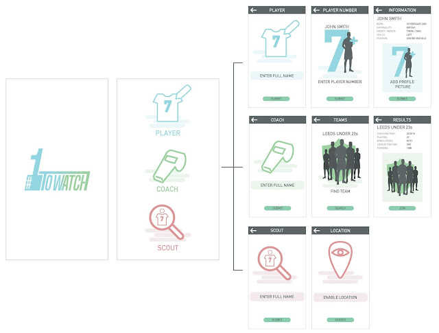
After initially deciding on a layout that could be consistent throughout the app's identity, I finalised the structure for the 'Player' section of the app. In the top right hand corner of the wire-framing is the icons used throughout this section, while the lines in between each screen represent the functionality of the icons and the pages that users are taken to when tapping on certain areas.

No comments:
Post a Comment