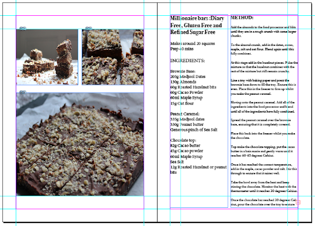
After seeing several layout examples used in baking books and cook books it was possible to try out different layouts, to see which would be most effective for the intended audience. As many of the cook books showed the recipes to be made as a list, it seemed appropriate that the use of centred text would be an appropriate way to allow the viewer to quickly scan the recipes.
The first layout involved centring all the text in the recipe together. This was then positioned to the right of the spread, beneath the chapter marker. This way the viewer's eye would continue from the chapter indicator to the paragraph.
The next layout idea involved a similar structure, only it would be in reverse, making the text situated to the left of the spread. This would in turn allow the viewer to read from the left using the 'align left' option for the text.
This layout was created so that the left page would show several variations of the recipe photos. It would also separate the ingredients of the recipe from the method of making it. By placing the text in two separate paragraphs it would be easier for the reader to scan the recipe and the required ingredients.
This layout was created to test whether or not having all the text in a centred paragraph would also be easier to scan through. The problem here was that several recipes were lengthy in their methods, which would then mean the text above it would need repositioning.
This layout proved more useful as it situated the text to the left of the spread, in two different columns and the photographs to the right of the spread. By putting the text to the left the reader will see the text first and read it from left to right, in an orderly fashion. By having the title, serving suggestion and ingredients listed using centred text, it made it possible for the viewer to scan through the information quicker. This also made the first column show importance over the second column. In terms of the right page of the spread, situating a large image in the centre top and a smaller image below proved convenient in this layout. This was because it allowed the page enough space to place in a footnote, informing the reader of a quick fact regarding the recipe.
After receiving feedback on all of the different layout options, the most preferred was the final layout. However there were also some suggestions made, on ways to improve the layout further. The section indicator used on each page, situated in the top right corner, uses one of the colours found in the photographs. The columns were also separated further apart so that the legibility would improve. The text found in the second column also changed, as the alignment was moved to 'align left' from 'justify with last line aligned left'. This would prevent the words from opening up the kerning wider, therefore making the text more readable.
Cover page considerations
After receiving feedback from peers in the critique session, it was clear that the cover would need to look simple. To do this, a full bleed photograph of one of the recipes would be the best option as it is found in the majority of books similar to this. Another suggestion was to see whether sans serif font would work well on the cover, to communicate a modern feel.


No comments:
Post a Comment