
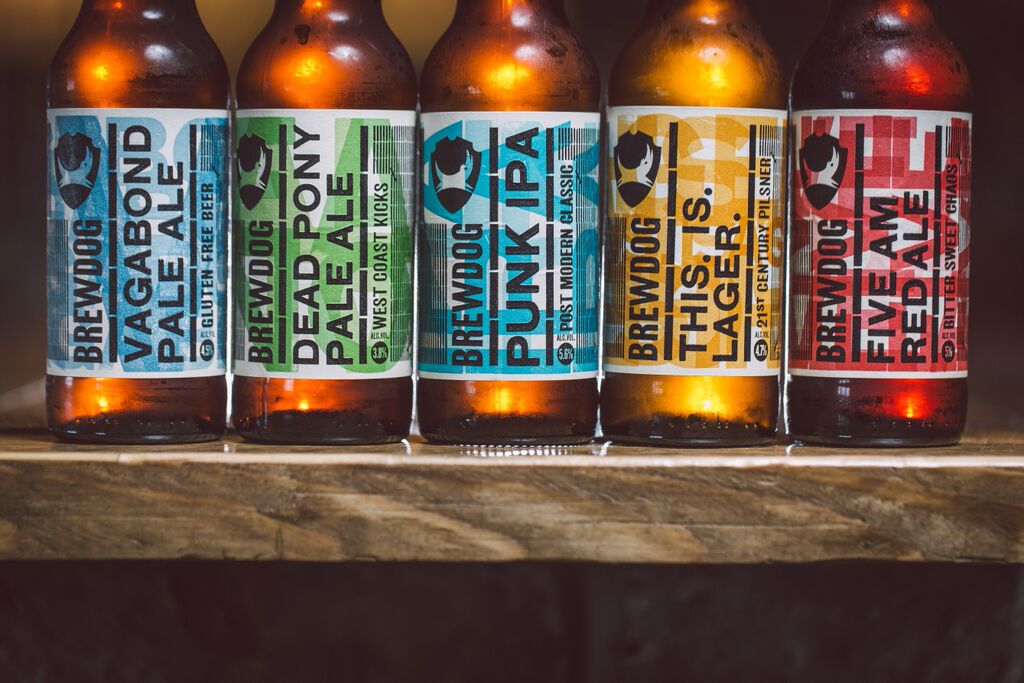
As shown here, we can see that some brands decide to design labels that stick to a certain layout and style that is used on different variations of bottles. Brewdog craft ales have used a simplistic choice of colours for their labels to differentiate the flavours. By consistently using the same typeface and imagery it is possible for the audience to identify the brand from others.

In a similar way to Brewdog, Rush River Brewing co has used the colours to differentiate the different types of beers and ales. Another way the the brand has identified the bottles is by using different logos in the top centre of the labels with separate background patterns. These types of designs show has there can be a middle ground between detailed and simplistic labelling for a brand.

Pembroke Craft Brewery has used very simplistic design to market their products, as shown above. By limiting the designs to just 4 colours on white labels, it is easy to distinguish the brand for its uniqueness. Another noticeable quality of the designs is that a simple crossed line separates the information from the brand's identity, as well as labelling each type with a number. By adding a number it can be easier for the audience to reference it in future.

Geometric Brewing Co. decided that having a design devoid of many colours would be the best option for marketing their beers and ales. As shown above, we can see that the label takes advantage of the colour of the bottle and its contents by using a contrasting white label. Another way that companies could utilise their packaging would be by creating labels that have transparency in certain areas, so that the colour of the bottle or its contents can work as a colour for the label.

As shown here, the Wottonbrew Co. has used unique illustrations and typography to distinguish their brand. By using a simplistic illustrative approach it can be easier for the brand to stand out in the market due to the 'eye-catchability' of their products.

Ballast Point Brewing Company decided to take a more detailed, illustrative approach to their designs. By including imagery of different fish in high quality it is possible for the brand to establish their aesthetic, as well as making their intentions known to the viewer. The designs themselves show that it is likely they are marketed to people who may take an interest in fishing or marine life. It is also clear that the brand wanted to show their name clearly to the audience as they decided to use a bold font that attracts the eye to the top of the label.

Here we can see the different approach to the design element taken by Rogue, as they have decided to use a different packaging material to other brands. By choosing this it is clear that they want their product to be a stand out bottle among its competitors. Although choosing this option can be costly for the brand it is also beneficial in the long term as it is likely to either attract the audience or entice them to purchase it in future.

The Cisco Brewers Nantucket decided that their brand would consist of several different designs that define each beer or ale type on offer. The difference here, is that they have used the same layout but the name of the beer/ale type is more pronounced on the bottle, in comparison to the name of the brand. It also uses simple illustrations that show the uniqueness of each design, relating to the seaside. It is likely that this brand is also aimed at audiences who have an interest in the seaside or sea life.
No comments:
Post a Comment