Image gathering
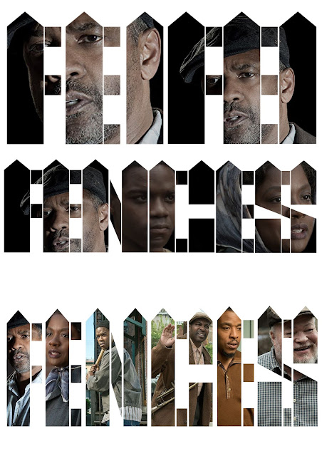
In order to create the poster in a variety of ways, it was first necessary to gather imagery from the film that could be used for the poster. For this, I focused on the characters found in the film, including Troy (Denzel Washington), Rose (Viola Davis), Cory (Jovan Adepo), Jim (Stephen Henderson), Gabriel (Mykelti Williamson) and Lyons (Russel Hornsby). As the film features only 6 main characters, this could be applied to the design in some way. One idea that I have in mind would be to show each character behind each letter of the title, as there are six letters used in Fences. However, the idea could also be simplified to the focus mainly on the 3 main characters Troy, Rose and Cory.

To start off the development, I first tried to show the image layer within the typography layer using a single image. From this I found that the letters were often too thin to cover the background space, exposing the image. As a result, It was necessary to alter the weight of the type in order to cover the negative space.
Next, I tried adding different images to each letter and at different colour levels. Making the images black and white seemed to give a more gritty feel to the designs, however this was not the intention I had in mind. Therefore, I decided to use images that were dramatic and serious so that the poster could reflect the dramatic themes of the film. By changing the black and white to a slightly darker contrasted colour the images would give a sense of dark undertones to the poster.
One of the previous ideas that involved adding each character to each letter was also experimented with. However, this seemed to overcrowd the visual approach and in favour of this idea it was better to only apply three main characters in the background imagery.
Finalising
Before moving onto the final stages of the design process, the typography was slightly altered until I was happy with the spacing and positioning of each image. Adding a black background to these images would also give each letter form more emphasis and contrast against a white background.


No comments:
Post a Comment