Existing Cover
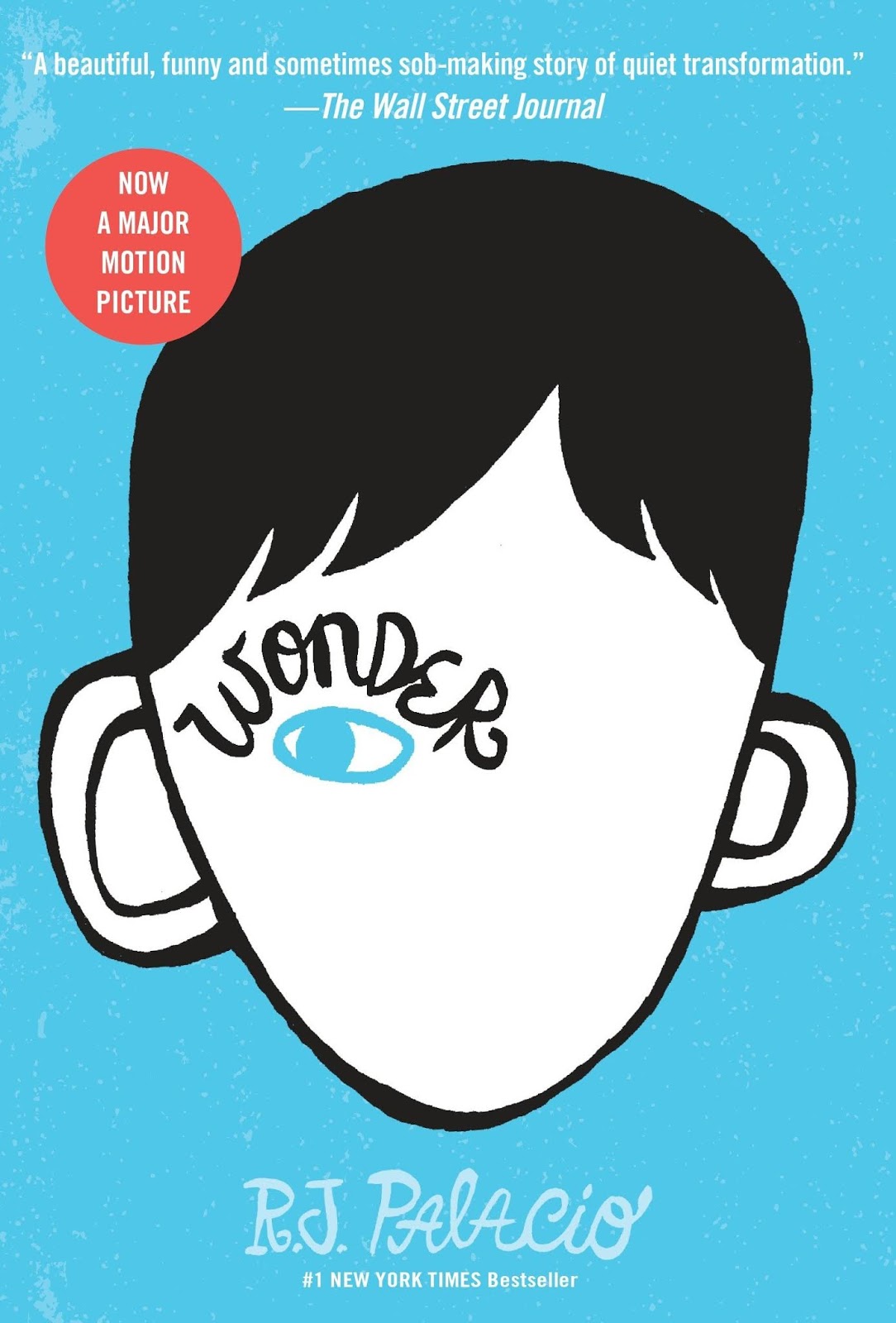

The iconic book cover by Tad Carpenter is both minimal and striking in its approach. This is ideal for the book's audience (ages 8 through 12) as it aims to be easily identifiable and legible to young readers.
The quote on the back has become iconic to the publication, making it a stand out children's book.
The design used for this cover is also easily understood as a boy with an abnormal set of facial features. The eye is made to look to the left as this shows the character looking on at other children and thinking about what they think of him.
- Natalie Merchant - Wonder is a song the book's title was based on.
- Could create the cover based on the type in a disfigured way, paying homage to the iconic original.
Penguin Covers Research
- So that I could get an idea of what Penguin covers generally look like, I researched several competitors and different artist's interpretations of well known books.

It was found that many of these cover designs were made attractive by their creative and artistic interpretations, including a strong illustrative approach. The common factor in these designs, were the consistent use of patterns and colours for book series and thematic influence of the book's story, character or key event.

This also made several covers more attractive to wider audience. For example, the Harry Potter book series had been interpreted by an artist in a way that gave the series a consistent identity, which as a result made the cover more mature and likely to be appealing to older audiences. This style of design worked best for franchises, as it gave each cover individual colours, but also reminds the audience of the key scenes in which to remember the book by.
No comments:
Post a Comment