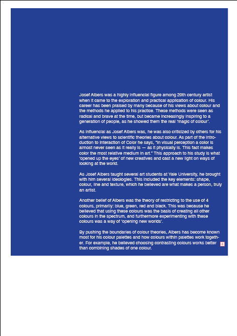
After receiving feedback from peers during the critique session, it was possible to gather ways to improve the colour booklet in a way that would make it more effective visually and contextually. As the previous example of the booklet had not shown structure in terms of layout, this meant that a layout system would need to be used in order to keep the booklet uniform and organised. For the outcome of the booklet, the use of the rule of thirds was put in place as a way to align text in certain areas, as well as structuring certain areas that would show more significance over others.
As suggested by peers during critique, the layout for the booklet would need to include a uniform colour scheme. Therefore, I decided to use International Klein Blue, paired with white font throughout. By doing so, it would show the viewer not only the information on Klein Blue but how it can be applied to a graphic design context such as this.
Through the use of the rule of thirds for the layout of the booklet, it was possible to create a pattern between pages, which would separate text using the background colours. This would demonstrate one way in which design principles can be applied to a brief, such as this. This structure within the booklet allowed the text to stand out more than it had done in the development stages, and furthermore improve the visual aesthetic of the booklet.
As a result of the outcome, many peers gave positive feedback on the success of the final design. This was due to the uniform nature of the booklet and the way in which it conveys and demonstrates several ideas about design principles.


No comments:
Post a Comment