Wednesday, 30 November 2016

Design Principles - Studio Brief 2 - Romek Marber / The Marber Grid


Romek Marber Timeline
Romek Marber is a Polish designer, most notable for designing a grid system for Penguin books. Having seen several of his cover art pieces, the task will be to produce 3 cover slips that will use the same grid system, devised by Marber. For part of this book cover slip, designing a timeline of Romek Marbers important stages in his life will be required, therefore I have picked out some of the key moments to include in the designs.

  • Marber is born in 1925 in Poland
  • 1939 - he is deported to Bochnia ghetto
  • 1942 - he is saved from being sent to the Belzec death camp by the commander of the forced-labour workshop in the town.
  • 1946 - he arrives in the UK and is reunited with his brother and father.
  • early 1950s, he attends St Martins.
  • 1953 - he attends the Royal College of Art.
  • While at RCA he joins a range of talented designers, including: David Gentlemen, John Sewell, Dennis Bailey and Ramond Hawkey.
  • 1950s - he starts working on  number of projects, including cover art for The Economist.
  • 1961 - Germano Facetti commissions Marber to design covers for 'Our Language' and 'Language in the Modern World' by Simeon Potter.
  • 1961 - Facetti asks Marber for a proposal of a new cover approach for the Penguin Crime series. Romek Marber then creates the Marber Grid system.
  • Throughout 1960s and 70s this arrangement is used primarily by Penguin books 
  • 1965 - Marber's final crime novel cover for The Scarlett Letters by Ellery Queen.
  • 1968/1969 - His last commissions for Angus Wilson novels were spoilt by insensitive lines of type applied by the publisher.

Tuesday, 29 November 2016

Studio Brief 1 - Evaluation

As a result of studio brief 1, it was possible to learn new skills that would assist in the interpretation of a brief as well as the design process. After researching several designers and their theories of colour, a booklet could be made in response, as a way to interpret the ideas and present them in a way that was reflective of the theories. For example, as there was research into Yves Klein and the colour International Klein Blue, the booklet would respond to the theories of the colour by using it throughout the pages. This would then prove to the viewer the way in which the colour can be used in a graphic design context.

Studio brief 1 also provided the opportunity to receive and respond to feedback from peers at several stages in the process. As a result, the designs were then further improved and more fitting to the context in which they were placed. Peer critique also provided the opportunity to view other peoples approach to the brief, which allow new ideas to come about. These ideas could then be experimented with and used for later projects, similar to this.

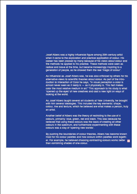
As the brief was about colour, this provided knowledge into the ways in which colour is interpreted depending on it's setting. For example, as Josef Albers explains, choosing contrasting colours works better than combining shades of one colour. This was then evidenced during the process of the colour swatch, as it allowed certain colours to be identified from an area within an image. It was also used during the final stages of the booklet, when the background colour was changed throughout, so that the white text would contrast the surrounding.

As a result of studio brief 1, further knowledge has been gained into the ways in which colour can be applied to design, and the techniques that allow us to identify certain colours as having shared meanings. These meanings are also universally recognised, making it possible to communicate to an audience the intentions of the colours used in the designs.

Design Principles - Studio Brief 1 - Rationale

Colour Booklet Rationale
As a result of the research into several creatives and their theories, a booklet on the use of colour in graphic design could be made. The booklet reflects on several opinions and theories, as well as appropriation of colour based on a context. Included in the contents, are the ideas from Josef Albers, Yves Klein and Pantone. The theme of the booklet was the expression of colour and ways that it can be used and interpreted by the viewer. Therefore, by demonstrating the use of the colour International Klein Blue, the booklet was able to communicate to the audience how this colour can be applied to a context, such as this.  In terms of structure, the booklet layout also follows the rule of thirds on each page, in order to show consistency and uniformity from one page to the next.

Sunday, 27 November 2016

Design Process - Task 2 development

After creating several different interpretations of letter forms in obscure ways, the next step was to further enhance these designs digitally. By doing this, it was possible to see how something subjective could be interpreted and turned into an objective sign. To process the results of the designs other methods also included the use of Photo Booth to create distortion, photocopying and cutting up pieces and experimenting with the overlaying of colours. Therefore, the result of this was a wide variety of designs to choose from, that could potentially communicate the word 'ecstasy'.

Here is the experimental stage in which coloured plastic folder was cut up and over-layed to create a distortion of the background lines. By using circles it was possible to select certain areas of the page to use for later developed designs.


Saturday, 26 November 2016

Design Process - Study task 2 (initial ideas)

To start off the task of creating objective symbols of subjective things, the use of experimentation with shapes and letters helped to form a basis of the designs. The first way that this was done was by distorting letterforms and splitting them up to see what results would come about. As the chosen word for the task was ecstasy, choosing letterforms with certain shapes that represent ecstasy seemed appropriate. Therefore, for this particular word, many of the shapes included in the designs evolved around triangular shapes and serrated shapes that communicate quick, energetic movements within them. As a result of the experimentation stage, it became easier to determine the direction in which to take when creating developments in Illustrator.


Friday, 25 November 2016

Design Process - way finding video


to start of the project we went out to Leeds city centre to capture images of the sign systems used around the area and study how they might create a diversion or an interaction for the public.

As you can see all the images show a direction in which to guide people, or they provide people with information about a required interaction when in that certain space.


As the group activity was to create of video of our way finding system, we narrowed our ideas down to two ways of diverting and attracting public reaction. The first idea was to create a diversion between two pillars on the Leeds University Campus, which we found to have a frequent flow of people passing through. The idea behind this was to see if the public would take a different route on the campus or if they would attempt to cross through the tape.

When arriving at the spot that we had in mind we found that in fact the most frequently passed through space was between the plant box and the pillar shown on the left. Therefore we decided to set the tape up there to test our theory.


our predictions for this theory would be that people will instead take the route between the two concrete pillars or they will go to the left side of the plant box.


One issue we found that could have been done better, was the face that the tape used in the experiment was quite thin and loose. Therefore, had we used a thicker tape, we may have collected better results.


As a result of the experiment we found that our predictions were correct and people did in fact take a different route to avoid the tape.
However there were also several people who felt that they should take a different route due to the direction in which our camera was pointing. Therefore, a better way that this activity could have been done would be to place the camera somewhere out of sight from the public to gain more accurate results.


For the next part of our video, we decided that we would try to engage the public into high-fives. To do this we attached arrows made of green tape to Daniel's jacket to point people in the direction of his hand. By using green tape we were making the high-five seem more welcoming than if we had used red for example. However we could have also tried other colours of tape to see whether the interactions would decrease or change in any way.


As predicted, several people did in fact engage in the interaction, which I believe is due to the fact we chose a location that would be populated by many passers-by, in the shopping district of Leeds city centre. Overall, I think that our experiments were a success in involving the public into way finding systems, but there were also other possible alternative methods we could have experimented with to see whether there would be different results.


Group final video - https://www.youtube.com/watch?v=vlN6rlf8-ps&feature=youtu.be

Design Principles - Studio Brief 1 - Outcome

After receiving feedback from peers during the critique session, it was possible to gather ways to improve the colour booklet in a way that would make it more effective visually and contextually. As the previous example of the booklet had not shown structure in terms of layout, this meant that a layout system would need to be used in order to keep the booklet uniform and organised. For the outcome of the booklet, the use of the rule of thirds was put in place as a way to align text in certain areas, as well as structuring certain areas that would show more significance over others.
 As suggested by peers during critique, the layout for the booklet would need to include a uniform colour scheme. Therefore, I decided to use International Klein Blue, paired with white font throughout. By doing so, it would show the viewer not only the information on Klein Blue but how it can be applied to a graphic design context such as this.


Through the use of the rule of thirds for the layout of the booklet, it was possible to create a pattern between pages, which would separate text using the background colours. This would demonstrate one way in which design principles can be applied to a brief, such as this. This structure within the booklet allowed the text to stand out more than it had done in the development stages, and furthermore improve the visual aesthetic of the booklet.

As a result of the outcome, many peers gave positive feedback on the success of the final design. This was due to the uniform nature of the booklet and the way in which it conveys and demonstrates several ideas about design principles.

Wednesday, 23 November 2016

Design Principles - Studio Brief 1 - Development

After compiling information on the theories of colour and looking at ways that colour is used in graphic design, the booklet could then be put together as a result.
The first idea for the layout of the booklet would be that each page would reference colour in some way, while also representing the theories of the artists included in the booklet.

The front page design shows overlapping colours so that the viewer can see that when one colour is mixed with another or placed near it the shades can then differentiate.
For the page on Josef Albers use of colour, the information would surround the images, informing the viewer of the colour swatch idea. This also shows how colours can contrast one another when arranged together in the form of a colour swatch. These ideas were reflective of Josef Albers theories and therefore, seemed appropriate to be included in this way.

The idea for the International Klein Blue page was to show examples of the colour used throughout graphic design. By adding the title in white Bodoni 72 over Klein Blue it would show the viewer straight away what the colour looks like.

After researching and adding information on Pantone, RGB and CMYK, it was possible to create this page. By showing the letters of RGB and CYMK in the colours that they represent, it is easier for the viewer to understand their uses within graphic design.

For the use of colour page in the booklet, several examples of colour used in different elements of graphic design were shown as a way to further explain the theories and ideas that had been researched. This page also explains to the viewer the ways in which colours can be interpreted by individuals and perceived as having a shared meaning when used visually. For example, the colour red can be used for expressing love, a sign of danger or to be informative in a formal manner. Therefore, by showing examples such as the BBC News website's use of red, it is possible to demonstrate how the colour is used in context.

After creating the first draft of the booklet, this was then presented to peers for review on ways that it could be improved. Several suggested spreading the text and imagery across different pages, so that the layout of the booklet could flow easier and therefore become more understandable. Another suggestion was to make use of a single colour that could be used throughout the booklet as a way to show arrangement. These ideas can then be used as a way to start creating an outcome for the booklet.

Monday, 21 November 2016

Design Process - Research


As a group of 4, we were tasked with designing a personal sign system and a way finding system that would create an interaction with people in public spaces.

Key words for ideas

  • public stairways
  • shopping centres
  • public buildings
  • road/traffic signs
  • interactive
  • engaging
  • super-graphics
  • colour/scale/shapes
  • entrances/exits
  • control
  • environment

social conventions or norms

  • keeping to one side of the road
  • following sign directions
  • not sitting next to someone you do not know
  • listening to music with headphones
  • 'one way'/'no entry' systems
  • giving way to someone else/opening doors for someone else
Their alternatives
  • moving into the road
  • disregarding sign direction
  • sitting next to someone you don't know
  • playing music out loud
  • going against one way and no entry signs
  • allowing yourself to go first
By exploring ways that might go against social norms and conventions, we may be able to attract the attention of the public and create diversions, new connections and make people stop or interact in some way with our sign system.


Sol LeWitt
Sol LeWitt is best known for his large-scale wall drawings which mainly consist of paint and pencil designs using grid systems, colour rendering and shapes. As one on the leading creatives in Conceptual art, LeWitt's work reflects similarities with super-graphics as many of the pieces made by him share a style that can be seen throughout 3D art, printed art and interactive street art. When looking at his work, a pattern emerges that shows he focuses on keeping colours flat and contained within geometric shapes and lines. The same can be said about several sculptures created by him, as they share a similar style to the large wall designs.

Candy Chang - Before I Die
this piece of street art was inspired by the feeling Candy had when someone close to her died. From this she created a piece that asks the public what they wish to do before they die. The piece consists of a chalk board wall with several responses from passers-by, detailing what they want to do in life before they die. A pot of chalk pieces also prompts people to write on the wall, which is another engaging aspect of this installation.


Aakash Nihalani - Domino
This public street art shows coloured tape stuck to a wall to look like 3D rectangles toppling over one another. As shown in the photograph, this piece is engaging with its environment because people can take photographs next to it, pretending to hold up the 3D objects.


Colour Me Katie - Dreams
This artist has created several street art pieces that show engagement with passers-by. By sticking thought bubbles on walls in public spaces, it makes people walking past look as though they are thinking.