Tuesday, 5 March 2019

OUGD603 - Mass Art Day 2


  • Designing the layout of magazine/newspaper, we began by listing potential sections of the content to include.
  • This included interviews with students, places of interest, sketches of participants, a comic strip, potential photographs and other sections.
  • We then gathered our ideas and started applying roles between the group. My role in this would be to oversee the sketches from the illustrators, creating potential layouts for the sketches and then to organise the sketches into spreads once they are finished.
  • We had decided at this point, that the publication would be designed by students for students. This meant making it look like a student newspaper that reflects life in Leeds, in a way that could entice potential new comers to the city and give them an idea of the opportunities here.
I started out by creating several different layouts in the style of a comic book. This allowed me and the illustrators to visualise how to display the cartoon in a sequence.

 
Next, I added the images to different styles of green gradient grids, as this was consistent with the layouts made by Carlos and Ami. 

Placing these gradients as square outlines around the sketches was the first way to separate them in a similar way to cartoon strips.


As the majority of the newspaper was to be created with a black background, I decided to invert the colours of the sketches to match this black background. This would allow the lines of the sketches to remain consistent with the white outline text used in Carlos' layout. One thing to consider before tomorrow would be how the green gradient can be applied differently and how text may be applied once finalised.

Interviews
In order to gather more material for our publication we decided it would be beneficial to interview several students to get feedback on their experiences with Leeds, the places they recommend and what makes it a unique place to live. This would then give us information to add to the spreads and for the illustrators, there would be an opportunity to represent the student through sketches or caricatures.


Monday, 4 March 2019

OUGD603 - Penguin Book Cover 2019 - Development

After deciding to use the typography based idea for the development stage in the project, the colour scheme was then applied in a variety of ways. Finally, I decided to use the deep blue for the central text, dark blue for the author's name and light blue for the background. The spine of the book cover would be used as a separation between the blue on the front and the blue on the back. Therefore, I decided to choose white for the spine and as a result the title became sharper to the viewer.


The back cover of the book focuses on reviews by well known news papers, the iconic quote from the book and a short description of the storyline. Using different weights and alignments for these sections, combined with contrasting shades gave the back cover more legibility and hierarchical focus. As the book was aimed at young audiences, it was important to make sure that the content was not overcrowding and easy on the eye, as well as being quick to interpret. This way the front cover could be seen from a distance and upon close inspection of the back, the text would quickly summarise the success of the book and the story itself.


OUGD603 - Mass Art day 1

For my external collaboration, I decided to take part in the collaboration with students from Boston's MassArt university. For this brief we had been tasked with finding a visual narrative for the city of Leeds, and to create something that could celebrate it in some way. Working together as a group of 5, we began the day by showing the MassArt students around Leeds University campus, the Corn Exchange and Leeds Market.

Our aim was to study the traditions and heritage of the city, in the hopes that we could build up a research project that could explore the unique trademarks of Leeds. We began discussing the possibilities for a visual narrative and gathered several ideas about Leeds that make it a unique city. 

  • Leeds is a popular student destination with opportunities for graduating young students.
  • The architecture we found was a mix between the tradition heritage of the city and contemporary modern design. We found that many new buildings around Leeds city centre were visually identified by their geometric patterns and silver and gold colour schemes.
  • We found Leeds to be a fast paced location for commuters and young professionals, with bustling night life and plenty of locations that accommodate to student life. 
Ideas
  • A newspaper or publication, designed for tourists that can share typically British material in a sarcastic way. This idea came from the notion that British humour is national to our identity and it can be found where ever we go in the UK. It also derived from the idea that newspapers often publish stories of complaints or incidents that have little relevance to our lives. From this, we thought that creating a publication would be one way to express British humour in a way that can attract visitors to the city and entice them into reading physical material.
  • Another option would be to create an identity that can represent the city as a whole. As it is a fast growing and ever changing city, we thought that the identity could show this through poster art or some form of way finding that could be placed around the city.
Photos
Collecting photographs around the city would give us material to work from in terms of Leeds architecture, street businesses and people. We found that there was a mix between the traditional grade 2 listed buildings, which reflect the city's heritage and the modern buildings that use geometric shapes to reflect the growing creativity of Leeds. In terms of our narrative for the project, this would be good research to use as it would show the Mass Art students how the city is developing in the modern world but remains true to its values and traditions.
Visiting several independent student locations, such as Dry Dock would give Mass Art students a feel for student life in the city. This is an important aspect of the project, if we are to focus on the student population and the places familiar to them.

One thing that was known to students in the area was the Otley Run, a well known pub crawl that involves several pubs in the town centre, down to Headingley. This could also be referenced in the project, as it is seen as part of Leeds' student culture.

OUGD603 - Penguin Book Cover 2019 - Initial Ideas

The book itself touches on some interesting themes that could be explored for the visual aspect of the project. Quotes or short reviews of the book allowed me to understand the audience's interpretation of the story and how this might be transferred to the design of the cover. One particular idea that came to mind was to make the inclusion of typography a focus point of the design, meaning the cover would rely heavily on the letterforms for the visuals.

  • Recreate the existing design in a type based way
  • Explore the ways in which type is altered to create imagery.
  • Explore the colours used in the cover and how to contrast different shades.
  • Explore what makes a cover appealing to young audiences (ages 8 - 14).
  • Visualise Auggie's face in some way, using typography.
  • Playful and youthful colour schemes.
  • Themes of individuality
visual research ideas
Using these images as a visual starting point for the design, the cover would use typography to build up an image of something. The idea I had in mind for this, would be to create the cover out of text and distort the letterforms in a way that would show Auggie's facial disfigurement.


The existing cover makes use of minimal colour schemes, which help it to reflect a playful simplistic approach, ideal to it's target audience. In the same way, establishing a similar colour scheme to use for the new cover would bring originality to the design but also pay homage to the original. Therefore, I started by picking 3 shades of blue that could be used in the starting stages of the design process.


In relation to the theme of individuality, I first started with an alternative idea to see whether this could potentially be used. The idea was to visualise 'not fitting in' which made me think about a puzzle and the pieces within it. This visual included a puzzle piece that did not fit or look the same as the rest. After early critique on this idea, it was clear that the typographic approach was a better idea to pursue.

Therefore, the type design process began and started off with several quick variations. What I found was that the word 'Wonder' could be split into two halves and evenly divided into a square shape. This then brought about the idea to alter the letter 'O' within the title and later the entire title. Drawing several different head shaped silhouettes interpreting Auggie's appearance helped to come up with the guideline shape in which the text would be positioned.

The result was a closely combined title, that would take up the majority of the cover space.


Sunday, 3 March 2019

OUGD603 - Penguin Book Cover 2019 - Research

For the Penguin book cover design 2019, I will be researching and designing a cover for Wonder by R.J. Palacio. I chose this book because in the past I had designed for the adult fiction and adult non fiction covers, meaning I had not tried to design for the children's book cover competition. The aim will be to use knowledge of the previous submissions as a starting point and create designs that can appeal to younger audiences.

Existing Cover


The iconic book cover by Tad Carpenter is both minimal and striking in its approach. This is ideal for the book's audience (ages 8 through 12) as it aims to be easily identifiable and legible to young readers. 

The quote on the back has become iconic to the publication, making it a stand out children's book.

The design used for this cover is also easily understood as a boy with an abnormal set of facial features. The eye is made to look to the left as this shows the character looking on at other children and thinking about what they think of him.


  • Natalie Merchant - Wonder is a song the book's title was based on.
  • Could create the cover based on the type in a disfigured way, paying homage to the iconic original.
Penguin Covers Research
  • So that I could get an idea of what Penguin covers generally look like, I researched several competitors and different artist's interpretations of well known books. 
It was found that many of these cover designs were made attractive by their creative and artistic interpretations, including a strong illustrative approach. The common factor in these designs, were the consistent use of patterns and colours for book series and thematic influence of the book's story, character or key event.


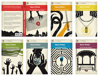
    This also made several covers more attractive to wider audience. For example, the Harry Potter book series had been interpreted by an artist in a way that gave the series a consistent identity, which as a result made the cover more mature and likely to be appealing to older audiences. This style of design worked best for franchises, as it gave each cover individual colours, but also reminds the audience of the key scenes in which to remember the book by.


    Saturday, 2 March 2019

    OUGD603 - Youth Culture - content research


    Youth nihilism articles


    Friday, 1 March 2019

    OUGD602 - PPP LAUTURD

    Study task - The Computer Doctor pitch
    - create a short pitch defending the bad choice of design in this logotype.
    Defence pitch

    • The text is clear and concise, with the green text highlighting what the business is.
    • The contrast between the Italic and regular fonts helps to separate different sections.
    • Accompanied by a strap line, the viewer can immediately see what it is we do and how our business can help them.