During the course of the OUGD504 studio briefs, a new set of skills had been learnt and developed, which will be useful for future projects. Having acquired these skills, it became possible to approach a brief from a different perspective and understand the ways to deal with a client.
For studio brief 1, design for print, working with the client in order to come to a solution to a problem was required. This meant first understanding the client's point of view for the project and what they expect to achieve from it. From this, a level of research into the topic was conducted as a way to further gather ideas about how to approach the project. These ideas were then discussed with the client and peer reviewed, which would in turn bring about more ideas on ways to begin a design strategy. The designs would then be tested and altered through the development stages, suggesting other options that could work as an alternative. By the end of the project, it became clearer on how the design should look, what stock to use and how it should be bound. These final ideas were then examined and compared with the client's original vision to see whether it had been successful. The brief also allowed for the chance to create a brief for another designer. This then gave further insight into the role that the client will be playing during collaboration in a project.
For studio brief 2, design for screen, it was possible to gather information on ways to solve a problem of our own. This meant finding a problem that exists in today's society and then finding a possible solution to this problem, through the use of an interactive platform. In this case, the problem was trying to find a way to encourage more young people to cast their vote in an election. The possible solution to this problem was creating an app that would narrow down the options for the audience, so they could understand which party best suits their view points. The project allowed for the chance to take a different approach, in which the design for the app would be considered on a particular platform that would work as an interaction. This meant designing pages for an app that would function, if it were to be coded into a real interactive application. Consideration in this project included, how the pages of the app would flow in wire framing, whether or not the design style would be appropriate for the audience and what layout would be needed for a design of this type.
Overall, the two studio briefs allowed for further opportunities to work collaboratively with clients and as an individual. This was insightful, in that it provided a glimpse of how it may be to work in a professional environment and how to manage collaborations. The projects also gave further insight into the ways in which to print the outcomes and the types of materials that are appropriate to the context. Furthermore, it will be beneficial for future projects as it has provided a more precise skill set, useful for professional environments.
Friday, 17 November 2017
Thursday, 16 November 2017
COP - Thursday nov 16th
Primary research methods
Any research involving human subjects need to be approved by Simon in advance. (ethical practice)
Human research needs to be anonymous and must contain informed consent in advance.
Empiricism vs Rationalism
These are the two main approaches to "knowledge"
Empiricism: something is only "true" if it is experienced using senses.
What you do through primary research
Rationalism: truth can be grasped intellectually using logic and reason.
what you do through secondary research (reading, discussion and argument).
Empirical:
Start with questions
Questions that have not already been answered. E.g. preferable questions particular to the subject.
Data collection:
Focus groups: deliberately selected participants.
Survey: Interviews (qualitative) questionnaires (quantitative)
Ethnography: study people of cultures - ( interviewer can become involved in the views or opinions of the subject. E.g. gangs)
Content analysis (extracting quantitative data from qualitative sources) measuring the frequency of pre-specified items (e.g. how many times the BBC uses the F word after 9pm).
Creative explorations: using creative techniques as a means to gathering subjective data: Lego building, collage, film making.
Quantitative data: In order to analyse numerical data you must start with a hypothesis.
Qualitative data: make sense of numerous qualitative responses from the same/similar questions won't happen without coding.
Wednesday, 15 November 2017
Studio Brief 2 - Evaluation
In conclusion to the design for screen brief, it is clear that in order to design an interactive user experience, first an understanding of the target audience is needed. In this case, through identifying the problem that is the amount of young people who do not cast their vote during the election, we can start to think of ways to change this. By targeting this specific audience with the platforms they use, there is potential for them to take an interest in the interaction. By creating an app for a mobile device younger audiences are more likely to download it as the information is quick and easy to access.
In terms of design, the app needed to have an approach both relative to the interest of the viewer as well as the context. This meant looking at existing apps that are likely to interest this audience, such as playing card games, as well as looking at existing design for politics. By combining the two it was possible to maintain the viewers interest while informing them of important issues at the same time. Taking inspiration from playing cards and casino tables, it was possible to use appropriate typeface and colours that would reflect themes of classic games.
Peer discussion and feedback also helped the project when deciding what directions to take and what would need to be changed as a result. Through wire framing the layout of each page in the app, it was possible to explain the intentions of the app to others and see what other features could be added and where.
Overall, the project has successfully conveyed the intentions of solving a problem through an interactive design layout. However, there are also some considerations that could have improved the ideas further, including changes to colour in the first section of the app. By changing the colours of the policies the audience would then be unaware of the party that they represent, making the test less bias. If the viewer is unfamiliar with the colours of the party then this would not be a problem.
Tuesday, 14 November 2017
Studio Brief 2 - Development and Outcome
After looking at the political approaches to the design of the interface, a more refined design layout could be established. Once the initial ideas had outlined a certain way to present the information it was then possible to develop these ideas into a more defined and visually improved version. After further discussion with peers, more ideas came about which helped to correct things that may not have worked in the app. To start off the development the layout was changed so that the app could include more colour and give the audience an idea of what type of app they were navigating.

As many existing apps on the market use layouts that are representative of physical objects, it seemed appropriate that the app that was being created tried this out. An example of this is found in gambling apps and games that mimic casino games. The layout used in them is particularly representative of physical objects, such as roulette wheels, game tables and poker chips. By creating a layout like this the information could be more fitting to the themes and context off the app.
Home Page

In terms of colour, the layout has been altered so that it represents a roulette table. This way the sections of the app can be defined by different squares on a roulette table, with black and red separating each. The backdrop has also used a green felt texture, which is likely to be found in casinos, on games tables.
'Find a Party' game

When clicking on different sections of the app, a poker chip will be placed on the square, indicating the current page the viewer is navigating. This is also a reference to betting on a roulette table, where bets are placed over a certain number or colour on the squares.

The layout of the game itself has also been altered so that the cards are sorted into the different policy topics. By doing this the viewer can choose the policy that they think is most important and this will then be added to a deck of cards below the options.

Selection of the card is also indicated with a poker chip, meaning the viewer can then move the chip to a different policy if they wish to.

The different topics included are issues that each party is expected to address during their campaigns. This includes the environment, renationalisation, workers' rights, the NHS, social security & pensions, housing, transport, foreign policy, migration and brexit.


As shown by the end of the question game, the viewer will be provided with a full deck of cards that show their choices throughout the game.

From the chosen cards, the app then informs the viewer which party most represents their views, based on the party that had the most cards chosen. It will also give the viewer a second recommendation if they are unhappy with the first.
'Politicians' section

For the second section of the app, a further drop down menu reveals the 'MPs, party and favourites' options, which can be navigated by the viewer.


When tapping the star icon in the corner of the MPs card, the card will then be placed under the favourites section of the app. This way the viewer can save information and return to it easily when re-opening the app in future.

Clicking on the card for the MP will then take the viewer to this page, which displays the further information as well as personal views and news links to current headlines involving the MP.

The final section of the app displays the ways in which the viewer can vote. By adding this option into the app, it will make the audience feel more inclined to cast their vote, after finding out the political party that is suited to them.
Sunday, 12 November 2017
Studio Brief 2 - App Name
App names
Playing card terminology
- Break
- Check
- Call
- Float
- Hand
- High card
- Jackpot
- Push
- Straight
- Value
Politics terminology
- Vote
- In favour of
- Members
- Hung Parliament
Possibilities
Straight vote
break vote
vote call
vote hand
high card voting
vote push
vote value
App name - Straight vote

This ideas was then developed using the 'Card Characters' font and finalised in the 'Futura' font. There was also card suits added to the design, with the spades behind the letter A, making it representative of the ace of spades.
Saturday, 11 November 2017
Studio Brief 2 - Research 2
After looking into the design elements of political parties and the designs created by the public in response, investigating the styles used in apps was the next step. By looking at different apps that were about politics, gaming or multiple choice questions, it would be possible to understand a way to design an interface for a similar audience. In this case, the audience would be people aged between 18 and 25. Therefore, by looking at apps that attract this audience, it would be easier to gauge a particular design style and flow to the app.
The first app that was looked at was 'CommonsVote', which provides the audience with information on different political parties running in the 2017 election and the MPs for them.


The first app that was looked at was 'CommonsVote', which provides the audience with information on different political parties running in the 2017 election and the MPs for them.

The first loading screen is similar in design to the manifestos that were previously viewed, including a full bleed colour background of the app and the logo. It also includes the logo for House of Commons, making the viewer aware that the information is from an official source.

The first interactive page of the app shows the different votes that are currently being decided in parliament, the date they were published and the amount of votes for each.

The option to click on these votes then takes the viewer to a different page where the votes are presented in a pie chart. Another option allows the viewer to further find out which MPs voted in favour and who did not, sorting them in to either 'by name' or 'by party'.

The next section of the app was the 'members', which shows different members of parliament, their political party, constituency and what votes they had engaged with.

One option for the page was to click the star icon, shifting the politician into the 'favourites' section. This was ideal for the viewer as they could then find their favourite politicians in one area, upon returning to the app.


The last section of the app was the 'About' section, explaining the uses for the app, where the information is coming from and what the votes entail. By adding a section such as this the viewer can understand the reason for the interactions of the app, as well as how to navigate it. Overall the app was very simple and didn't overcomplicate any of its features, making it easy to navigate and understand. Through the use of small icons, the viewer could choose from just three simple sections that provided information that was brief and easy to read. This type of layout may be something to consider when designing the user interface.
The second app that was explored was the 'Quiz of Knowledge' app, which provided the viewer with multiple topics to choose from, including art, history and music.

The first page of the app was similar to the first app as it showed a simple design layout for different sections. This app allowed for viewers to find other games of a similar type and look at the scores. In terms of the design, this app was more informal to the viewer as it used colourful options and more playful imagery, which shows the app was created with all audiences in mind.

By showing the categories with images in the background the audience gets a brief idea of what the questions will entail.

The questions for the app were separated into four options, which allow the viewer enough time to answer with a timer.

Friday, 10 November 2017
Studio Brief 2 - Design Research 1
Starting ideas
Design an app to help 18-24 yr olds choose a political party to vote for
Political websites design
Labour


Green party

After seeing different examples of the manifestos designed by the different political parties, it was clear that in order to understand the styles of political design, a different approach would need to be looked at. This seemed to be a necessary opportunity to look at the ways in which the audience would respond to the parties. In particular, the designs created by opposing parties' campaigns, as well as the material used on demonstrations.

In a similar manner to the Labour manifesto, the demonstration leaflets for Student Broad Left show exactly what the march is representing. In this case, "Students for Jeremy Corbyn" is the main focus point of the design followed by the aim of the march and the date in which it will be held. The use of a background image of the demonstrators also allows the viewer to quickly see what policies the party represents, including rights for everyone and matters relating to climate change, as well as Trident.


Design an app to help 18-24 yr olds choose a political party to vote for
- design could potentially be styled like a board or card game. This way it shows how politics is almost like a game to see which party can win.
- Politics can be seen as a race to power, during the campaign months before an election
- Politics is about Power, Responsibility, Decision making, Vision, Influence, Authority, Representing and Leadership to name a few.
Words that come to mind
Responsibility - link in a chain
Responsibility - link in a chain
Power - rule over others
Decision Making - defining best possible solution among other ideas
Vision - plan/sight/target/focus/future
Influence - impact/inspiring/benefiting
Authority - police/deciding/rules/do's and don'ts
Representing - presenting core ideas/ pride/informing others
Leadership - a figure for others to follow/ setting examples/ control
Political websites design
Labour

- The cover for the Labour manifesto uses the colours of the party to communicate to the potential audience.
- The simplistic design approach allows for an easier representation of the manifesto's aims.
- limitation of colour keeps the design minimalistic.
- separating the text in bold and regular weights allows for hierarchy of importance. For example, 'For the many' has been made in bold as it is the more important part of the title.
- The use of sans serif font and the reasonable kerning suggests the manifesto is communicating modern policy and the idea of future development.

- Establishing a foreword for the manifesto gives the audience a brief understanding of the type of party that Labour is.
- Again, the use of bold body text shows that the manifesto has structure and hierarchy in terms of what they want the viewer to see first.
Conservative

- In the same way that Labour has used red for their cover, the Conservative party has used their iconic blue for the cover of their manifesto also. This shows their core intentions through means of colour.
- Again, a simplistic design for the cover has allowed the Conservative party manifesto to display a sense of prestige and sophistication.
- This cover also uses a hierarchy to show how 'Forward, together' is the main plan of the party.
- this is then explained underneath by saying it is for a 'stronger Britain and a prosperous future.'
- The use of white serif font also separates the Conservatives from other parties as it shows formality for the party.
Liberal democrats

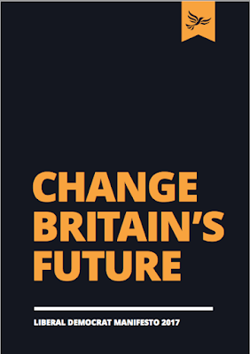
- To start off the Liberal Democrats' manifesto, the cover shows clearly in heavy bold text, the party's foreword 'Change Britain's Future'.
- The use of black and yellow allows for the text and logo to stand out to the viewer. This way the viewer can remember the quick and prominent text.
- This cover is different in the way that it uses the colour of the party, however it also manages not to overuse it to the extent in which others do, with full bleed backgrounds.
- The title Change Britain's Future is repeated throughout the manifesto at the start of each section regarding promises the party says it will make.
- This way the idea of changing Britain's future is suggested through the policies of the party.
Green party

- The cover for Green party's manifesto shows how they plan to make Britain "confident and caring" for its citizens.
- The use of colour in this manifesto is reflective of the ideas of the party. This includes the focus on maintaining the environment and rights for everyone. Colours such as light green and white show growth, nature and purity for the cover.
- The choice of a serif font for the cover allows for the text to stand out as the main component of the design.
After seeing different examples of the manifestos designed by the different political parties, it was clear that in order to understand the styles of political design, a different approach would need to be looked at. This seemed to be a necessary opportunity to look at the ways in which the audience would respond to the parties. In particular, the designs created by opposing parties' campaigns, as well as the material used on demonstrations.

In a similar manner to the Labour manifesto, the demonstration leaflets for Student Broad Left show exactly what the march is representing. In this case, "Students for Jeremy Corbyn" is the main focus point of the design followed by the aim of the march and the date in which it will be held. The use of a background image of the demonstrators also allows the viewer to quickly see what policies the party represents, including rights for everyone and matters relating to climate change, as well as Trident.

On the other side of the leaflet, you can find the the official speakers of the event and what they will be discussing. This further attracts the attention of the audience in a brief and quick manner.

This poster by The student assembly against austerity outlines some of the aims of their demonstration in clear red text. A poster of this nature is likely to be aimed at people who will stop to read the content, as its approach doesn't clearly state the aims of the campaign in a quick manner.


These leaflets by the same campaign show a layout that is more informative to the viewer. Through the style similar to a magazine or a newspaper, the campaign can target its audience in the same way that political newspapers can.


These leaflets by NUS and USU has created designs that can simply and quickly target their audience through imagery of a demonstration, met with dark pinks and purples. This has allowed for a hierarchy of text in white, beginning with the demand for viewers to "join the national demo", followed by "fund our colleges, stop rising fees" and the date of the event. A brief design like this allows for links to be added to the bottom, so the audience can find further information on the event.
Subscribe to:
Posts (Atom)