Thursday, 18 May 2017

Design Practice - Evaluation

As a result of Design Practice, it was possible to further understand and experiment with new approaches to graphic design. This included creating a publication design for a competition, exploring traditional printing methods and collaborative practice. Having experienced this throughout the module has allowed new ways to produce visual and contextually successful designs that can be applied to future briefs of a similar nature.

Exploration into the use of type and layout in previous modules, helped in understanding the approaches to studio brief 1, in which a book cover design would be made. As a result, the book cover was explored contextually, to gather initial ideas on ways that the previous designs communicated to their audiences. Therefore, the version that would be created during studio brief 1 could take inspiration from previous designs and utilise the key elements of the book. For example, when researching In Cold Blood, the characters in the book were shown to be ruthless murderers, which were then reflected on during the design stages of the project. This allowed the cover to communicate to the audience that the book would involve the representation of the killers in this way. Other elements of the cover that were taken into consideration during the process, were the colour schemes and the typefaces. By doing so, the book could reflect the themes and settings of the book. As it was set and released during the 1950s, it was appropriate that the style would be reflective of the times.

For studio brief 2, beginning an individual investigation into the events held in Leeds, allowed for several design ideas to come about. As a result, the Leeds CAMRA Beer & Cider festival could be explored using traditional print techniques. Having looked into the background information of the founders, it was possible to communicate the history of the event in a way that might appeal to a younger audience. After receiving feedback from peers, it was clear that the design stage would need to look at ways in which a new audience could be attracted to the event. Therefore, creating a list of the essential objects for a beer festival would add a humorous twist to the design. During the production of the designs, new approaches were used in order to create the outcome. This includes the use of photography for the essential objects and screen-printing the final design. In terms of the stock for the final print, the use of paperboard was also necessary in relation to the context, as it represented the material found in beer mats. After creating the final print, feedback from peers gave a critical reflection of the things that had been done well and the things that could be improved. Therefore, the feedback could be responded to in a way that would allow for future projects to consider different approaches.

Studio Briefs 3 and 4, both gave the opportunity to work with other people in a collaborative environment. This allowed for insight into the ways in which the other members of the group would approach the brief, as well as feedback on the contributions made to the tasks. This worked well as new possibilities could then be experimented with both as a group and individually, once the roles had been assigned to each member. As a result, the studio briefs gave people further insight into ways in which design teams would work together in a professional environment. 


Overall, the skills learnt during Design Practice can be revisited and reflected on during the course of level 5. They also provided an understanding into the ways in which future projects can be completed, both individually and collaboratively.

Tuesday, 16 May 2017

Design Practice - Studio Brief 4 - Evaluation

Having completed studio brief 4, it was possible to reflect on the areas that went well and identify the areas that would have been done differently. This included our self-reflection as well as from peer feedback. 

At the start of the project, we brainstormed several ideas on ways to deal with stress, which proved that the members of the group as well as the peers have similar ideas of what stresses them out. Therefore, we were able to communicate, as a group, on way that the stressful situations of the course could be countered using graphic design. 

Having worked in a group for studio brief 3, meant that studio brief 4 was similar in nature. This allowed more ideas to be generated and experimented with, as well as assigning different roles to each member as a way to produce the outcome. 

Working as a group also allowed for several suggestions to be considered and favored, based on their chance of success. For example, during the initial ideas stage of the project, we considered the use of ASMR videos that could be communicated to the intended audience. However the idea was discarded, as it would not be possible for it to be featured in a physical form. This was something we felt needed to be included as the aim was to engage the audience with a physical form.

Overall, studio brief 4 allowed the opportunity to work collaboratively with other peers, who may have different specialties in design. This was evidently beneficial by the final stages of the project as it was clear that the outcome had communicated the intentions of the ideas in consistent and precise manner, as previously planned. Having collaborated with others again, it is possible to transfer these skills to a later project. 


Design Principles - Presentation Boards (ISSUU)

Link 
 https://issuu.com/ap263113/docs/alex_pankhurst_ougd404_presentation

Monday, 15 May 2017

Design Practice - Studio Brief 4 - Rationale

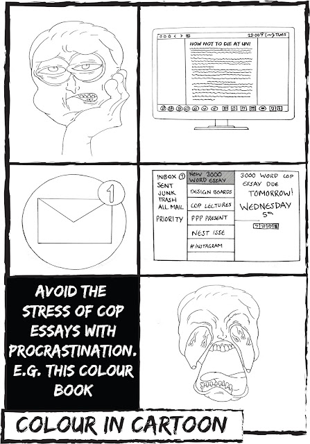
For Studio Brief 4, as a group, we created an interactive activity book. This would be made in the style of children’s activity book, but intended for undergraduate students on a design course. This was done through the use of humorous cartoons and activities, such as colouring pages, mazes and step-by-step guides. However, the contents of the books would be reflective of the stressful situations of the course, as well as ways to deal with them.


The colour scheme and layout of the book was considered in response to childish aesthetics and bright, attractive colours.


Sunday, 14 May 2017

Design Principles Evaluation

As a result of Design Principles, several transferable skills were learnt. This includes the ways in which colour is used in graphic design and when to use particular techniques involving colour based on the context of the brief. Having created a colour booklet, outlining several designers and their theories, the ideas of colour could be tested and experimented with throughout the course of the module. For example, when creating the book covers in studio brief 2, colour was something to consider when it came to the design process. This meant researching and testing the ideas of the colours, whether it be on their shared meanings or how well they would contrast other visual elements, such as type.

The consideration of type was also an important factor when working through the module. This was because there are several different ways in which the text can be applied to a design, however the choice will depend on the the context of the subject. For example, during the exhibition poster, the type chosen related to the Tate Modern, making it suitable for the design context.

In terms of the layout, it was vital that for certain tasks a layout would be chosen. This would also depend on the context of the subject, so that it would demonstrate the correct structure when designing the visual elements. For example, the book covers needed to have a Marber grid layout so that they could communicate the traditional methods used in the Penguin Books series. However, other stages such as the poster design, allowed for our own interpretation of the layout, which would depend on the context of the exhibition being communicated.

For the format of the module, there were several ideas about how the outcomes should look. For the colour booklet, the use of thin card or grainy paper would have worked well, as it would relate to the same type of stock found in Pantone's colour swatches. For the exhibition poster, the use of vinyl would have worked best as the intention was to hang the poster outside galleries or in public places. This would have been a suitable material to use as it is durable to the weather and relates to the stock used in real exhibition posters.

Peer critique also allowed for several ideas to come about for the project, including areas which should be pursued and which areas should be changed. As a result the outcomes of the studio briefs became more aesthetically appealing and relevant to the contexts. Peer review also gave the opportunity to look at ways in which other people had approached the brief and what colours, stock, layout and type they had used in response to the module. All of these skills will prove to be transferable for future projects and will allow for different approaches to come about, when starting a new brief.

Design Practice - Studio Brief 4 - Outcome

As a result of the developed activity book ideas, the group was then able to print the pages and bind them into the intended booklet, at an A5 size. The book was printed at A5, as the cost would need to be kept down as well as making it convenient to students. As there were issues with printing the book using a professional printer, the group chose to use lower quality printer for the final outcome. One thing that was also considered was to hand stitch the pages together, however due to limited time this option was discarded.

The group also pursued the idea of using sugar paper and yellow card for the stock of the book. This would then easily allow the design to be printed on to them. Another feature that would be added to the book, was the pocket included on the inside of the back page. This would contain the cutouts for the ‘student clothing’ activity on the previous pages. This allows the viewer to remove the clothing items and place them in different areas of the provided models page.

Having changed the cover of the book, it was possible to reflect on ways that this may have been improved with more colour. The group agreed that the use of digital print for the book might have allowed the colour scheme to be done differently. This could have then been analysed during the final critique in comparison with the alternative version.


After receiving feedback from the final critique it was clear that many people agreed that the cover design could have been improved further, had it included the use of white in certain areas during production. Other peers say that the interactive element of the book works well for the context, as it would be ideal as an icebreaker activity for the first year students to engage with.

There were also some mistakes that could have been improved including a spelling mistake on one of the pages as well as aligning the book cover text central to the image. This may have subsequently allowed the book to look more professional and attractive to the intended audience. Furthermore the exploration of different colours may have also allowed the book to work well in the context. For example, as one of the initial ideas discussed by the group was to collage the front cover, creating this as an example may have gained further suggestions and feedback from peers on whether it would have worked or not.

Overall, the project has allowed the group to communicate the intended ideas about life at university and the student’s personal experience on the course. The book also works well in communicating a humorous intention to the intended audience about aspects of the course that may be seen as stressful. However the point of the book is to allow the viewer to de-stress.

Saturday, 13 May 2017

Design Practice - Studio Brief 4 - Development

After all members of the group had created several ideas, these designs could then be added together and put into a sequence for the activity booklet. As the initial ideas included colours within some of the designs, our initial reaction was to use glossy paper that would display them professionally to the audience. However we felt that they were not engaging enough for the audience and therefore decided that the colour would be taken away. This way the designs could be interacted with by the audience in the form of a colouring book.


As other members of the group were focusing on different modules the book also includes the use of a maze and an interactive sticker section, both of which would be reflective of the activities found in children’s book. After gathering all the pages together for the book, we needed to decide what format the outcome would take. Therefore, we looked at the different stock used in children’s activity books and the types of colour that were used, where necessary. The group found that the best option to take would be to either use glossy pages for the front and back cover or to create the entire booklet using sugar paper. The sugar paper option was chosen as the paper is frequently found in books that allow for coloured pencil or paint to be applied.

In terms of the front and back page, the group decided that there needed to be a childish element to the visual presentation. Therefore, the idea was to show glipses of the content in the form of a collage. However, after trying this idea the group found that there would be an issue with printing white as the printer that would be used was CMYK. Therefore the front and back cover were changed to include one of the sketches as well as the maze, with the title of the book in black outline. The group also chose to use yellow as the use of bright colours would be ideal for the childish context of the book. Furthermore, the inside of the book would be off-white so that colour could be applied to the different sections of the book by the viewer.


By choosing this particular stock, the book could then be produced while keeping the cost down, which would reflect the money saving nature of students. It would also show the same materials that are likely found in childrens activity books. The next step would be to add the pages together and print the activity book, so that it can be reviewed in peer critique to finalise ideas that need changing. Our concerns for the critique were the ways in which the cover might be changed and whether the stock was appropriate for the context.

Friday, 12 May 2017

Design Practice - Studio Brief 4 - Initial Ideas

After recieving feedback during the first critique on our ideas, the group was able to experiment with different possibilities for the project. For example, many peers suggested that the children themed activity book could be reflective of the module that graphic design students have completed. With this the modules could then be divided between the three memebers of the group so that our ideas would link to two modules each, and then the visual designs could be based on the chosen modules. 

When being reflective of the different modules that have been completed through the year, it is possible that the skills could also be demonstrated in the activity booklet, as another way to show the undergraduate students what to expect from the course. This includes the choice of colour, layout and stock that will be used when piecing together the book.

As the other two member of the group were responsible for Design Skills, Design Principles, Design Process and Design Practice modules, this meant that the remaining modules would be my own responsibility. This included Personal Professional Practice (PPP) and Context of Practice (COP). As the two modules are similar in nature, this meant that they could both be approached in the same way, through the use of illustrations or through the memes idea.

To start off the initial ideas, I first thought of the stressful situations that had personally been encountered during these modules. Therefore, they could be visualised and put into context with initial sketches. As the first idea was to create internet memes, looking at popular 2017 memes helped to gather design ideas that related to PPP and COP. These were then recreated with humourous descriptions relating to the course.


The second idea was to hand draw then digitally edit cartoon strips of different stressful situations found in COP and PPP, this could be done either in colour or as a colour-in section of the booklet. Therefore, it would be engaging and interactive with the audience. 


Thursday, 11 May 2017

Design Practice - Studio Brief 4 - Research

To begin studio brief 4, we devised a series of ideas that would relate to our time on the course. One way that we did this was by reflecting on our mid-year starter activities during personal perfessional practice. During the module, we came up with ways of dealing with stress at university. Therefore, as this activity was one of the highlight for all the memebers of our group, we decided that our project would be based around university and stress.

The idea for the project was to create something that would allow the new undergraduate students of 2017 to understand the situations that they may come across while on the graphic design course. This includes, what they can expect from the subject as well as what life can be like at university. 

To begin the research into the project we started by looking at things that help us to de-stress or things that help us to avoid stressful situations. This includes reading, listening to music, pleasing images or sounds, inspirational quotes, interactivity, colouring, social media and TV. These areas could then be divided and researched by members of the group to gather the initial ideas.


When searching for evidence of pleasing images and videos, one popular trend on social media was the use of calligraphy on Instagram. The videos show satisfying brush strokes of the calligraphy being made. As this is something that can relate to graphic design, the idea to explore calligraphy of our own was one option. 


Another option was to create internet memes, as these were another popular feature of social media and in particular students of a similar age group. The idea here would be to create several internet memes and set them up on a social media account for the students to see. The memes would also relate to the stressful situations that people find themselves in while at university.


The last idea that was contemplated was to create an interactive colouring book, similar to a children's book, but made with humorous content and intended for undergraduate students at an art college. As a group we felt that this idea would be the best to pursue as their were many possibilities in the way a colouring book could be interpreted and visualised for this purpose. Therefore the group consulted other peers for feedback of our ideas during group critique on ways that the book could be approached visually.

Wednesday, 10 May 2017

Design Practice - Studio Brief 3 - Exhibition involvement

After an exhibition group had been chosen to plan the display, given roles were assigned to each person. My role was to screen print the patterns and designs onto the back of the invites for the exhibition. By doing so it would be possible to make the invites look more professional as well as showing the viewer a glimpse of what the exhibition entails. This could then be documented and sent to the RAUM_Leeds Instagram account to be used for further promotion of the exhibition.