Tuesday, 30 January 2018

OUGD505 - SB2 - Cannabis research / Project influence

When it comes to the debate on whether cannabis should be legal or not, there are varied opinions in today's society. However, over recent years studies into the effects of the drug have changed perceptions of it. What was once considered by the vast majority of western society as a dangerous substance, has now garnered more positive attention and focus on the medical effects it possesses. Although the debate is still on-going, there are signs that legalisation is likely to take place in years to come in several parts of the world. Having legalised a regulated sale of cannabis in several states of USA, the government is now in discussion about whether other states will follow on this principle.

There are currently 9 states in the US that have legalised the use of medical and recreational cannabis, including Nevada, California and Massachusetts. In these states, cannabis is sold legally by official retailers that have the ability to work with growers around the country. Although it is legal, there are still several laws prohibiting the resale of the drug as well as the limit on the amount people can grow for personal use. As several other states are yet to decide on legalisation, there are some laws that have been altered in a way that decriminalises the possession of cannabis. For example, possession of the drug may still be illegal, but local law enforcement may decide not to take action as it is putting people in prison for minor offences.

Other states have legalised the drug, but only for medical use and under supervision for those who may need it most. One example of this would be the way in which medical practitioners gather concentrated elements of cannabis to use for medical treatment. This means that the psychoactive substances, such as THC, are removed from the medicine and only stand as a pain relief for patients.

Media Research


Why I changed my mind about medicinal cannabis | Hugh Hempel | TEDxUniversityofNevada

This TEDx lecture shows the importance that medical cannabis has on patients who need it. Hugh Hempel's twin daughters suffer from a rare terminal illness, however they could not access the medicine they needed as it was not legal in the state they were living in. In order to receive the medical treatment they moved to Nevada, where the treatment was then provided and the twin girl's health improved as a result. In Nevada they have the ability to cultivate their own cannabis and treat their daughter's condition.

The Legend of 420
The legend of 420 documentary showed how cannabis laws in the US have changed over the years, as well as providing the viewer with an insight into the people that campaign for change across every state. Several of the people interviewed in the documentary provide a look at the type of businesses that have emerged as a result of the legalisation in several states. This includes artist Daniel Militonian, who's art work has been inspire by the effects of cannabis and often the subjects of the work are made while under the influence of the drug. Another organisation that is documented was the staff at Oaksterdam University, as they teach young entrepreneurs about ways to cultivate cannabis, as well as breaking into the legal market.

Strava Craft Coffee (Colorado)

One of the businesses to feature in the documentary was Strava Craft, a Colorado based coffee company that uses elements of cannabis and hemp as part of their recipes. This business was particularly interesting as it showed how a demonised set of ingredients can be used in coffee, the same as any other coffee competitor. It has also been presented as any other coffee brand would, with modern design for the packaging and information on the website of the origins of the coffee. This may prove useful for starting the design stage of the project, as it shows how to present these products to the right audience.

Sweet Grass Kitchen


Included in The legend of 420 documentary, was the Denver based bakery Sweet Grass Kitchen. This company was unique in their market, as they produce baked-goods infused with cannabis. In the same way that Strava Craft use cannabis as a selling point for their business, Sweet Grass Kitchen have been able to use the legalisation laws to their advantage in Colorado. This also provides insight into the design process and layout of the business, which may prove useful for ideas of the project.


Friday, 19 January 2018

OUGD505 - SB2 Social Issues

After looking at different social issues that face our society, it was possible to establish several issues that would be most approachable for a design project. This includes chemical weapons, capital punishment or the legalisation of Cannabis debate. For the chemical weapons issue, there are several approaches that could be taken, including anti-weapon demonstration. For capital punishment, there are mixed opinions that could be represented, as the debate is controversial. The same thing can be said about the debate as to whether Cannabis should be legalised in the UK, as there are several places in the world currently experimenting with the legalisation of the drug.

The debate for legalisation of Cannabis could be approached through packaging design. This idea came about when thinking about the places that Cannabis is legally sold in other countries. In Amsterdam, several coffee shops sell Cannabis as part of their menu, which has been a prominent part of dutch culture and has attracted tourists from all over the world. There are now several coffee shops that have world wide attention, include the famous Bulldog coffee shop.

The aim of the project would be to re-design current products that are available, in a way that shows the sale of Cannabis to be as ordinary as legal products. For example, Starbucks sell different products in their stores that are in some way related to coffee, including coffee beans and flavoured drinks. However, if Cannabis were to be sold in a similar manner there would most likely be a change in the social stigmatisation attached to the drug. In some areas of Amsterdam, where Cannabis is legal, there have been several stores that experiment with products that are related to or include Cannabis. This could be in the form of butter, infused candles, drinks, food and clothing.

To approach the design aspect of the project, it would be essential to first understand the way in which current businesses, like Starbucks, promote their products to their customers. This will mean looking at the packaging design, labels, store layouts, advertisements and the audience. From this it will be possible to establish a set of guide lines to use when designing and marketing the Cannabis products.


Starbucks
When looking at an example of the store layout for Starbucks, we can see that their approach to visual presentation is based around the origins of the coffee. This may be by displaying fair trade information, where the coffee comes from and how it is made. The interior design includes the use of dark wood, burlap sacks and chalk boards, which give the customers a surrounding that reflects the type of business that Starbucks is. In the same way, interior design for selling Cannabis products could also relate to the origins of the drug and the processes involved in making the products.

Starbucks also have a range of 'on-the-go' products for sale, which use similar graphic approaches as the products found on the in-store menu. This includes simplistic and minimalistic design, limited colour palettes and re-use of the typeface for each product. As white is one of the primary colours for the brand's visual presentation, it is often found in the text or as a background for darker text to reflect on. The use of sans-serif fonts also reflect a modern, simple design choice.


When looking at the layout in an Amsterdam coffee shop, we can identify similarities to regular coffee retailers. Behind the counter, the store offers customers cannabis related products, such as drinks, cakes and other consumables. It also sells clothing, branded with the same logo as the coffee shop, which is likely to have a popular selling point with tourists. This coffee shop in particular was called Baba, located in Amsterdam. We can see from the interior, that the theme of the shop is based around Indian tradition and particularly religious symbolism found in Asia. Cannabis, is to this day a present part of Indian culture, as people have used it to achieve an 'enlightened' state of mind as well as seeing it as an offering to Shiva. The use of cannabis within Indian culture can date back as far as 2000bc, proving that this particular coffee shop has been inspired by the origins of cannabis use.

In the same way that regular coffee franchises and shops offer coffee menus, cannabis coffee shops also use menus to inform their customers of the prices of cannabis. This example shows that the use of a chalk board makes the menu similar in nature to any other business. This may prove useful during the initial ideas stage of the project, as it provides an example of the typeface found within coffee shops. 

Coffee shops tend to sell other products in the form of sweets, such as the ones shown in this picture. These products are likely to be purchased by customers who may be new to cannabis, as these products offer an alternative approach to the mainstream ways of consuming cannabis. They also present the customer with something they can enjoy, if they are uninterested in smoking cannabis.


Monday, 15 January 2018

OUGD505 seminar Ethics and Practice

What are ethics?
- moral principles that govern a person's behaviour
- standards to abide by

  • Do you think ethics is important in graphic design? why?
Ethics is important in that design needs to be considered with the audience in mind, so that the production is appropriate. There is however, the approach that ethics may not be considered as it may not be appropriate to the intentions of your work (they may intentionally go against the ethics).
  • what defines "good" in graphic design?
Having core morals and standards to go by when working in the world of graphic design.
  • what does ethical practice entail in graphic design - what principles?
Consideration within the practice (materials and process etc.) Recycling could be something to consider in relation to saving the environment. Ethics also depend on the person applying them to graphic design. Their moral principles may go against the process or ideas required for a brief.

"Good design is good citizenship" - Milton Glaser

Freedom of speech is also an important factor, which shouldn't be put in a position to be changed to a clients needs.

Themes of the philosophies
  • being a good citizen
  • who to work for
  • influence and persuasion
  • aesthetics and ethics
  • value and purpose
3 principles of ethical practice that would be beneficial to adapt.
  • Allow ethics to play a part in decisions you make as a graphic designer, however it is also beneficial to try alternative routes to a problem.
  • Use of ethics in design is important as you will design with the audience in mind.
  • Ethics is important for the development of societal values and brings with it unique and flourishing ideas to the world.
How does sustainability relate to ethics?
  • ethics proceeds sustainability, because it is more broad and a more naturalistic approach to graphic design. Sustainability is more functional and engaging with a project. What are the sustainable factors of a project? For example packaging design may be considered with sustainability in mind to cover environmental issues. 
Footprint - ethical printing service
Cast iron design, Boulder, USA - design company
Re-Nourish - online tool box/ ideas for sustainability


Sunday, 14 January 2018

OUGD501 - COP2 research for practical idea 1

The aim of the practical investigation will be to produce a futuristic representation of a textbook or brochure that may reflect a future society. This will mean the information within the publication will reflect future disciplines and give the audience an idea of what the educational curriculum may look like in years to come. By imagining future subjects that may be taught in schools, it will be possible to reflect what the education system might look like. This imagination comes from learning about society's direction when it comes to technological advancements. As the essay looked at different aspects of technology's influence, it was possible to understand what changes may come about in future. This included, the advancements in medicine, the development of more efficient forms of transport, the skills needed for more technological jobs and the development of entertainment.

Imagining these aspects as subjects within a school textbook would show how education could change as technology advances further. It is certain today that technology is present within the curriculum, however there are still forms of traditional teaching included. The aim will be to create a brochure for a secondary school, that entices younger audiences and their parents to the subjects that the school offers. The brochure may also show how these subjects will be beneficial for job security and employability in the future.

To understand how to create a brochure of this nature, it will first be beneficial to look at existing brochures for schools and universities, to see what content is used. It will also provide a sense of layout and visual communication, which can then be interpreted during the design phase of the project. It may also be useful to gather opinions from peers, on whether a brochure would work better as a series or as one hand out.

Series of brochures content

Coding - show coding as a new subject being introduced to the curriculum and display it on the brochure in a futuristic way.

Medicine - Medicine will be an important subject in future as humanity is dependent on its development. This could be designed using imagery found relating to medicine.

Vehicle Production - There is likely to be a decline in manufacturing and therefore introducing this subject will allow for mass production of vehicles, while there is an ageing population.

Climate change - This subject will highlight future issues with our environment. The subject will teach pupils ways to maintain our environment.

Food maintenance - This will teach students about how to grow food that is sustainable to the future. This may also highlight the change in diets over time (vegan).

Feedback from tutor

One way that the project can be approached would be to focus on one area of the education system and look at the design styles used for approaching younger audiences. It may also be beneficial to revisit the essay and find a specific approach to graphic design, with relation to the education research in the essay. One way that the design process could be approached differently would be to look at how education is promoted using technology, such as online through a website. This way it may be possible to communicate the ideas of the essay using a design technique that is related to technology.

One way that it may be approached would be to make a wireframe of an app that promotes a graphic design subject in an institution.


Thursday, 11 January 2018

OUGD501 - COP2 practical self-briefing


The aim of the project is to create a piece of graphic design that either encourages people to use their digital devices less and embrace traditional entertainment, or it could be a prediction of where technology will go in the future. To gather ideas about how to respond to the research it is necessary to first revisit and pick out key points that could be explored practically.

Key issues
  • Medicine is something that has advanced with the introduction of modern technology. Without it, it is likely that survival would be difficult, as it has advanced to such a level that it has become dependable. 
  • Entertainment has changed as a result of technology, including the devices we use to view forms of entertainment. Things that we would not have previously thought to be entertaining became entertainment activities once introduced to technology. For example, online shopping could be considered a form of entertainment.
  • Scientific discoveries have been enabled by the rise in technology and have opened up new possibilities for the future.
  • Education has also changed as a result of technology as the classroom now uses interactive platforms that pupils can engage with. However, there is the argument that this introduction of technology could result in a lack of common social skills.
Design solutions
  • Recent news about NHS hospitals overcrowding could be incorporated into the design through the subject of medicine and technology. 
  • A design in the form of a metaphor could be made as a way to demonstrate technology's grip on society through entertainment forms.
  • create a design using technology used for scientific purposes.
  • create a design on a form of traditional education material. Eg, a school text book designed with the intention of promoting traditional practices.
  • Create an app that is metaphorical in communicating the idea that technology will become a focus point of education. For example, showing a set of school disciplines to choose from that reflect future studies. This may include jobs that involve technology as a primary tool or teach the students how to use certain technology.
Futuristic disciplines that may be taught in schools

  • coding 
  • manufacturing vehicles of the future
  • technology platforms design/study
  • IVF/ medicine
  • climate change
  • food maintenance 
  • language development

OUGD505 - SB1 micro-genre further exploration

Although UK drill music is relatively unknown to the mainstream, there are several songs that may be considered mainstream within popular hiphop charts. For example, the rap group 67 are considered to be the most well known in the drill scene and have gained millions of views on their videos, on Youtube. This includes 'Let's Lurk', 'Take it There' and 'Waps', all of which have professionally made music videos to go with them. This is evidence that the drill scene in the UK has also opened up new avenues for aspiring producers and film makers, as they are able to sell their 'beats' and create innovative videos that capture the feeling and rhythm of the songs.

There is also evidence that UK drill has subtle presence internationally, as many vloggers on Youtube react and review the artists from as far away as the United States. In recent months, the UK drill scene became more recognisable when comedian Michael Dapaah went viral after recording a parody video, in which his alter ego 'Big Shaq' appeared on the popular BBC 1 Xtra show 'Fire in the booth'. The song was later given a high production music video, which since its release has gained over 160 million views on Youtube. The song itself used the same instrumental as 67's 'Let's Lurk', which gave the original more popularity as a result. The video also demonstrated to millions of viewers, the type of slang used in the genre and how African/Caribbean words are influencing the lyrical content.

Opinions of UK Drill music

Reddit users opinions of UK drill

  • "I'm feeling it. Some of it can be a bit repetitive, but there are some top artists putting in work. Some of the more basic productions remind me somewhat of early grime. No EQ, no real production quality, just hard spitting and passion from a bunch of people with a lot to prove."
  • "The guys that sound original like Harlem, Reeko, 67, 86, 150, 410 etc are hard, but a lot of them just sound like they're using the same flow over the same beats rapping about the same content."
  • "I'm a Harlem Spartans fanboy and I'm loving the genre at the moment, there's loads of enthusiasm, loads of new singles constantly. I don't like how people compare it to grime though because it does centre around releasing singles, views on YT etc. and not on radio sets or live shows like I think grime does more. That being said if there was some kind of cross over I'd love to see capo Lee do more songs with a drill artist."
Youtube 
  • LDN documentary by Nathan Miller 

 - There is a change in the platform in which hiphop in London is distributed to the masses. What was once considered a small underground rap scene, has now flourished into a new wave of potential talent. The artists of today share their content on Youtube (GRM Daily/ Pressplay Media / SBTV) and based on the view count or response, they can then build a career.

From gathering general feedback on youtube drill videos, the audience is mostly positive toward the genre. It is clear from the view count on the videos that drill has become a popular genre in the underground scenes and has brought about new talent. 

Response from Nathan Miller on opinions of UK Drill


January 2015 - December 2017
There has been a slight increase over the past 2 years in the amount of filed crimes in London, according to the Metropolitan police website. When looking at particular crimes such as "carrying an offensive weapon", there are certain boroughs of London that stand out as the most common areas that these types of crimes occur. The statistic for carrying an offensive weapon show that over the 12 month of 2017 there was a significant increase in comparison with the previous 12 months. This particular crime had gone up by 31.38% and had over 16,000 recorded cases, with the most common place being the Lambeth borough. Over the last 2 years there have been over 340 murders recorded in London. 

There is however, also a factor to consider with crime statistics. Not every crime committed is recorded by the police, as some crimes are not officially filed by the victims. This may be to do with the minor offences that people believe are not worthy of police time. Another factor to consider is the cuts made to the police budget over the months, which has resulted in less officers on patrol. New laws have also been introduced which restrict the police from constructing stop and search procedures, primarily on the grounds of intrusion of people's privacy and consent. They are only able to stop and search individuals on the grounds that they have "reasonable" justification for doing so, including knowledge that they may be in possession of an offensive weapon.


Based on the research into UK drill several characteristics of the genre could be established. One way to gather ideas for the project was to mind map the words associated with the music, including the slang terms and the names of gangs and artists. As the practical ideas will be in response to the genre's themes, the first thing that came to mind was the ways in which the genre reflects a reality, even if it is a violent one. The response to drill in the form of graphic design may inform audiences of the themes as well as the factors that are associated with it.

Knife attack deaths of 2017 (In relation to youth knife culture)

Djodjo Nsaka, 19 died 20 January 2017
Quamari Barnes, 15 died 23 January 2017
Irfan Wahid, 16 died 10 February 2017
Liam Hunt, 17 died 14 February 2017
Abdullahi Tarabi, 19 died 11 April 2017
Matthew Rothery, 18 died 16 April 2017
Jordan Wright, 19 died 19 April 2017
Mohammed Hasan, 17 died 23 April 2017
Elijah Dornelly, 17 died 7 May 2017
Joao Gomez, 18 died 13 May 2017
Matthew Cassidy, 19 died 29 May 2017
Abdirahman Mohammed, 17 died 2 June 2017
Koy Bentley, 15 died 5 June 2017
Osman Sharif, 16 died 6 June 2017
Mahad Hussien Ali, 18 died 29 June 2017
Folajimi Orebiyi, 17 died 4 July 2017
Joshua Bwayla, 16 died 2 August 2017
Sait Mboob, 18 died 8 August 2017
Daniel Namanga, 19 died 8 August 2017
Jermaine Goupall, 15 died 8 August 2017
Saif Abdulmajid, 18 died 6 October 2017
Kyle Yule, 17 died 6 October 2017
Reagan Asbury, 19 died 15 October 2017
Kyron Webb, 15 died 20 October 2017
Aren Mali, 17 died 29 October 2017
Rhys Singh Bahia, 17 died 31 October 2017
Michael Jonas, 17 died 2 November 2017
Kacem Mokrane, 17 died 20 November 2017
Jason Isaacs, 18 died 21 November 2017
Connor Ansell, 16 died 24 November 2017
Jacob Abraham, 15 died 7 December 2017
Meschak Dos Santos Cornelio, 18 died 31 December 2017
Kyall Parnell, 17 died 31 December 2017


Tuesday, 9 January 2018

OUGD505 - SB1 micro genre choice

After searching through the website Everynoise.com for different sub-genres of music, the one that was most appealing was UK Drill music. This sub-genre of UK rap emerged after being inspired by 'drill', which originated in Chicago, USA. Starting off with the origins of drill, the genre can be traced back to the early 2010s, when rappers such as Chief Keef, Lil Dirk and Fredo Santana became prominent figures in the then underground style of rap. Around mid-2012 is when drill music began to gain mainstream popularity, with sites such as Youtube and Soundcloud being used as a platform to share the songs.

Origins
Influenced mostly by gangster rap, this form of 'trap' music was another emerging sub-genre which focused on violent nature, nihilistic lyrics and gang culture among young people living in Chicago. The most notable characteristic of drill, which separate it from mainstream rap, was that it focused mostly on the gritty and realistic depictions of life on the streets of Chicago. Drill is known to have emerged from the poorer districts of Chicago, including Englewood, Chatham and Riverdale. This is likely due to the high levels of crime in these areas, in particularly gang affiliated crimes, including murder.
Rapper Keith Farrelle Cozart (Chief Keef) 

Drill music often uses 60 - 70 beats per minute, which is slower in comparison with trap music. However some producers often use double tempo, working at 130 - 140 beats per minute. Drill music has also attracted media attention in the past, having been criticised for its 'glorification' of violence, criminal themes and its influence on listeners. Following several feuds in Chicago, drill music has also been used as a platform for rappers to taunt one another through 'diss tracks'. In rare cases, some of the tracks featuring taunts have ended in violence between gangs and even killings. This link between music and violence is what critics of the genre believe is having a negative affect on the listeners. The word drill is often associated with an automatic weapon, but has also been used as a term that refers to fighting and retaliating. This is evidence that drill involves the rivalry and retaliation between two oppositions.

Over the last 8 years drill music from Chicago has inspired rappers in the UK to create their own take on the genre. In South London, there are several areas, predominantly Brixton, which took a liking to this style and adapted it to become UK drill. The reason for this is likely because many people who listened to Chicago drill could relate to the lyrical content in their own way.

Characteristics of drill
Like many existing sub-genres of UK hiphop, UK drill uses a wide range of slang terms to communicate their opinions. This is a combination of British slang mixed with Caribbean and African dialect. Much like the drill found in Chicago, it also uses a rebellious tone and as a result has garnered negative attention from the police and the media. Although this sub-genre is popular around the UK, it has not yet reached mainstream heights to which the songs are among popular charts. After looking at several reports on the rise of drill in the UK, it is clear that the main platform for this genre is Youtube. Channels such as SBTV, Mixtape Madness and Pressplay Media are the most popular for artists to share their music. The videos that are uploaded on these channels are then judged based on their lyric content by viewers, similar to how a talent show would showcase potential talents and the more attention they receive from the audience the more likely they are to continue showing their talent.

Through this process many talented rappers and rap groups have emerged as prominent figures in the genre. This includes 67, Loski, Harlem Spartans, Abracadabra and 410. Their style of rapping has set a cornerstone in the genre for other artists to follow and be inspired by. This includes their flow, lyrical content and attitude toward the art form.

67 - (ASAP, Dimzy, Liquez, LD and Monkey)

Abracadabra


Studio Brief 1 - Animal Farm design development

After researching into the different possible ways in which propaganda can be used and examples of the styles, it was then possible to interpret a cover design for Animal Farm. The next step would be to create another interpretation of the book in a different way. As the time period of the Russian Revolution was during 1917, it was necessary to look at the publications that were released at the time. One publication that was particularly interesting was the soldier led newspaper The Wipers Times, which originated in the trenches during the first world war. This newspaper was created as a way to lift the spirits of the other soldiers, who would be surrounded by tragic circumstances every day. The paper was mostly comical in its approach to information as it would make viewers happier than just reading ordinary informative news.


As a result of The Wipers Times, a modern day theatre production was created to reenact the original story of the newspaper. For the advertisement of the show, a poster was created that payed homage to the original cover design of The Wipers Times, using the same typeface and imagery.


One way that Animal Farm could be interpreted would be to recreate the aesthetic of a 1917 publication. This way the cover would look more as though it were created during the time period of WW1, whilst appealing to a new generation. This process could be completed by staining paper with coffee, folding it several times and then scanning it. This way it can imitate old paper that has survived for years, much like the book itself. This surface could then be developed by adding the design digitally or by printing onto it.
Trying this style out, the process for the design began by scanning a brown paper envelope to use as the background. This was then applied to the design, replicating the style used by The Wipers Times. A mix of sans serif font and serif font allowed for the design to look as though it would be used on a newspaper. A layer of red was also applied over the paper background, replicating the red found in many Russian propaganda posters. As a result of this experimentation, the design did not work as successfully as anticipated, as it did not feel as though it communicated the ideas of the book. Instead it made the cover look as though it was imitating a publication or newspaper, which was not the intention for the design. Most peers also agreed that in order to develop the cover for Animal Farm the previous style should be pursued further.

In response to this, an alternative version of the barn design would be made in order to see whether a different avenue should be taken at this stage. This meant creating the design in the same minimalistic style, but using different imagery for the design.

This design was then shown during discussion with peers, but was decidedly not as strong as the original barn design. Therefore, this design was also not pursued further.

Going back to the choice of typeface was also another way to find more alternative options for creating a cover design of Animal Farm. This would allow for more discussion when it came to the group critique, on which typeface would most suit the cover and where it should be applied within the design structure.

By including a mix of serif and sans serif fonts, it would be possible to see whether the traditional approach should be taken or if a modern update would work better. Personally, the best option in my opinion would be to either use Cheltenham or Georgia Regular, as they were almost seen as a compromise between legibility and traditional value. Georgia Regular in particular showed letters that were easy to read, but also stuck to the traditional format.


Monday, 1 January 2018

Studio Brief 1 - Animal farm initial design stage

After looking into the ideas surrounding Animal Farm and researching into the Russian aesthetics, it was possible to gather ideas that could potentially be used for the cover design of the Penguin book. From viewing several posters from WW2, it was possible to get an idea of the colours and styles to use when designing. This included the heavy use of minimalism, in particular the limitation of a colour scheme. This meant that the design would only include a handful of colours and they would primarily reflect the colour schemes used in Russian propaganda.

The first design for the cover was inspired by a particular poster which focused primarily on Russian heroes, rather than political party views. The poster reads "We will fight strongly, strike desperately - grandsons of Suvorov, children of Chapaev." The design used in the poster itself consists of multi-media design decisions, including a minimalistic background, which looks to have either used print or paint. The bottom half of the poster shows the soldiers and tanks of the army, which have been made using graphite or lead pencils.

The background to this poster is what was most appealing, as it subtly blends the black and red together in a minimalistic style. This is what inspired the cover design to use limited colours in the same way.

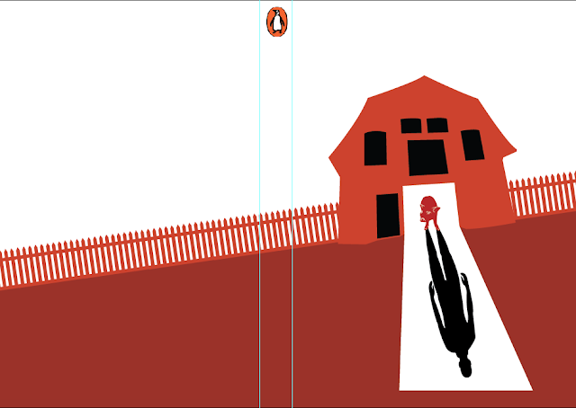
The aim of this design was also to make sure that the Napoleon or all of the pigs would be shown in the design as the most superior. When thinking about what made the pigs superior in the story, it was clear that they begin to show human qualities, and are even described as being as powerful as the farmers. This brought about the idea of showing the pigs to be human-like in their nature. One way to do this was to show a pig with a human's shadow. This concept would then explain to the reader how the pigs in the story eventually become more and more human-like, developing less animalistic traits.

The idea that first came to mind was to show a pig coming out of the barn and the light cast from the doorway of the barn would reveal the shadow below the pig. As the design was to be minimalistic, in the same way as the propaganda poster, the barn and the pig would both coincide with the colours that they would be set against. For example, the light from the barn would also show the details on the pig's body, in the same way that the propaganda poster uses black to highlight the lines over the red. 
As shown here, we can see how the white of the background would subtly blend into the red revealing the characteristics of the pig's body. Creating the design in this way also means that the number of colours used can be kept to a minimum.

For the front cover of the design, the barn would be situated in the centre of the page, with the pig shown in the doorway. By showing the pig to be the only animal in the design it reminds the viewer that the pigs are the primary focus of the story. The barn would also be placed at an angle on the page, as many of the propaganda posters tend to show direction in their designs. This idea of direction allowed viewers at the time to imagine their countries as "heading in the right direction", with many designs consisting of armies, tanks and planes all advancing to a certain direction. This allows for the design to illustrate the power and force that these countries possess.

In the same way, the barn would be placed at the top of a slope, with the rest of the farm land appearing on the back page, at a lower angle. This shows how the barn is seen as one of the structures of power for the pigs in the story and the rest of the farm are under their control. 


The next step was to then divide the design into two pages and add a spine to the centre. From here, further decisions could then be made about the type of font to use for the title and body text. It also meant the pig design could be added with proportion in mind, relative to the back page and spine. 

Another idea that came to mind during this stage, was that the shadow of a human figure coming from the barn would also fit in well with the windows being black. As the shadow will also be black, this could potentially show a subtle hint to the viewer that the barn belongs to the humans, but it later comes into the possession of the pigs on the farm. In the same way, the colour used for the pig is also the same colour used on the farm land. This reminds the viewer of where the pig has come from and where it is now. This also allowed the doorway to be a more central focus in the design as the white stands out among the black and orange.


The next step involved finding a suitable font to use for the cover. This meant looking for either traditional style fonts that were similar in style to the original book covers for Animal farm, or to look at a more up-to-date version of the font. A modern up-date, might allow for the design to appeal to modern audiences. However, the traditional option would show a link with the time in which the book is set and when it was released. 


Narrowing the options down to four different fonts meant there could be discussion with peers about which is the most suitable. After the discussion it became clear that the traditional style was best suited for the cover, especially Century and Bodoni 72. Although the idea to use a modern style was well received, it seemed that most were in favour of the traditional look of Century, as it was a more structured typeface that had wider letters and was easier to look at. It was also seen as a compromise between Bodoni and Garamond, as Bodoni possesses thicker letters, while Garamond has more spacious weight in its letters.


After the typeface for the design was established, it was then applied to the front, back and spine of the cover. The use of Century also proved appropriate for the body text on the back cover, as it was spacious and easy to read. The body text also begins with one of the most notable quotes from the book. This would allow viewers who may know the quote but not the book to understand that this is where it comes from. Once the design was finished it became clear that the limitation of colour proved to be appropriate for creating a cover that was minimalistic. 


Alternatively, another design approach was taken which follows the stye of Russian Suprematism. In the same way that El Lizzitsky created Beat the Whites with the Red Wedge, a design for the cover of Animal Farm could mimic this painting. That way further exploration into the style could be made and whether it would be effective when communicating the ideas of the book.

The idea behind this design, was that the black object to the left represented the windmill in the novel and the red arrows represent the attack on the windmill. As the attack in the book leaves the windmill destroyed, the red is shown as larger and more overpowering in comparison to the small black objects at the bottom. 
Analysis: As the design is inspired by another painting that represents an overpowering attack, the design theory works well in explaining the scene from the novel. However, when perceived from the audience's perspective, the design may seem confusing if they do not know what the design is referencing. Therefore, this would likely be a weaker option to pursue for the development of the over.