IDEA 1 - Virtual Reality Headset Guide
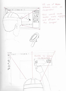 This initial sketch showed a VR headset, with the programs available to computers, installed to the side of the headset.
It imagined the uses of Photoshop, Illustration and Indesign through virtual reality headsets, as a way to predict how it may be used for design in future.
As shown in the sketches, the user could efficiently use the program by hand and could swipe and drop items by touch.
 This sketch was to show how the user perceives the image in different eyes, as well as how they may be able to create 3D designs by drawing from hand in a virtual space.
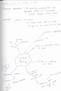
To find more options to pursue, a mind may of virtual reality was drawn and several ideas relating to it were then noted. From it was possible to find more inspiration from existing businesses, to use for the practical.
IDEA 2 - Website design for VR company
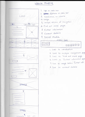 In order to create a website, the design would first need a plan of the structure. After looking at different VR companies, different elements of each website were assessed and further inspired the layout of this website map.
 The plan would be to show it as one continuous page for users to scroll down and select different options, including the information of the business and the contact info. An alternative version would also be proposed, that would make the website horizontal as opposed to vertical and offer multiple choices throughout.
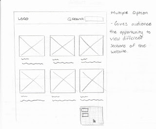
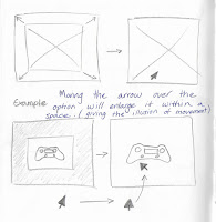
This sketch showed how the website could look interactive to the viewer, when they swipe over an option using the mouse arrow. As the options will involve imagery within a box, the idea was to show the image enlarging within that space, giving the audience a sense of scale as it mimics movement and dimension. This would be appropriate to the design, as the business would be related to the themes of movement in a virtual space.
Feedback
After sharing the ideas with peers, it was clear that the best option to pursue would be the webpage for a design company. This would be made using a vertical layout and would take further inspiration from design websites.
- Consider the typeface, logo/logotype and colour scheme in relation to technology and advanced aesthetic
- Use layout grid as a way to structure the webpage and use imagery to further promote it as a business.
- Make the company offer other formats of design, e.g. photography and 3D design.


No comments:
Post a Comment